Project
Rebranding the Bergen region's tourist board ‘Visit Bergen’ called for a faithful presentation as an international marketing platform. A local personality with a compelling character in the Asian, American, African and European markets and for Bergenske and Norwegians alike.
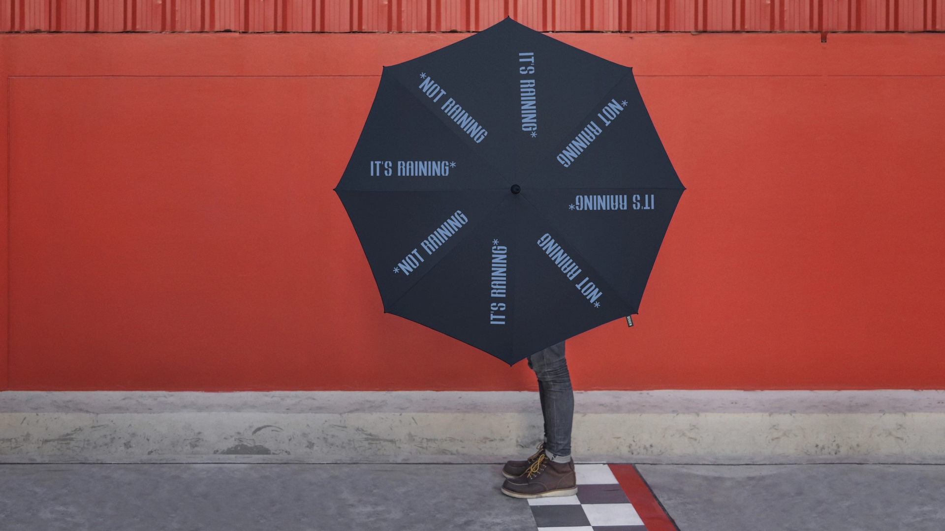
A region of trolls and hip hop, of rain and ice cream, of fishermen and coders, of cliff-faces and dance floors, of boardrooms, bedrooms, vikings and shoppers. A gem evermore profiled in The New York Times, BBC, The Guardian, Kinfolk, Condé Nast, to name but a few international media brands enchanted by the region.
(Work developed under ANTI Bergen & ANTI Trondheim)

Challenge
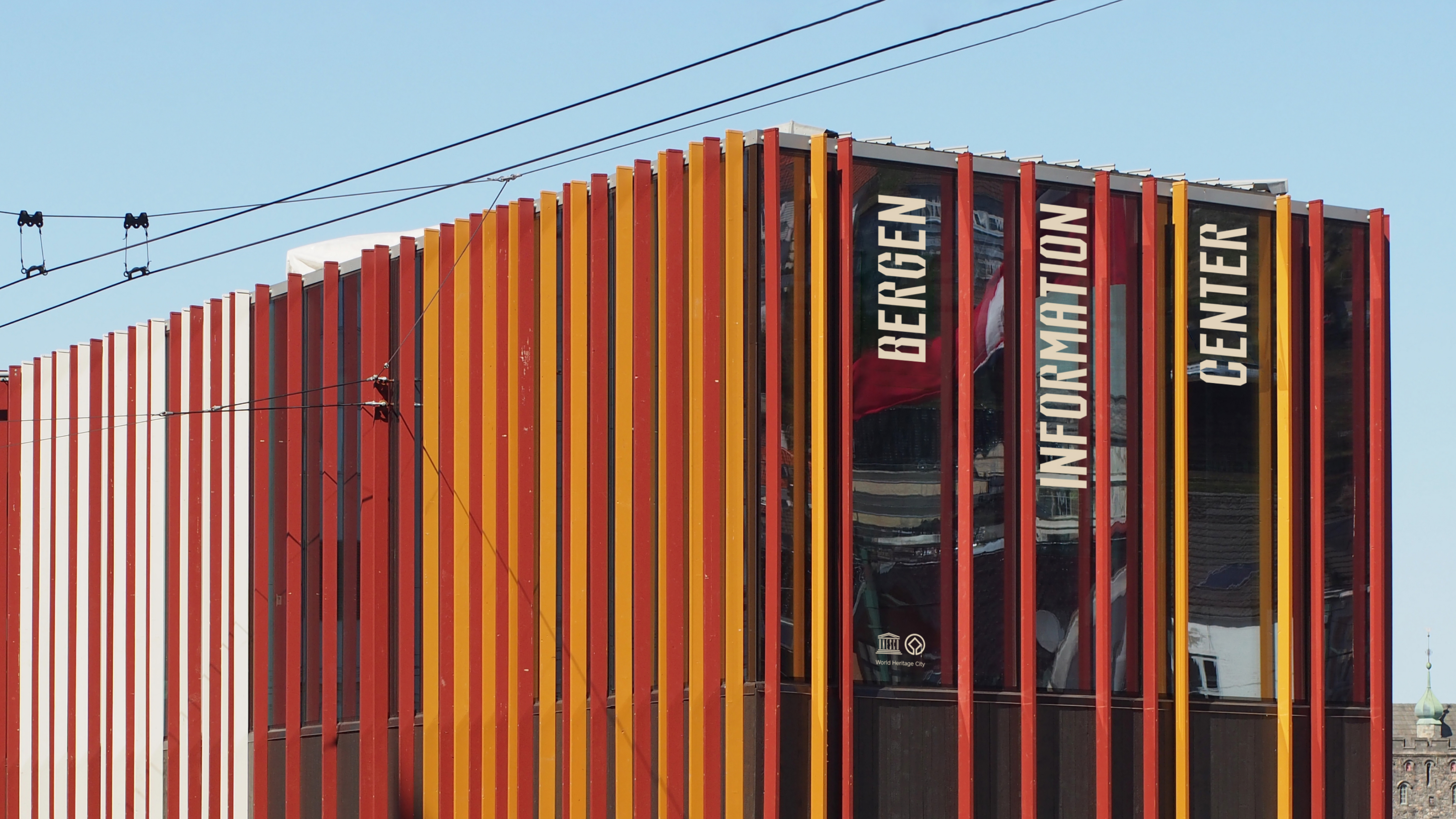
An organisation representing 400+ travel and hospitality business members. Who’s activities range from the Bergen Convention Bureau, facilitating delegates from around the world hosting events on Norway’s West Coast, the Tourist Information centre in Bergen, to promoting the region at home and across the world, through media relations, travel and hospitality forums and international marketing. Visitors per annum are currently four times the population of the region. With 1.2 million arriving in the city, by boat alone, each year. As such, Bergen’s rebrand is less about attracting greater numbers of international tourists, as it is celebrating those already here, enhancing their experience and enriching community life. Whatever the purpose, be it a hit of extreme sport adrenaline, a change of executive headspace, a gastronomic extravaganza, a kid’s fairytale adventure, a weekend of RnR or cultural hit; there’s one Bergen and one personality. A consistent core expression within the community and around the world. Showcasing the wide range of members and partners of different sizes, sectors and markets through dynamic content and channels.
Solution
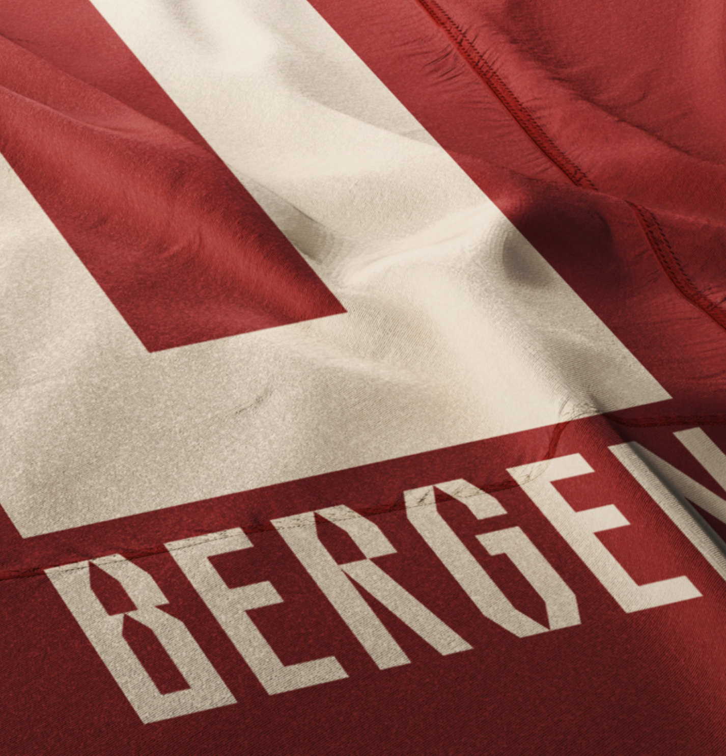
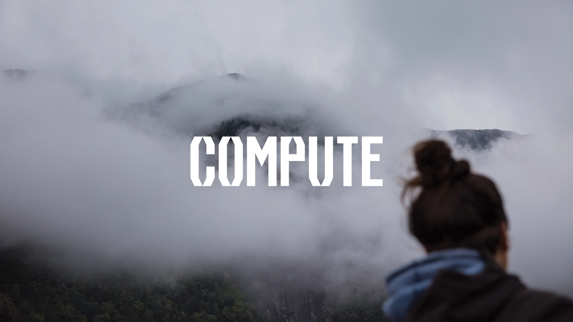
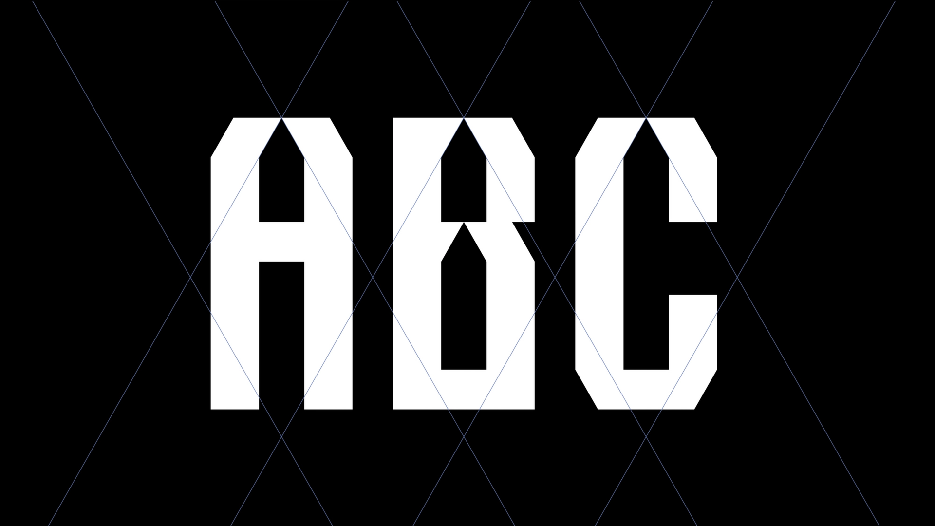
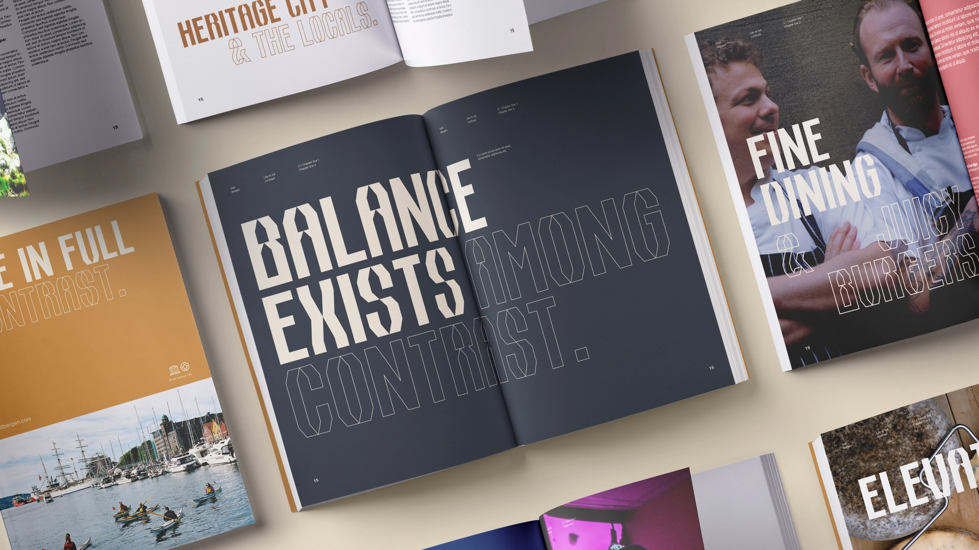
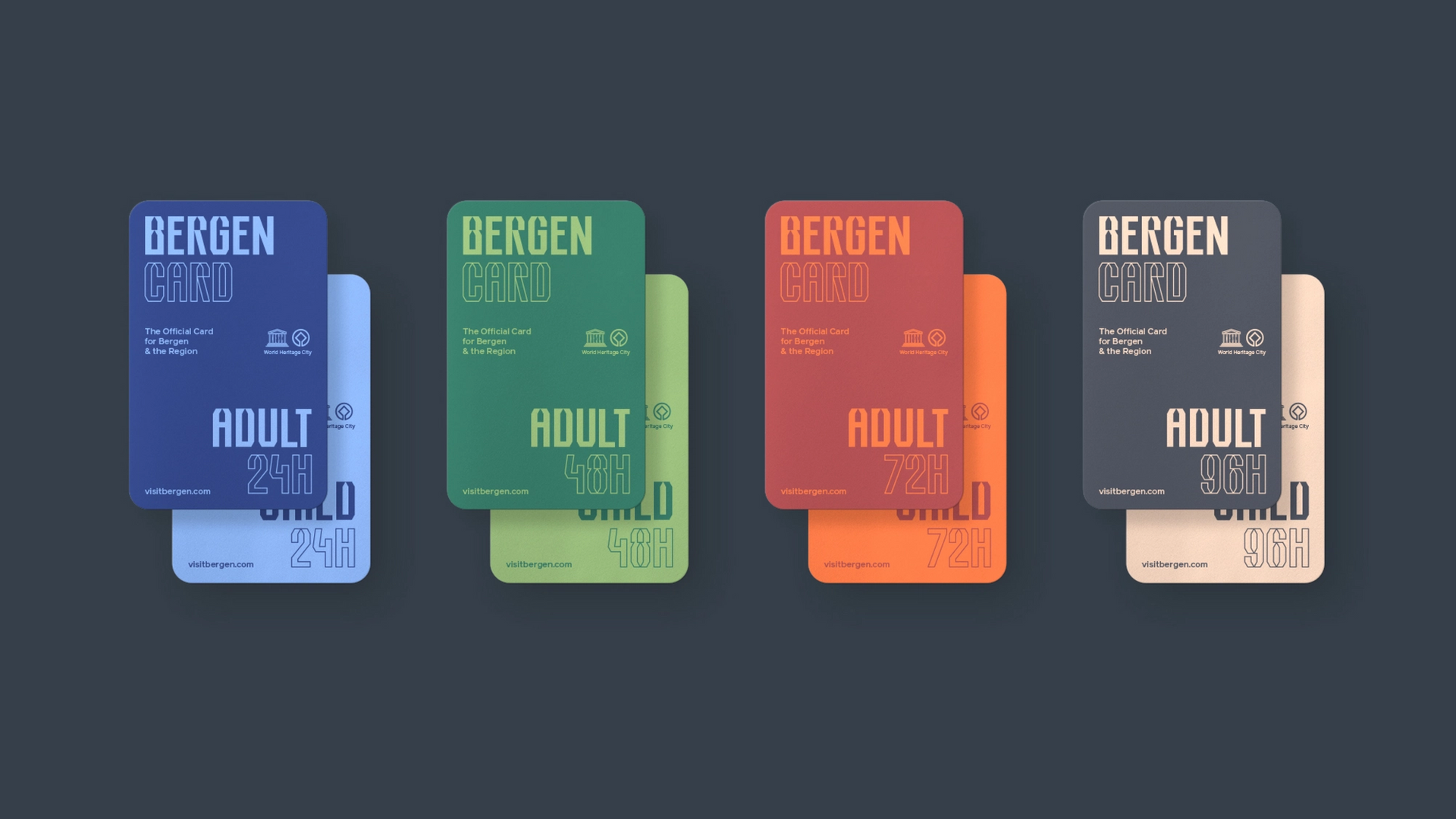
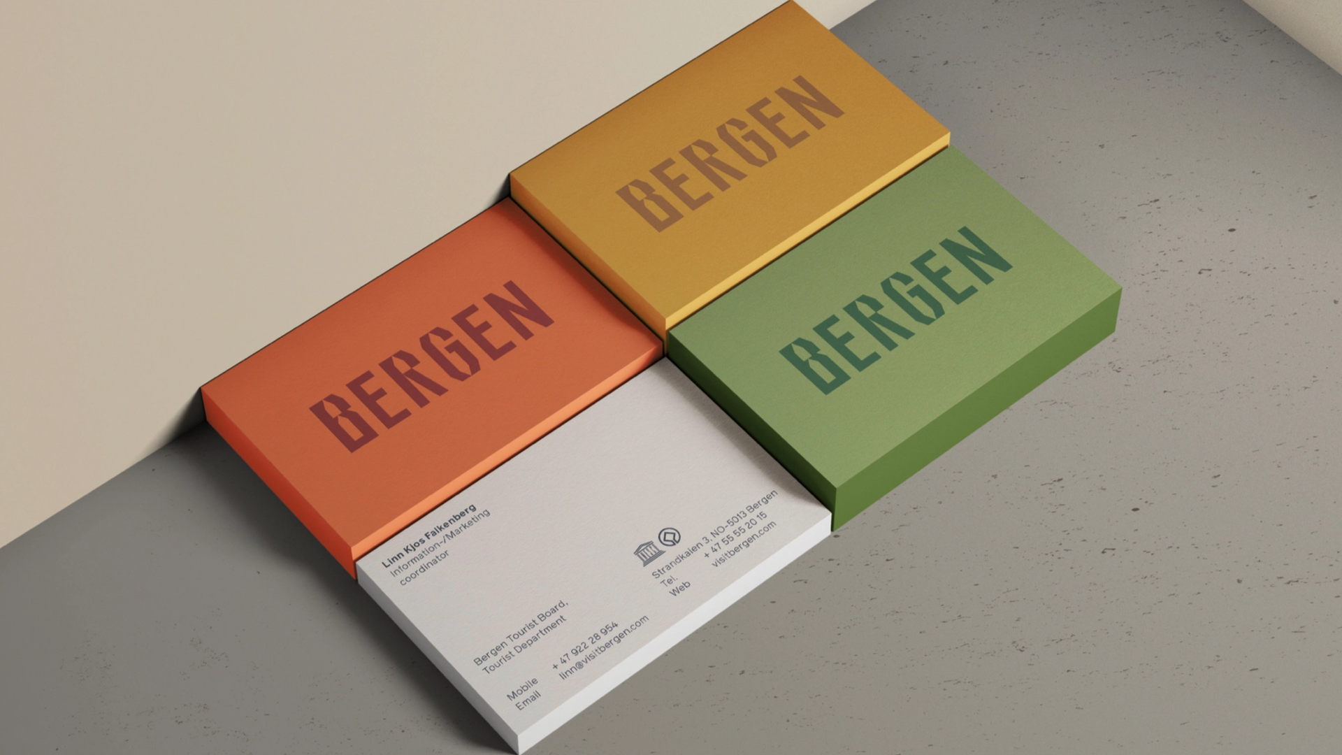
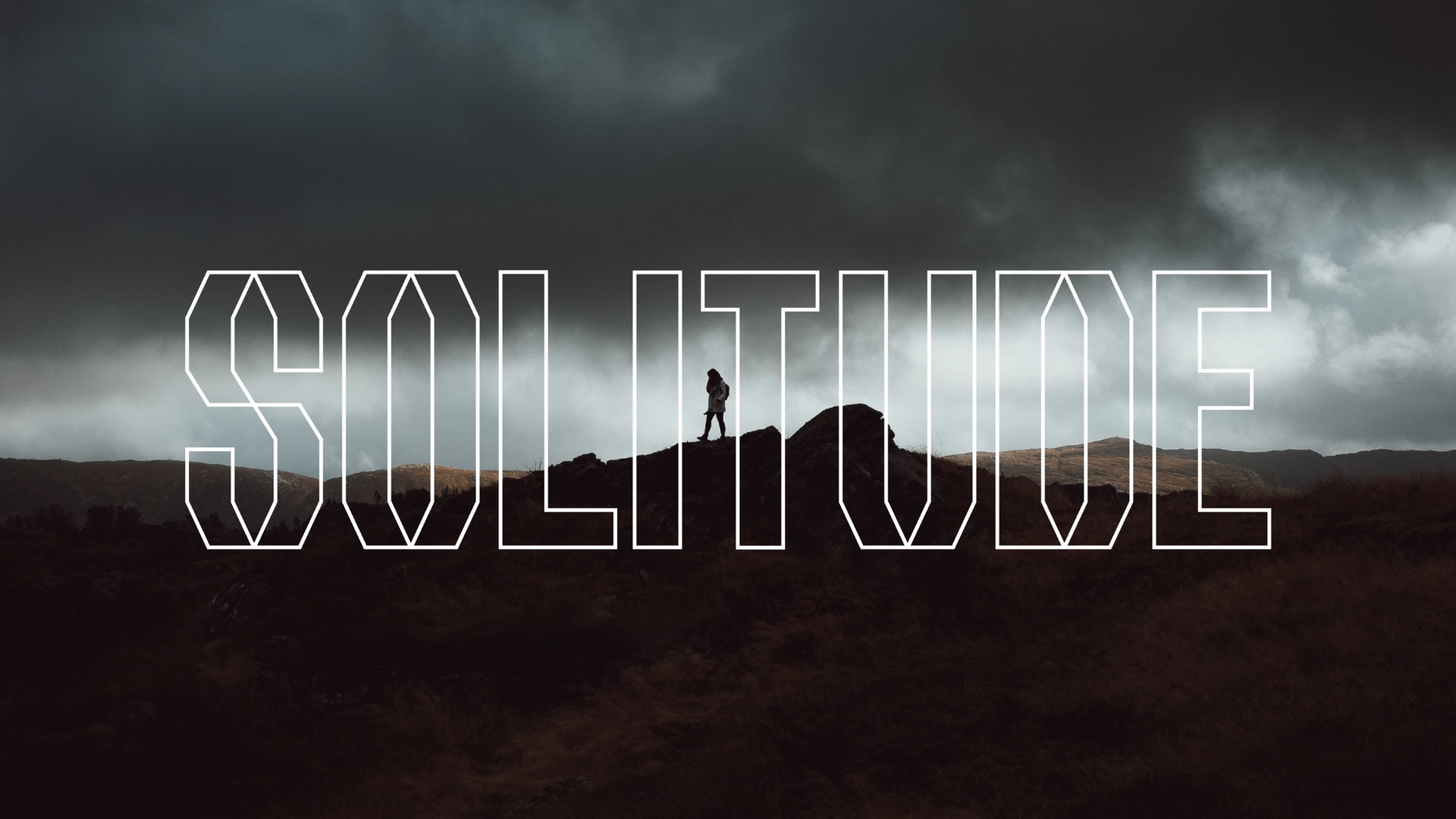
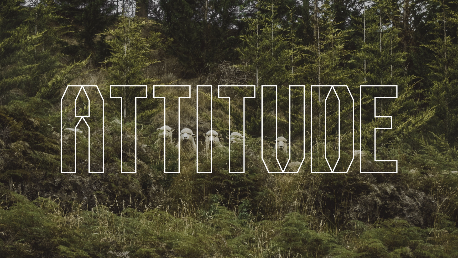
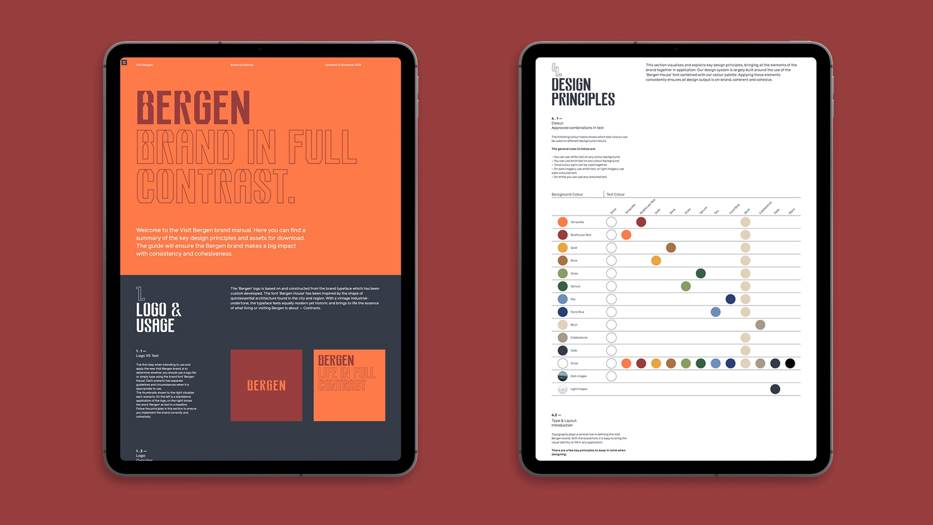
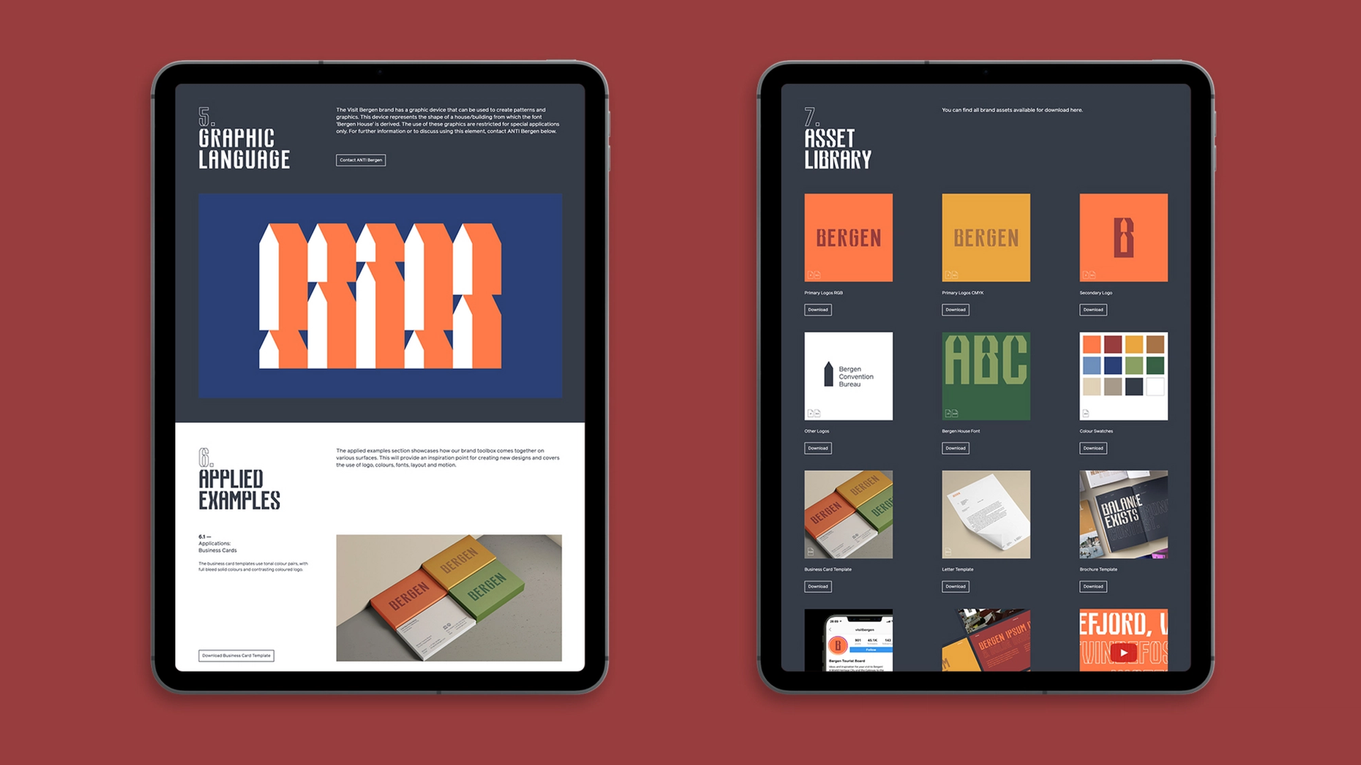
Such an iconic city and its surrounding region, naturally comes with an inheritance of many clichés and tired symbols. The new profile challenges the well known with the surprisingly unfamiliar, giving Bergen a whole new energy, lifting and celebrating the breadth of experiences the region has to offer. The focus was to move from the position of ‘Gateway to the Fjords’, and to anchor the brand in the quality of life that the region has to offer; no longer a gateway but a destination. A destination with ‘Life in Full Contrast’. A celebration of diversity of cultural and natural extremes, from urban street life to mountaintops, classical to contemporary, fast and slow. A personality that celebrates the contrast of scale, of size, of volume, of emotions. Practically, the identity functions as a quality mark for member brands, as an organisational identity, profiling the services of Visit Bergen, right up to a campaign platform. There’s no logo in the traditional sense, rather a custom typeface, primed to tell the stories of the region. A voice shouting from the mountaintops, whispering in the wind and singing in the crowd.

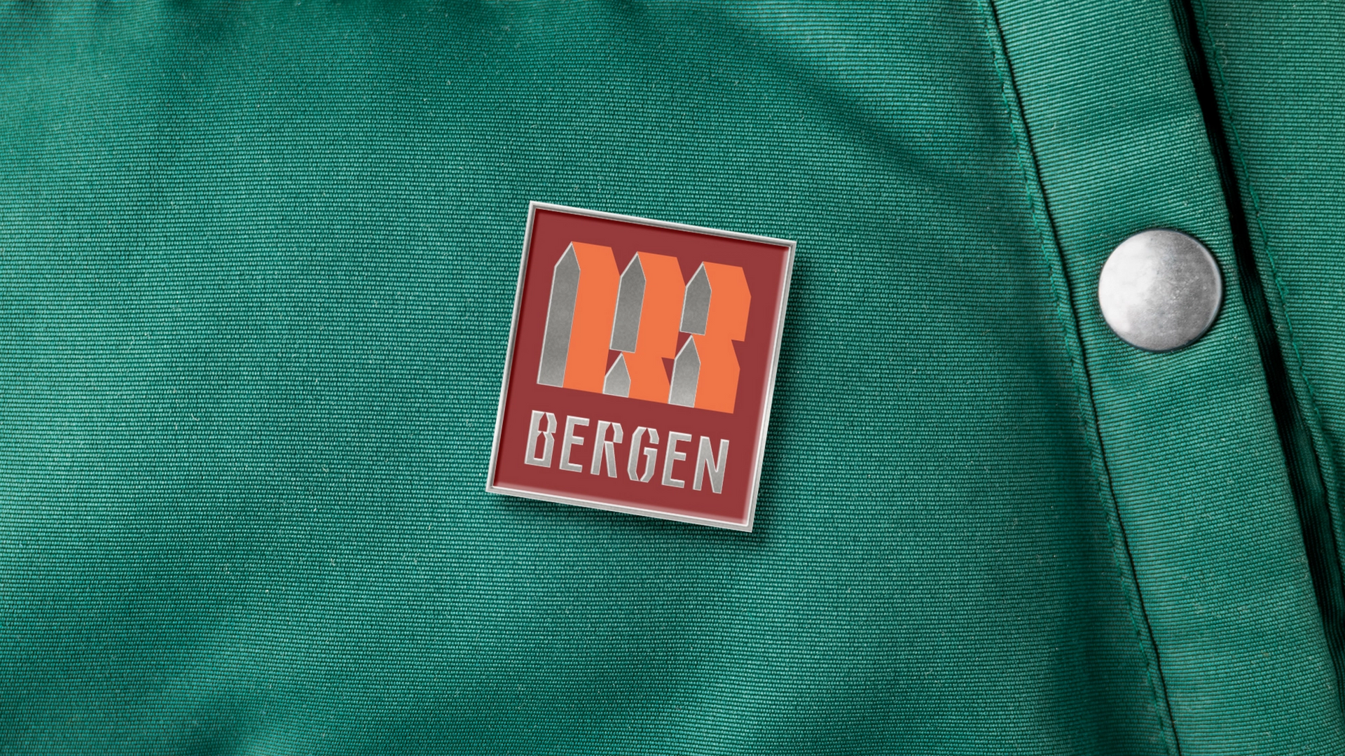
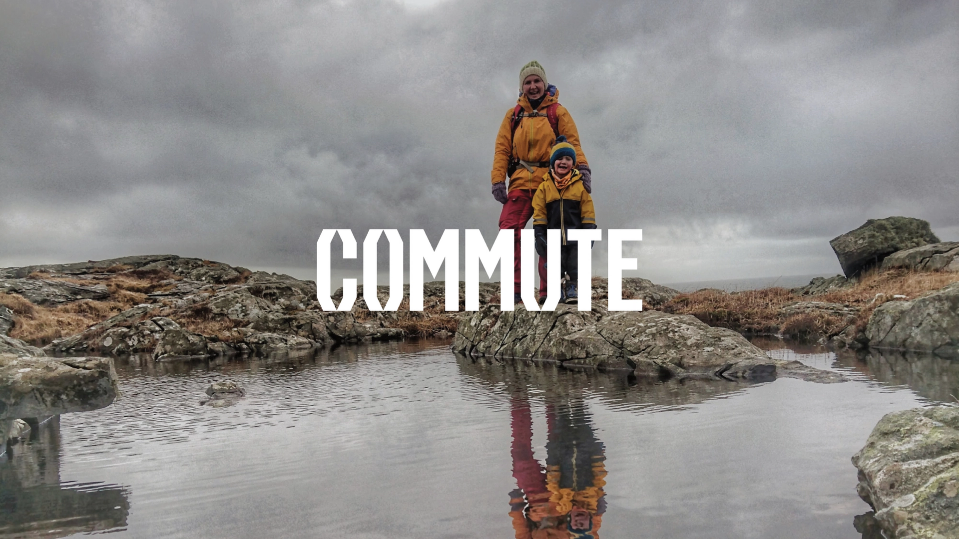
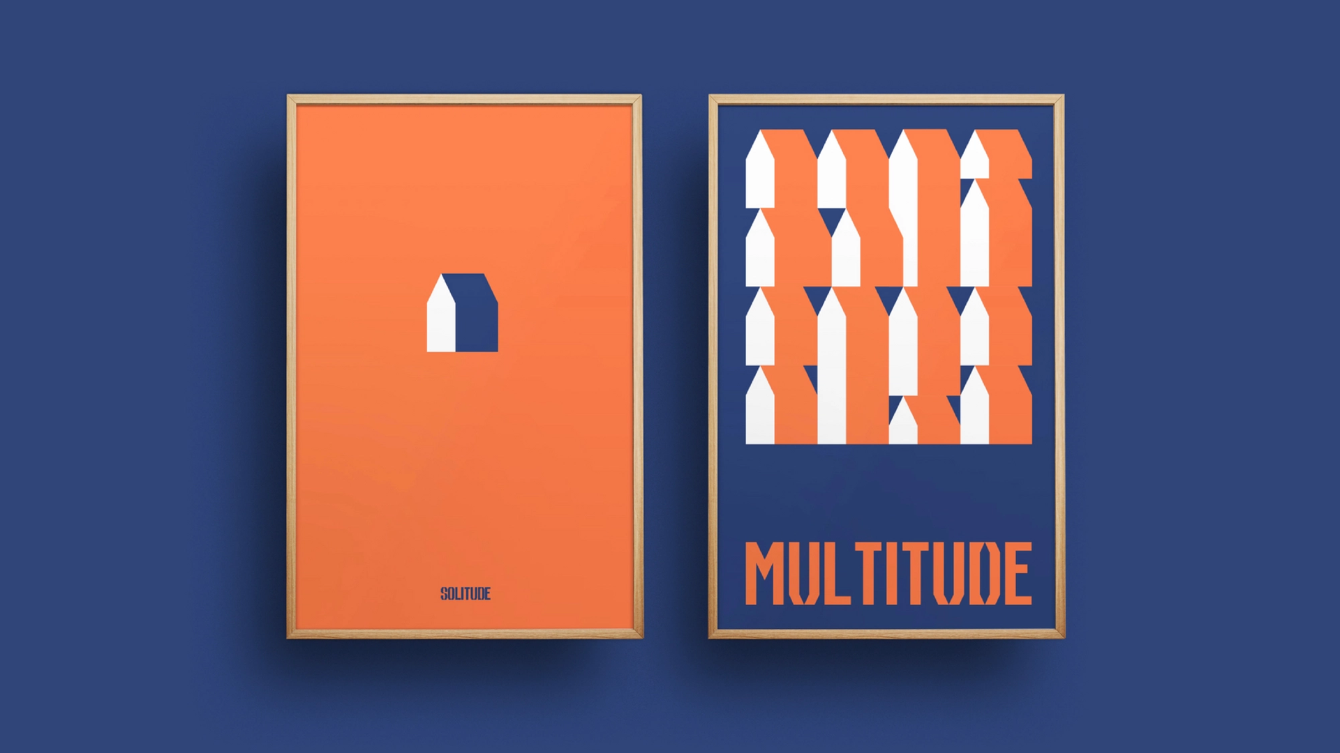
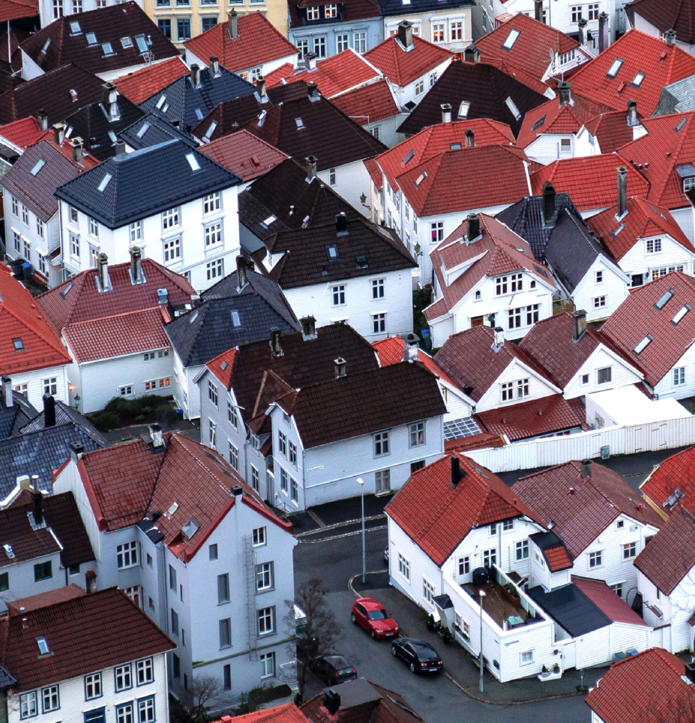
Tone of voice is a critical component of the brand. Bold and expressive, playful yet direct, a personality that is filled with self confidence yet welcoming. A region open and full of energy, proud of its contrasts in a way that is inviting. The use of copywriting with imagery and film is the simple yet impactful medium in which the brand grabs attention and carries its story — a simple yet energy charged method true to the no-nonsense Norwegian way. A symbol is found within the negative space of the bespoke typography, a graphical accent in the design-dialect of the region. This form can stand alone as a graphical element, used as pattern and shape, used in different frequencies to express the constants of the region, from urban to nature, calm to high energy, and so on. The new profile of the Bergen Region is entering the world in many different forms, as an organisational brand, as campaign, as rap lyrics and music video, as merchandise, as live experiences, and as much more to come.
