Project
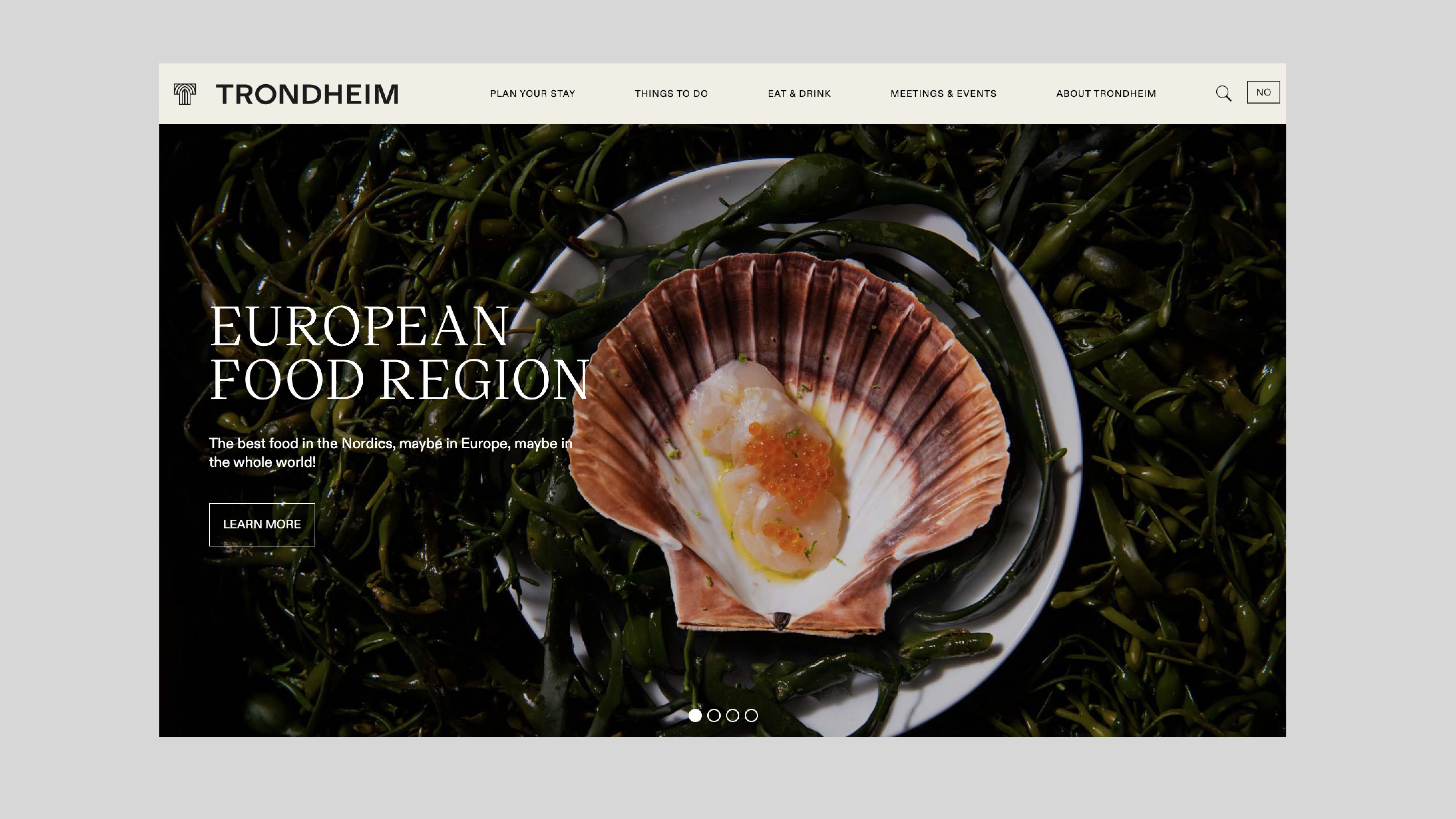
To increase visibility and build a reputation for one of Norway's most iconic cities, we were asked to make the new brand platform for Visit Trondheim, a destination company aiming to promote Trondheim as an attractive city to travel to.
Developing a clear, long-term brand strategy, and a strong visual identity to position Trondheim both nationally and internationally, we helped Visit Trondheim to take a unique position in the lifestyles and journeys of ‘its people’. Creating an effective strategy for good storytelling, and a brand that would let Trondheim be the story you write yourself into. A brand that you yourself complete, and the more you add to it, the more it adds to you.
(Work developed under ANTI Trondheim & ANTI Bergen)
Challenge
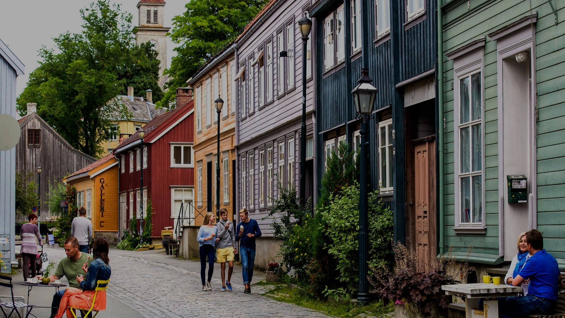
Like many other industries, the tourism sector was experiencing seismic changes during Covid. Looking at habits for selecting your destination, travelers today navigate in new ways and prioritise differently than before. They choose journeys that will represent who they are, seeking out experiences based on how things look on social media. A single image can entice people across the globe in search of a story worth sharing. Building a brand for tomorrow's visitors we looked to the qualities of Trondheim, creating a brand that invites you. For Visit Trondheim it was also important to include the many industries and partners that make Trondheim the city it is today. Building on insights conveyed in workshops with the partners and decision makers of Trondheim, we mapped out the many needs that our client could assist with in their brand strategy. Creating a solution where Visit Trondheim could give back to the city. With many different events in different segments of the industries, and a target audience varying greatly in terms of nationality, age and areas of interest, it became clear that Visit Trondheim needed to become an umbrella for all of these to naturally fall under, taking the role as the city’s storyteller.


Solution
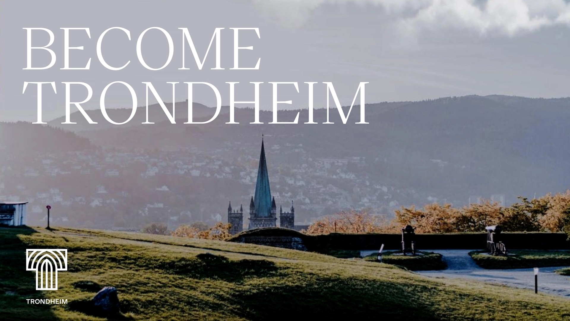
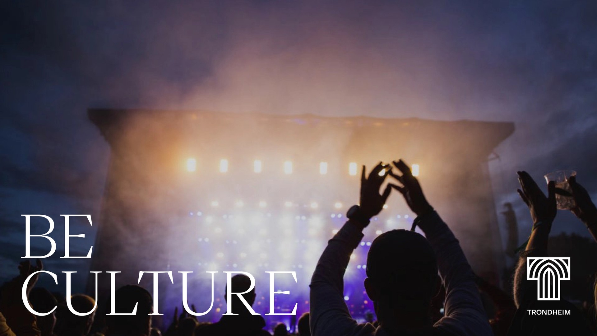
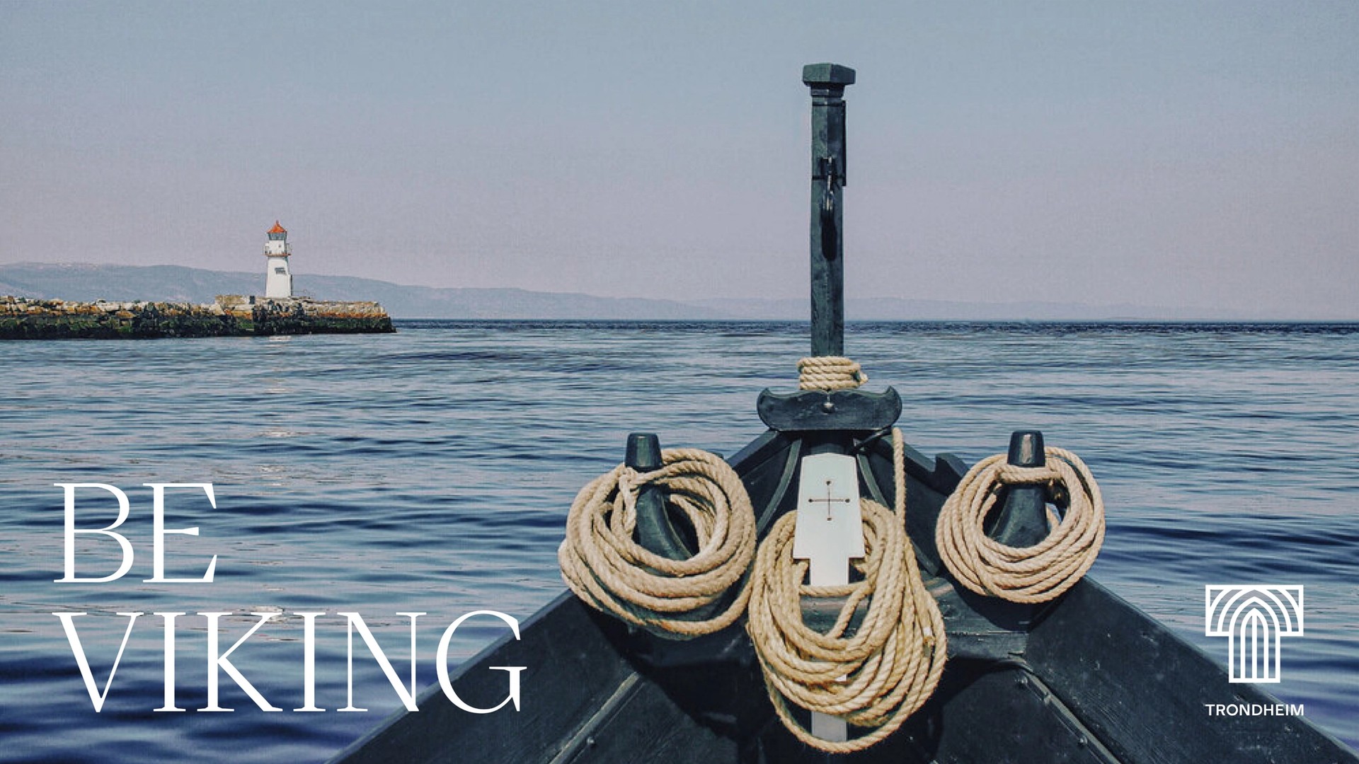
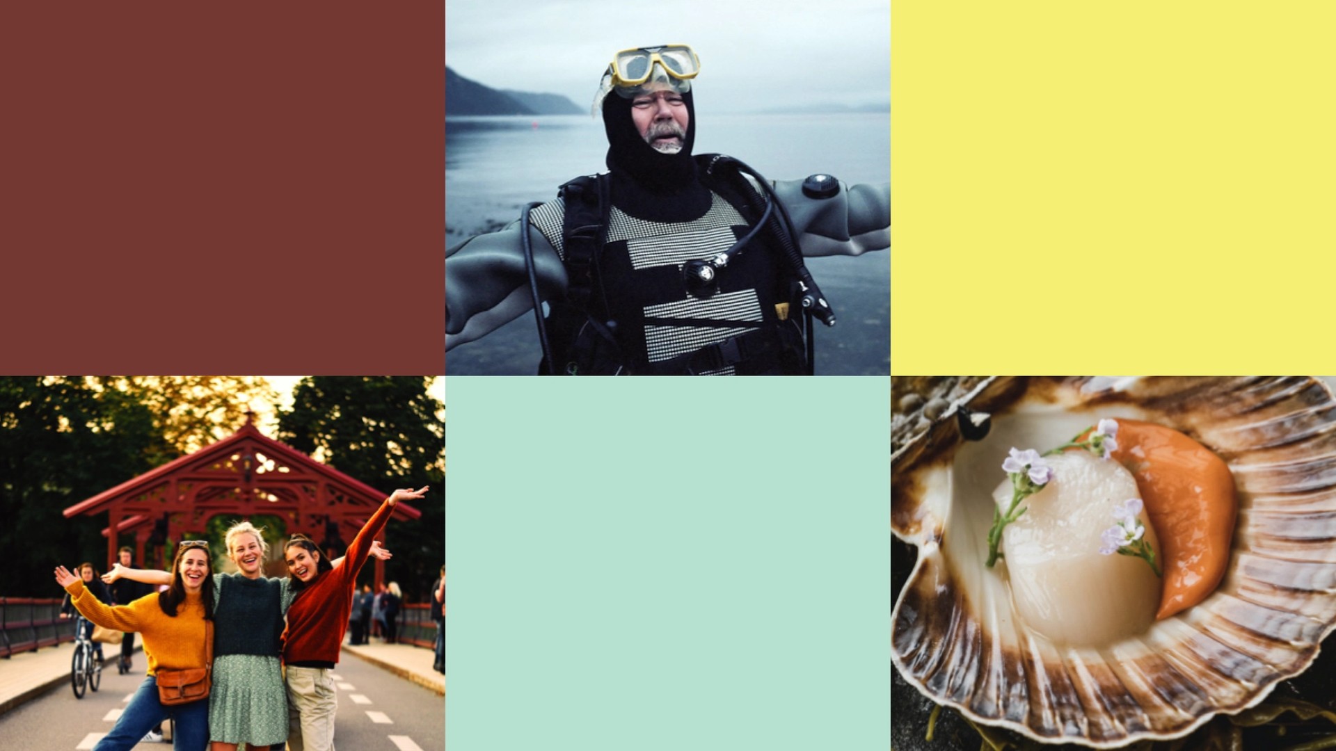
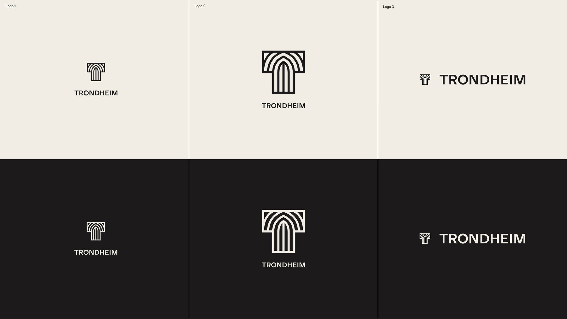
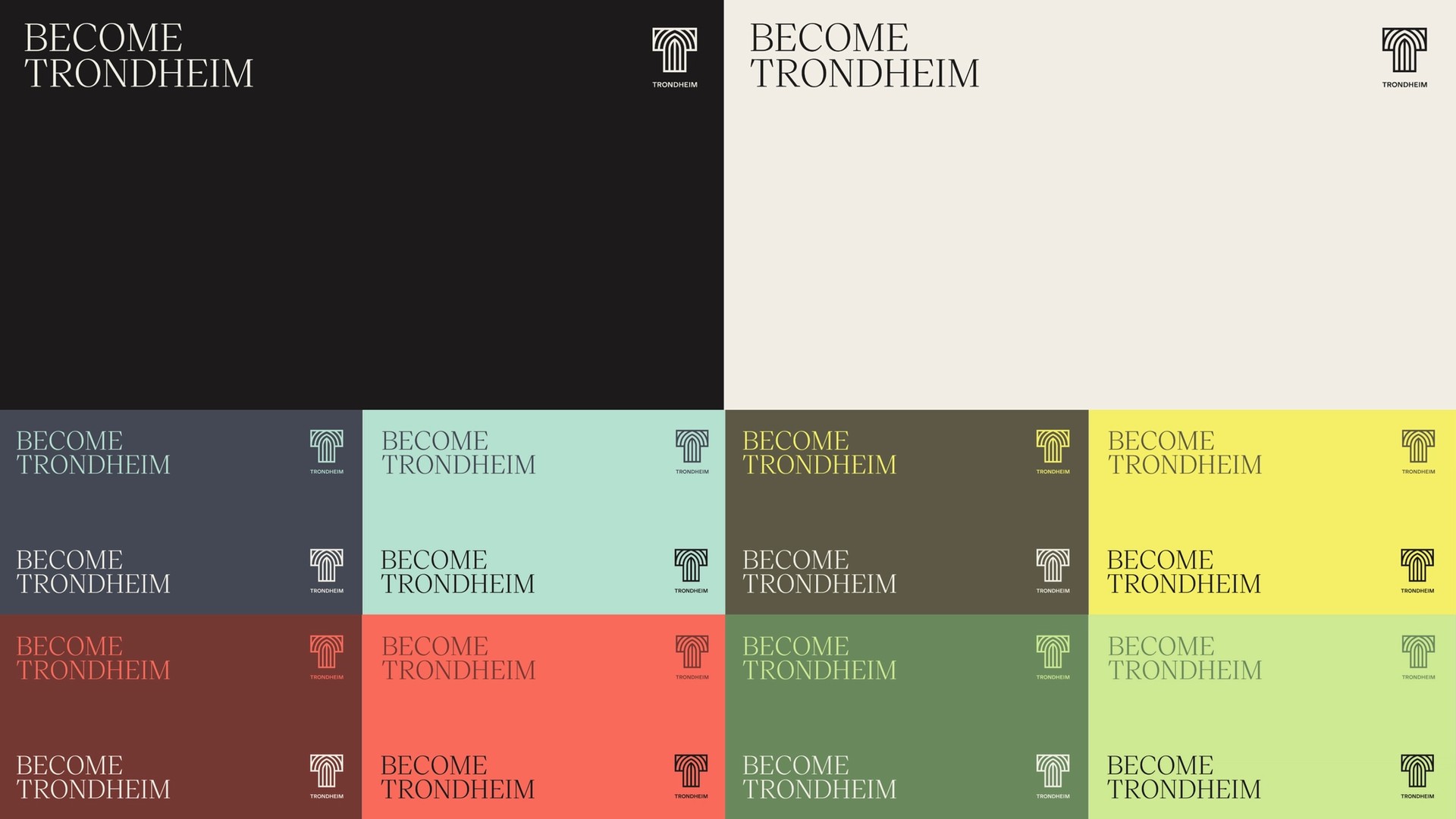
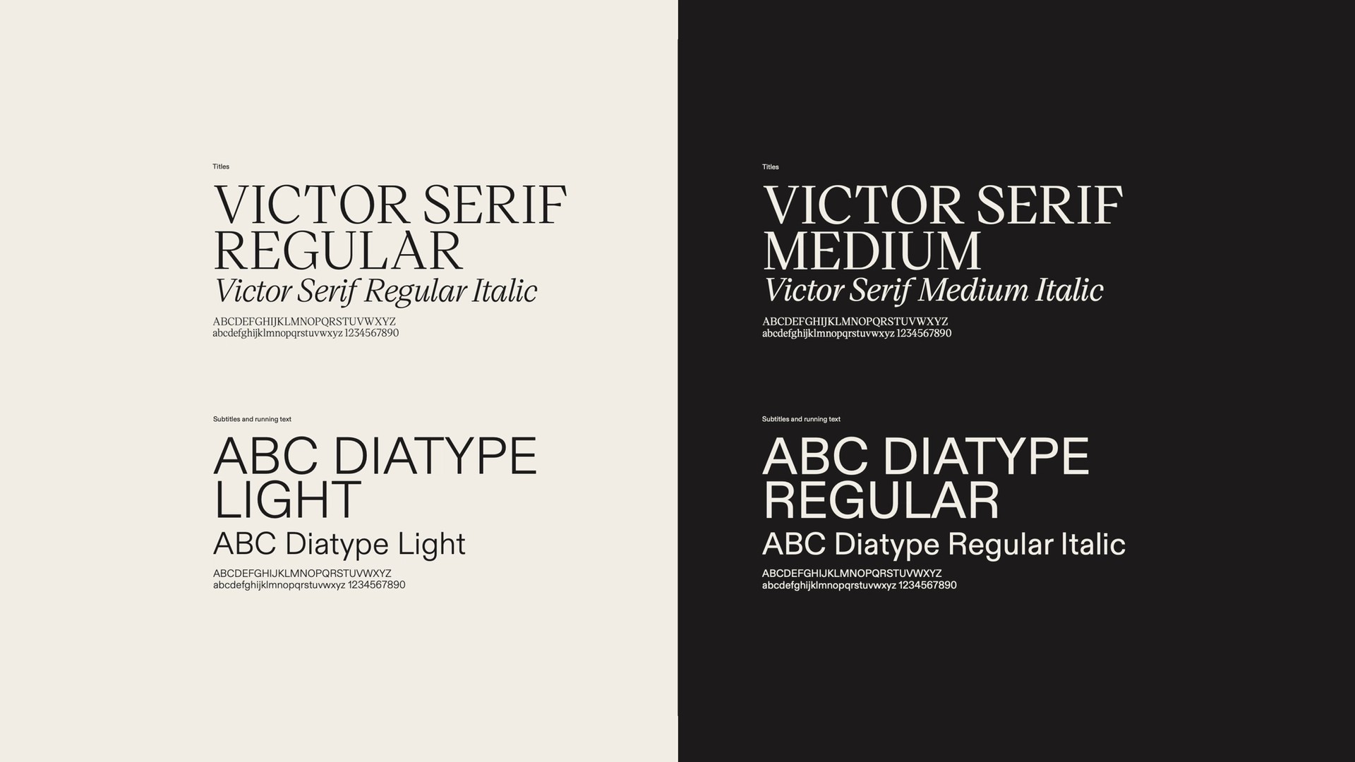
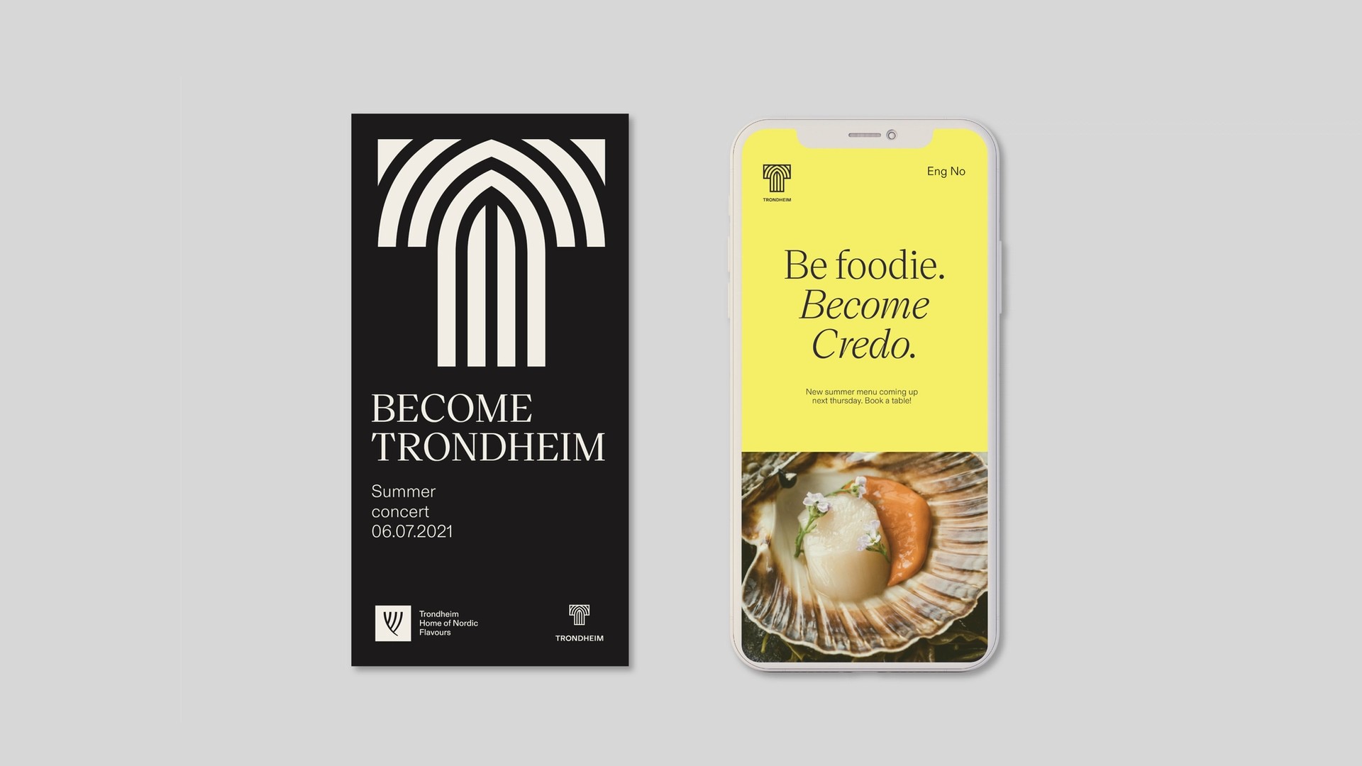
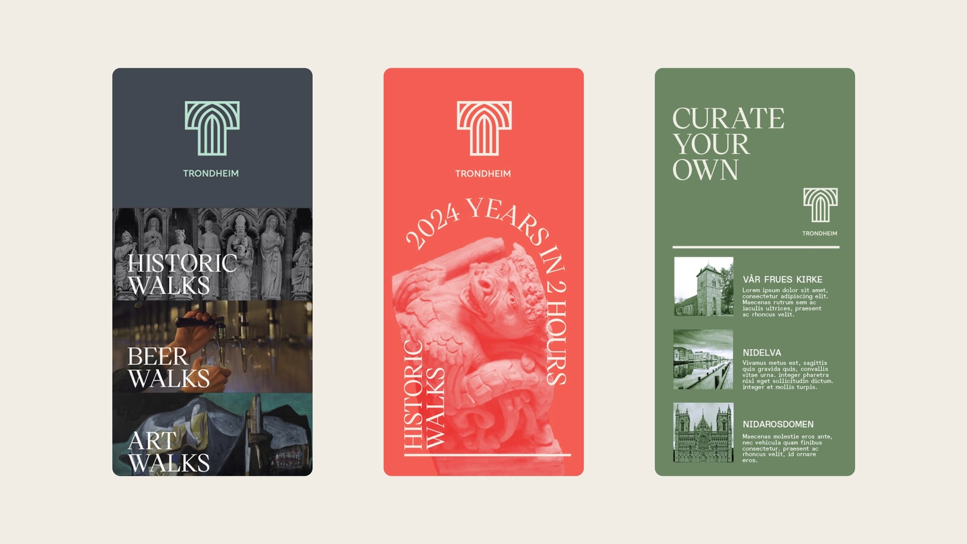
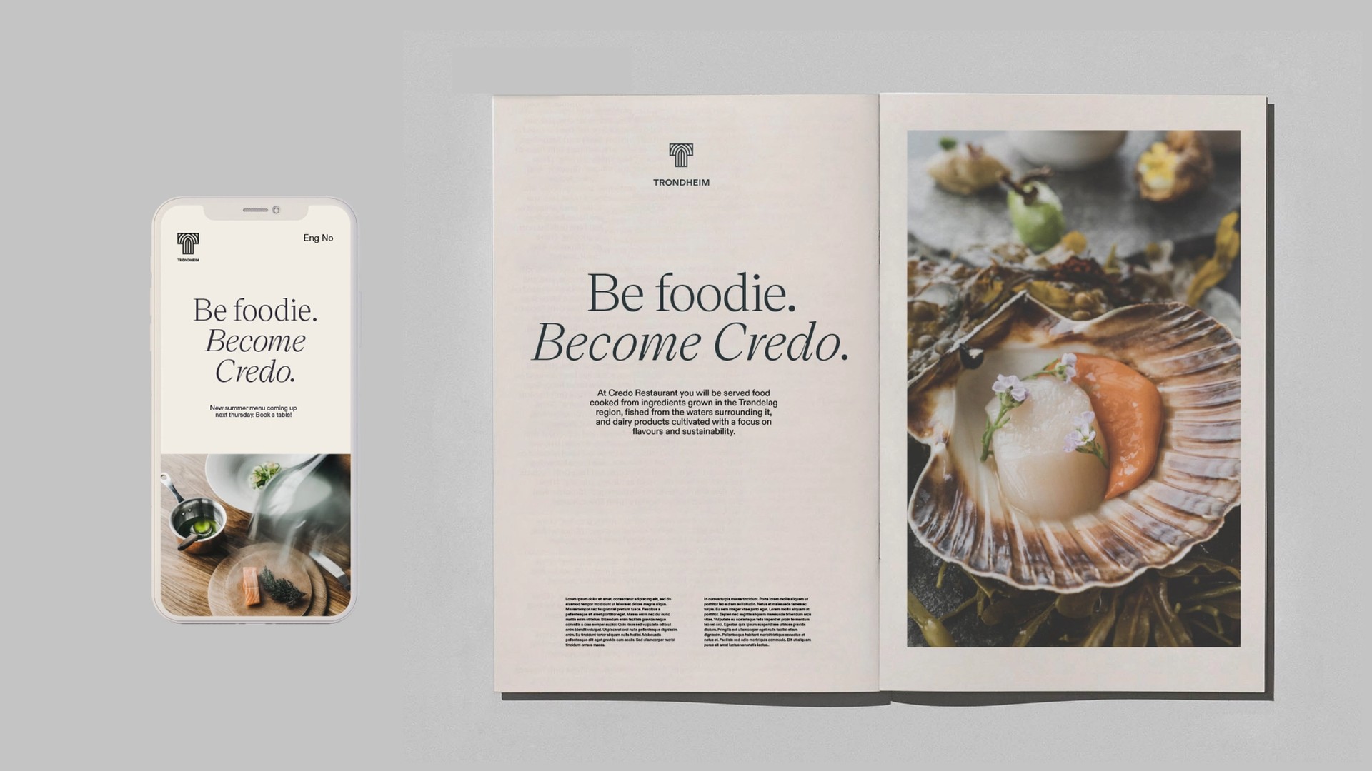
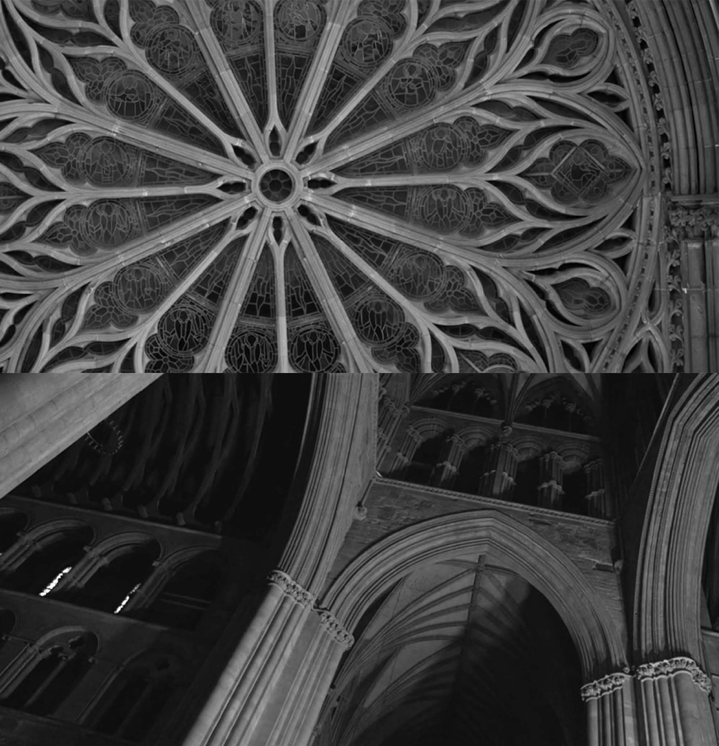
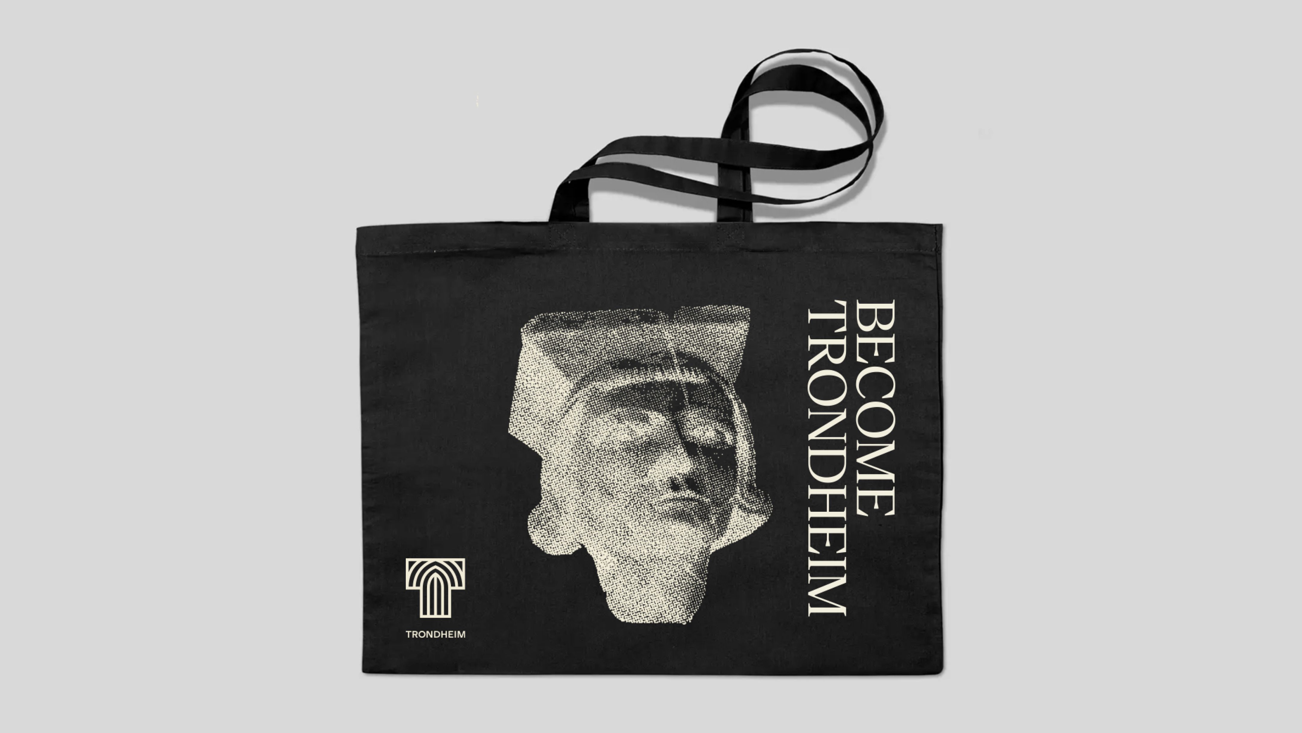
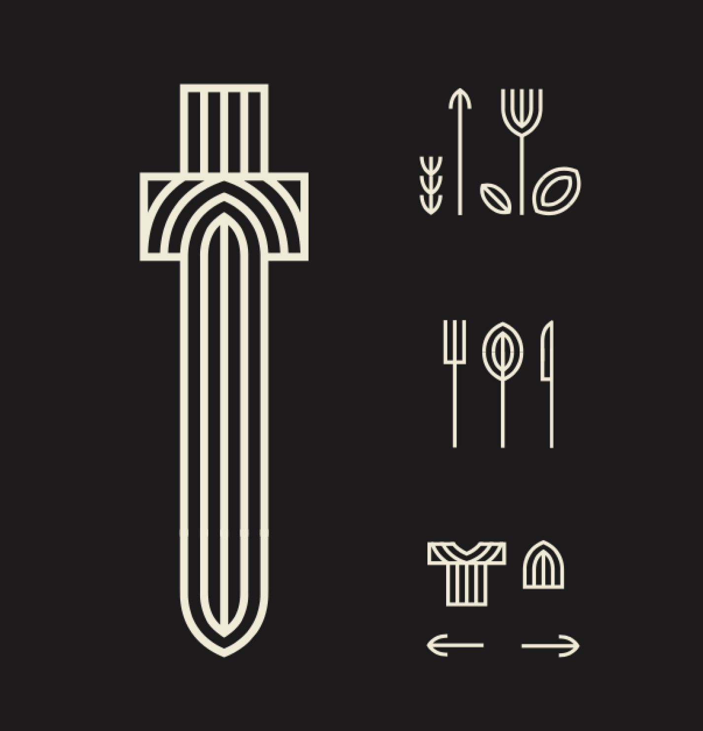
We created a platform for Trondheim to become a city brand that was relevant for all, not just as a tourist destination but as a community on a journey, open to influence. Allowing for great storytelling and for the people to become Trondheim. Be tech, be foodie, be wild, be expert, be Viking, be proud, be curious, be inspirational. “Become Trondheim” was a strategy that gave us the opportunity to inspire and recruit, both home and away. Building on the many great qualities that Trondheim has to offer: food, history, innovation, art and culture, nature, education and business opportunities. Developing the visual identity, it was also important for us to explore the qualities, properties and symbols that always will remain true for Trondheim. Nidaros Cathedral was used as a strong visual reference in order to create a sense of pride around the brand among locals. In addition to that, we also put an emphasis on OLD → NEW. Defining the Trondheim DNA, creating a balance between Trondheim’s historical significance and its current relevance. The new visual identity was created through a complex process that combines a unique story, expert design thinking, and simple geometric principles generating the building blocks for the broader visual identity and multifaceted brand platform.


