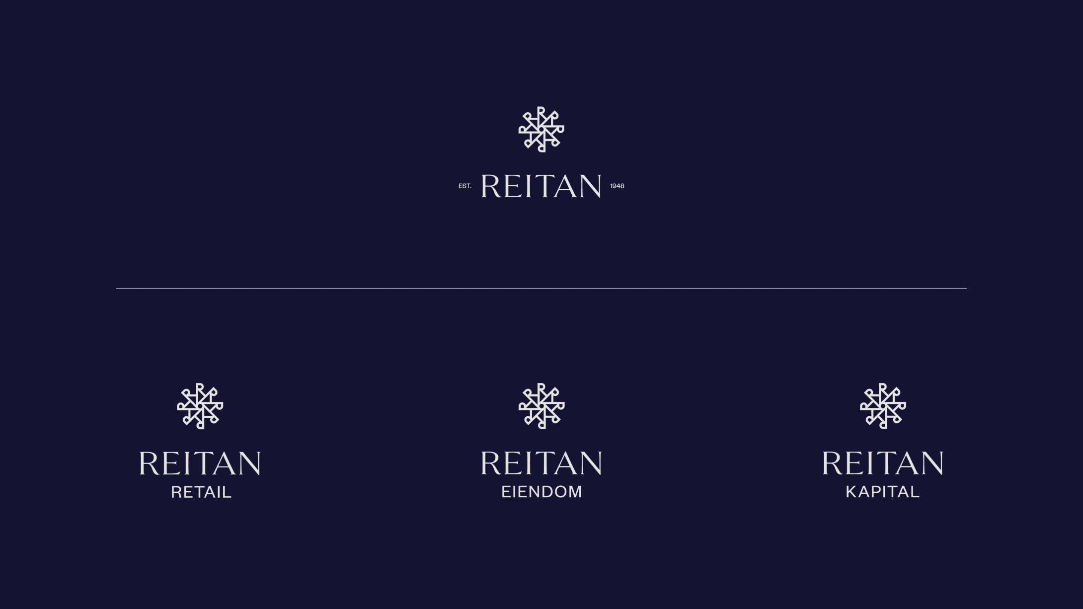
Through multiple workshops and processes with the client, we developed a strategy that follows a new structure, so as they grow new business areas they can use human behaviour as the guiding principle for naming future areas. Our focus was on internal communications, making their structures more visible in their main areas of business, where they went from 6 different business areas to 3 areas that focus on; Retail, Property, and Finance.
While most people in Norway can pronounce Reitangruppen (Reitangroup), most people in the Nordic and Baltic regions stick to Reitan. During our process, we looked into naming systems that could simplify their branding hierarchy and make it easier for everyone to understand the brandstructure. The company was renamed to REITAN AS.
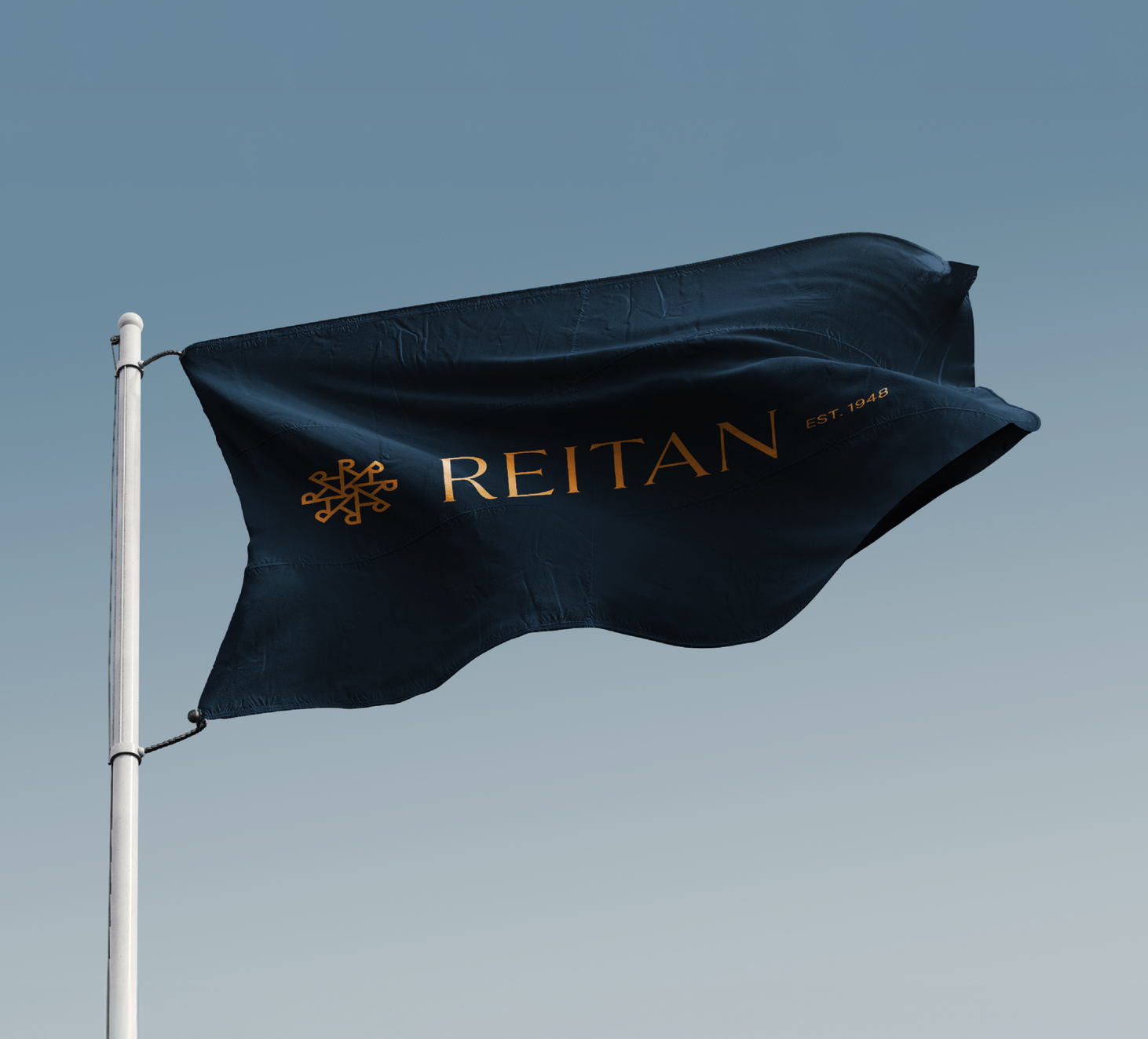
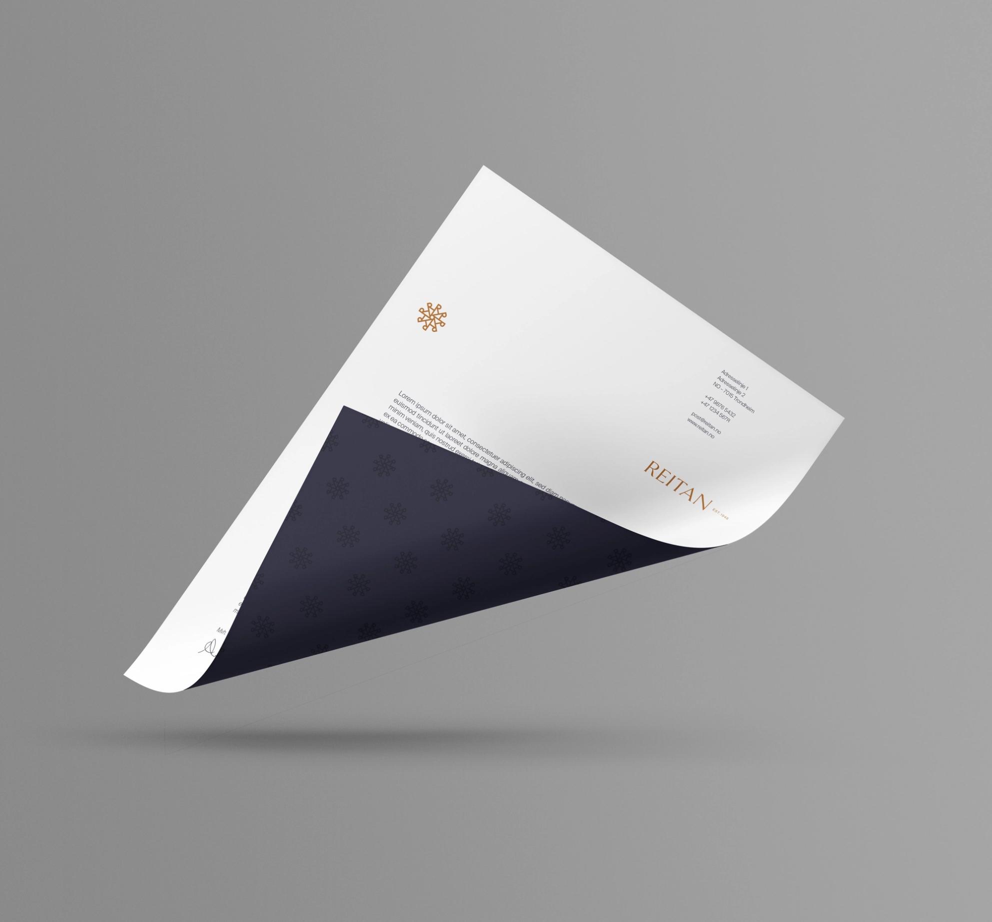
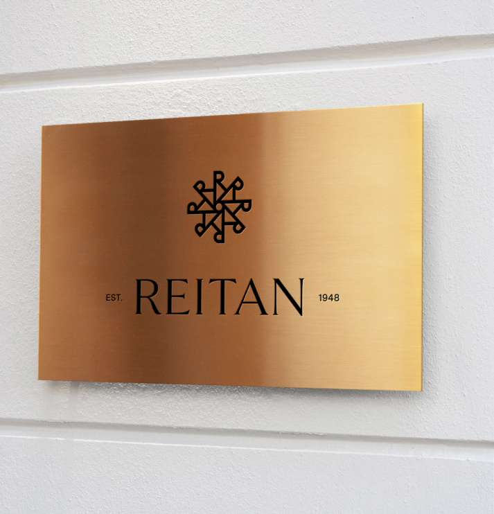
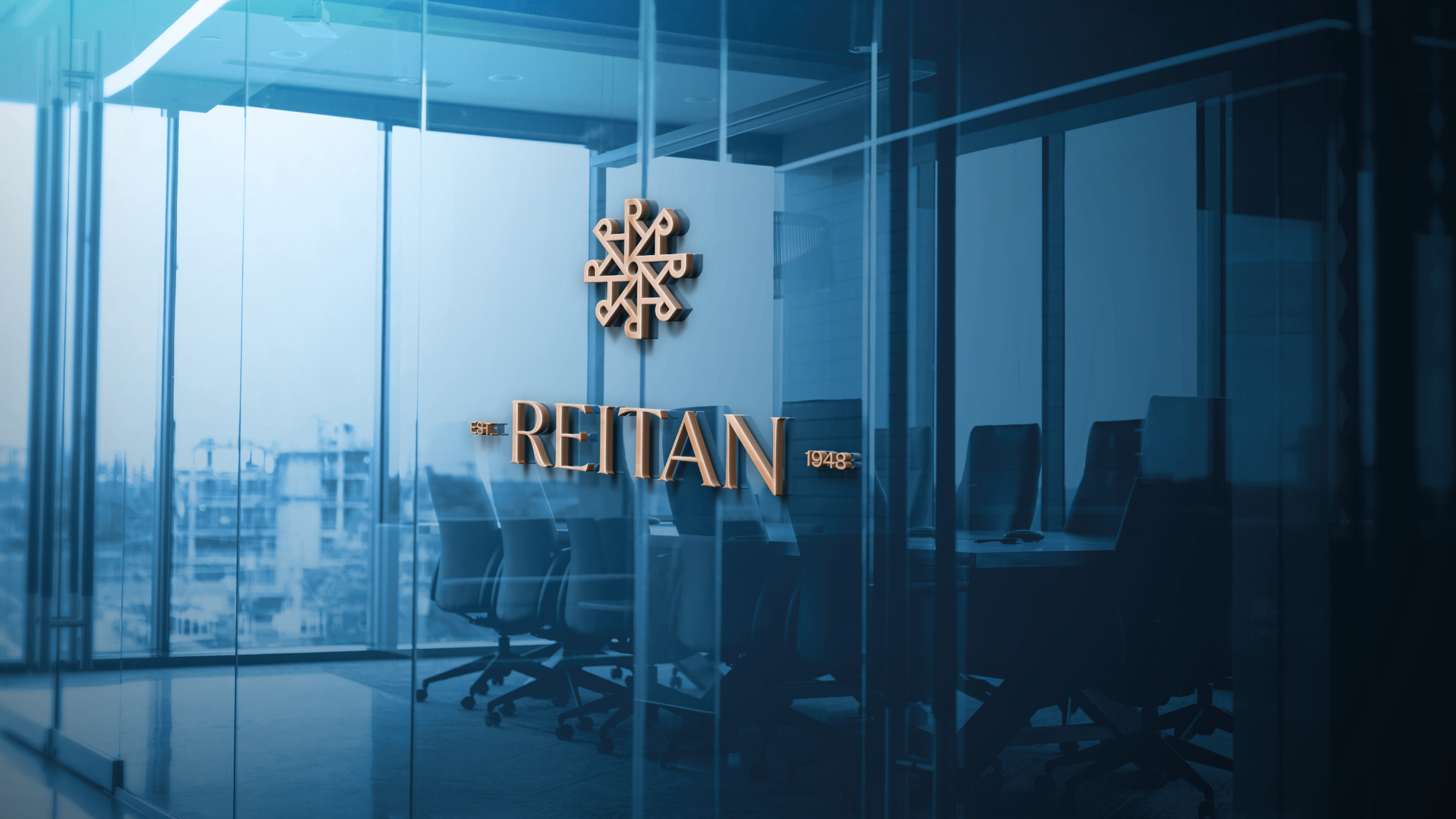
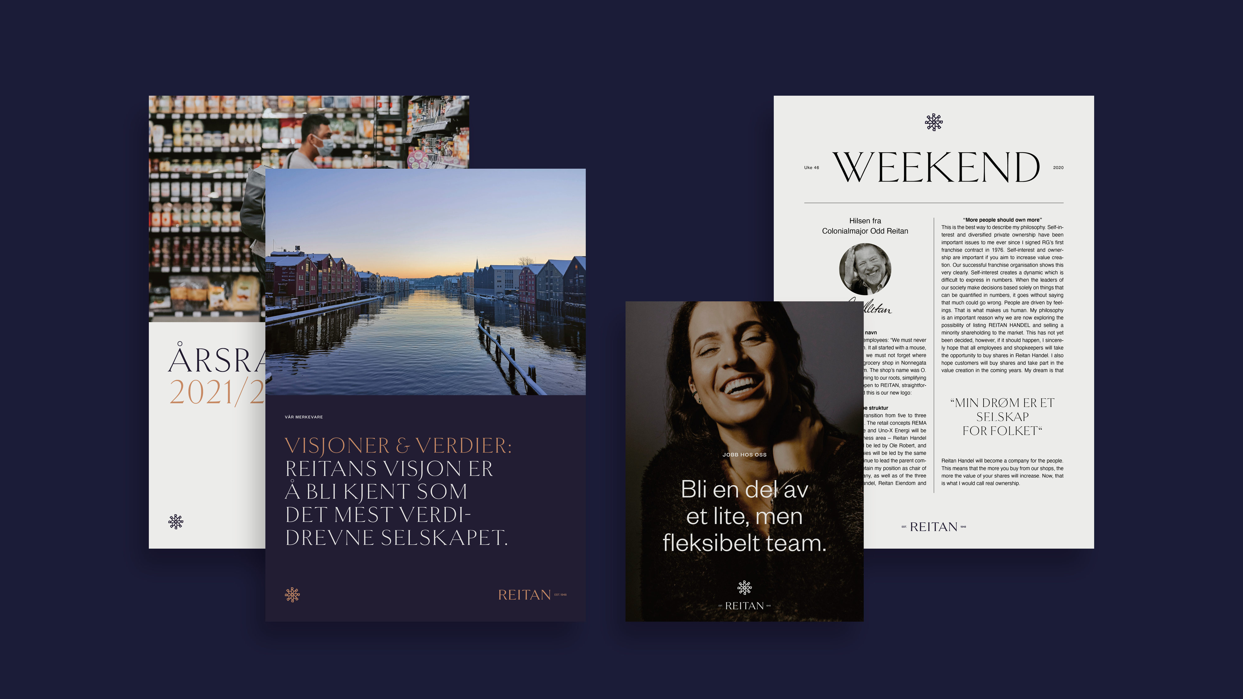
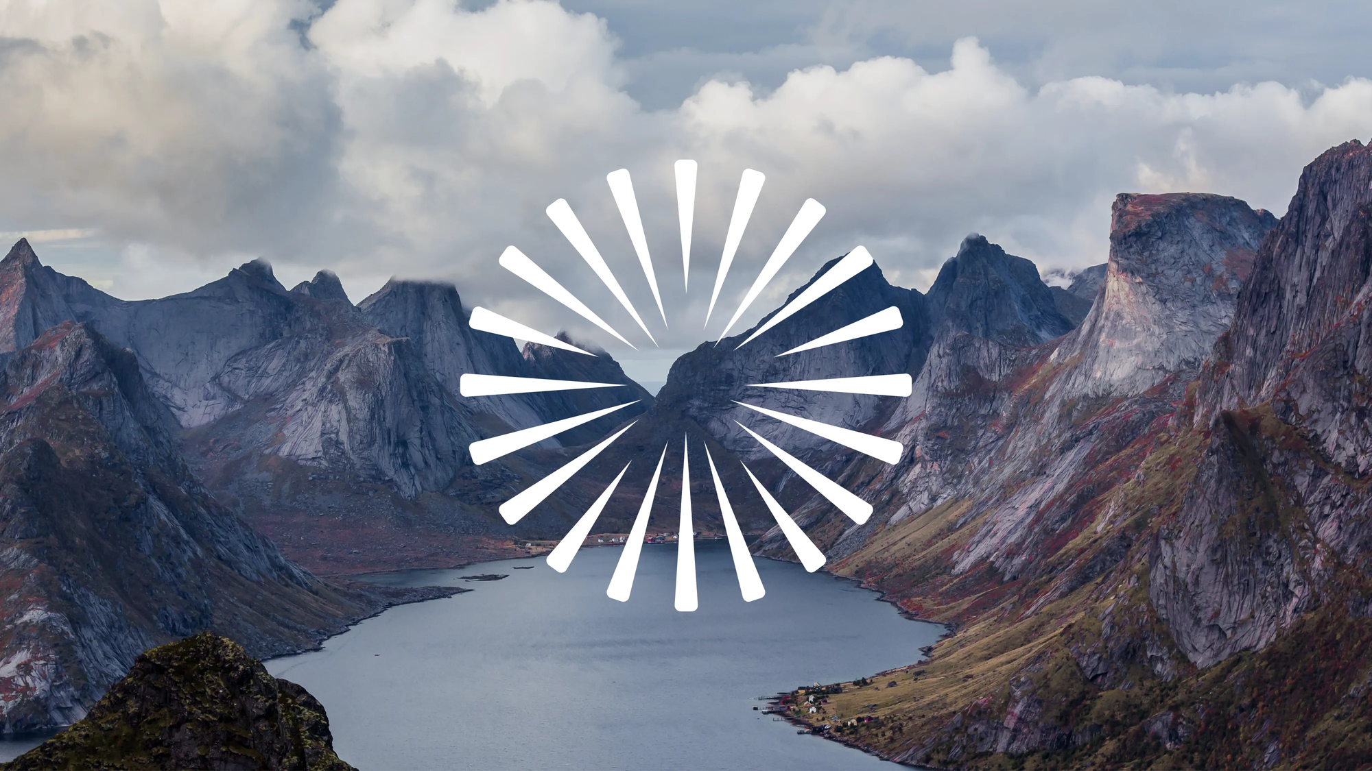
To create a sustainable brand architecture and build a visual identity we focused on the many great qualities and characteristics of the brand that could bring REITAN new life, and at the same time preserve their legacy. In an increasingly modernised and international market, the identity needed to convey stability, flexibility, and confidence.
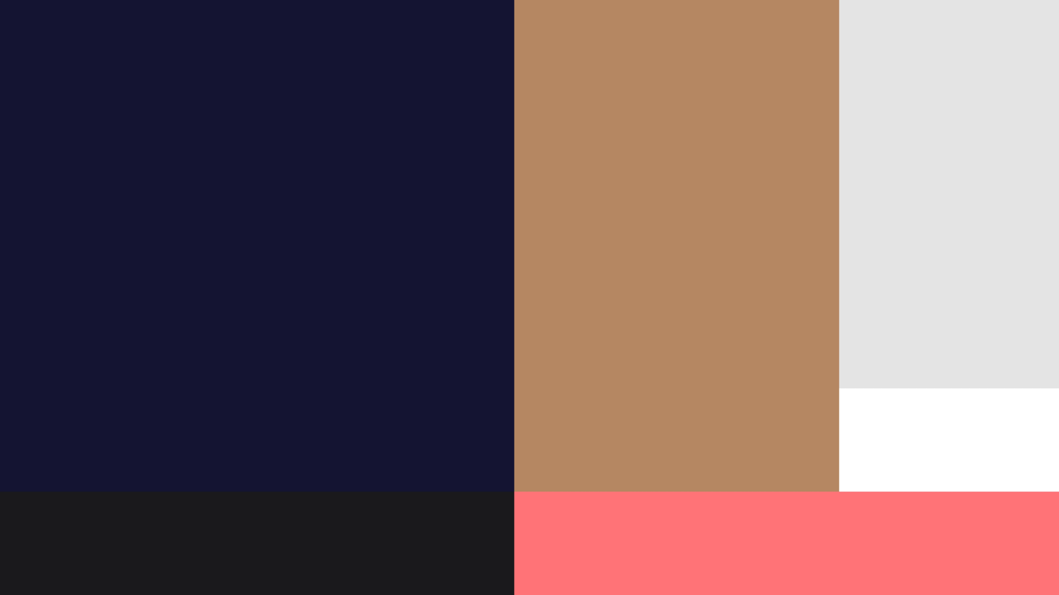
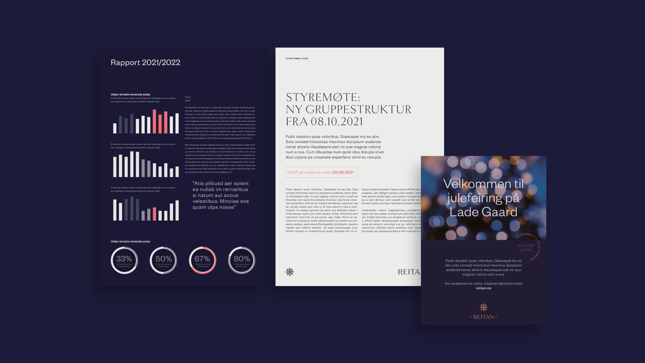
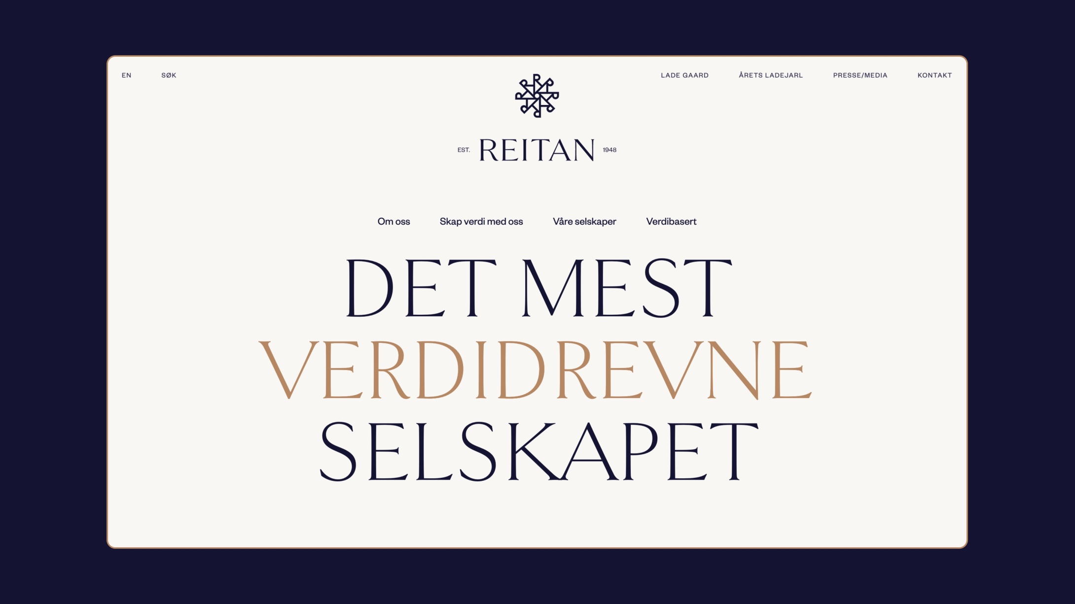
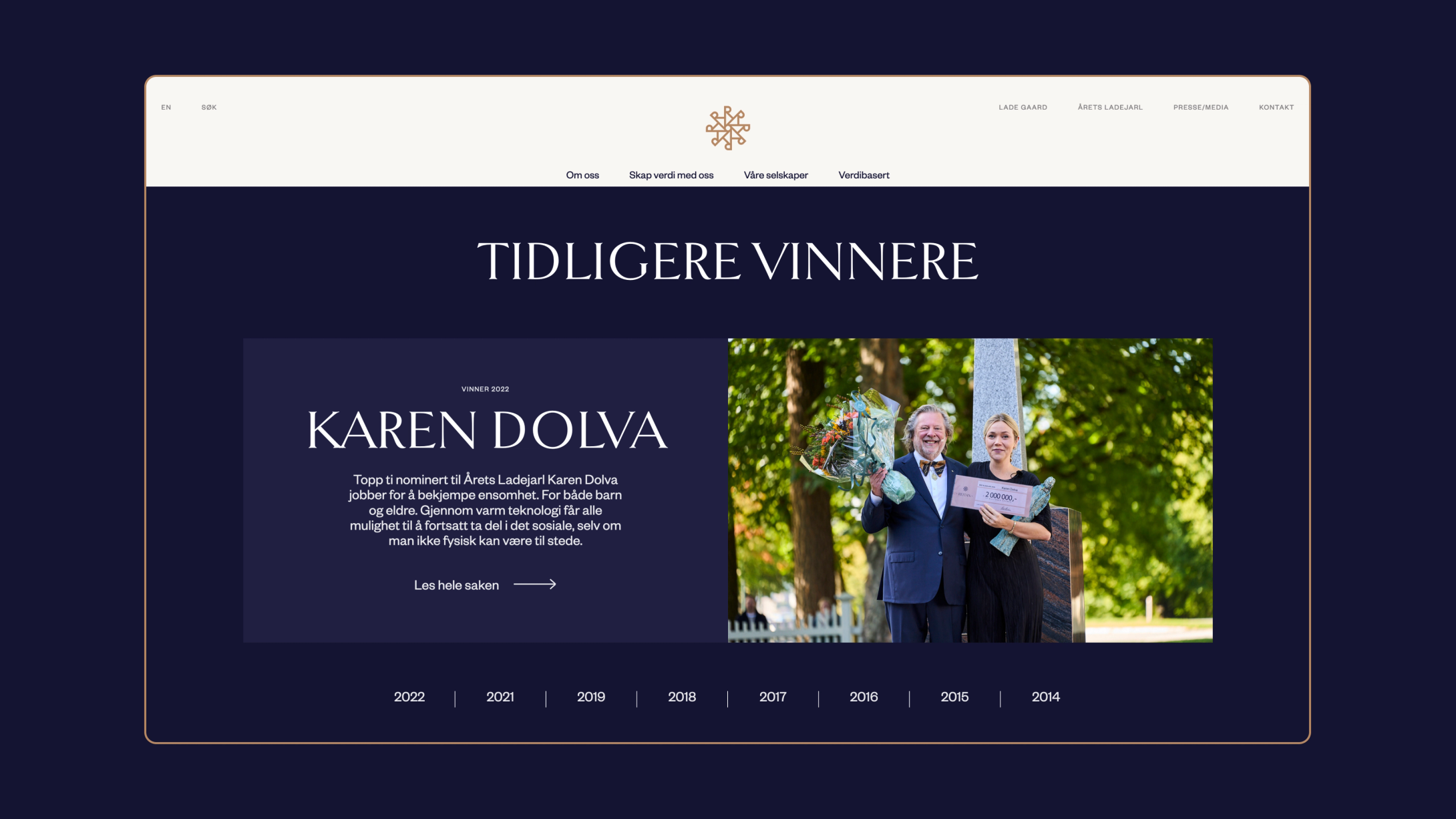
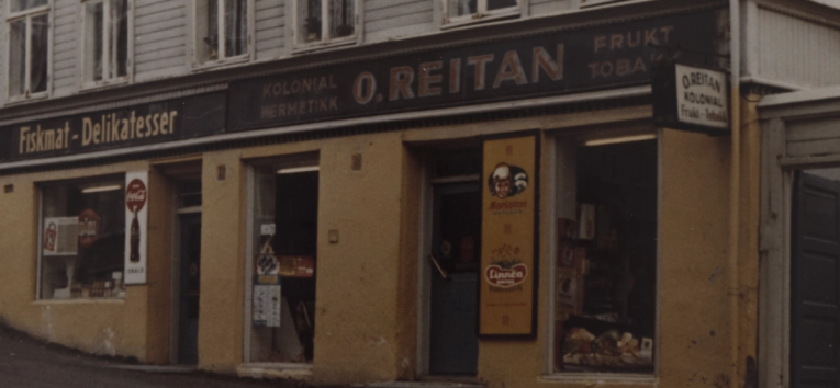
REITAN’s new design platform, system and website focus on their brand storytelling, redefining Reitan visually as a heritage brand. A brand with a long history and a lot of weight, renewed and ready for the future.