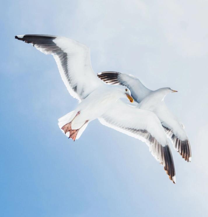
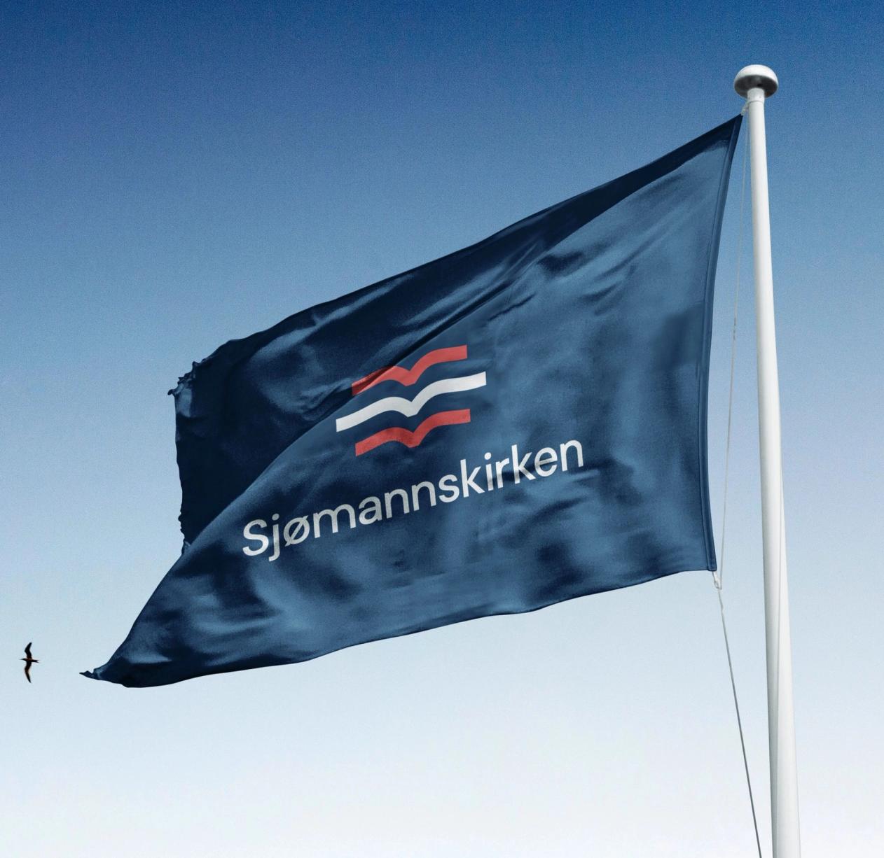
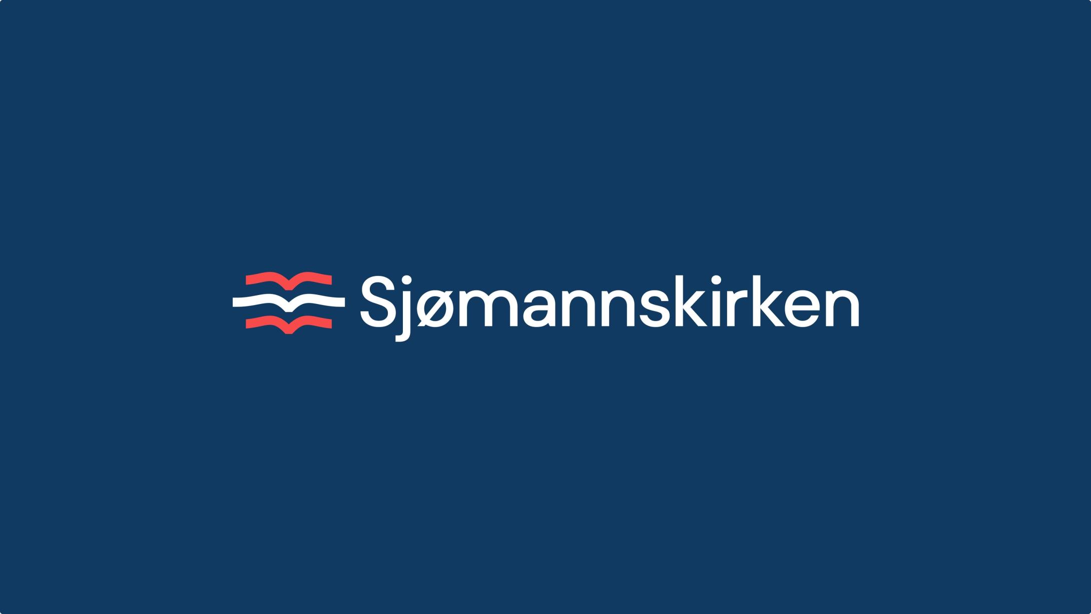
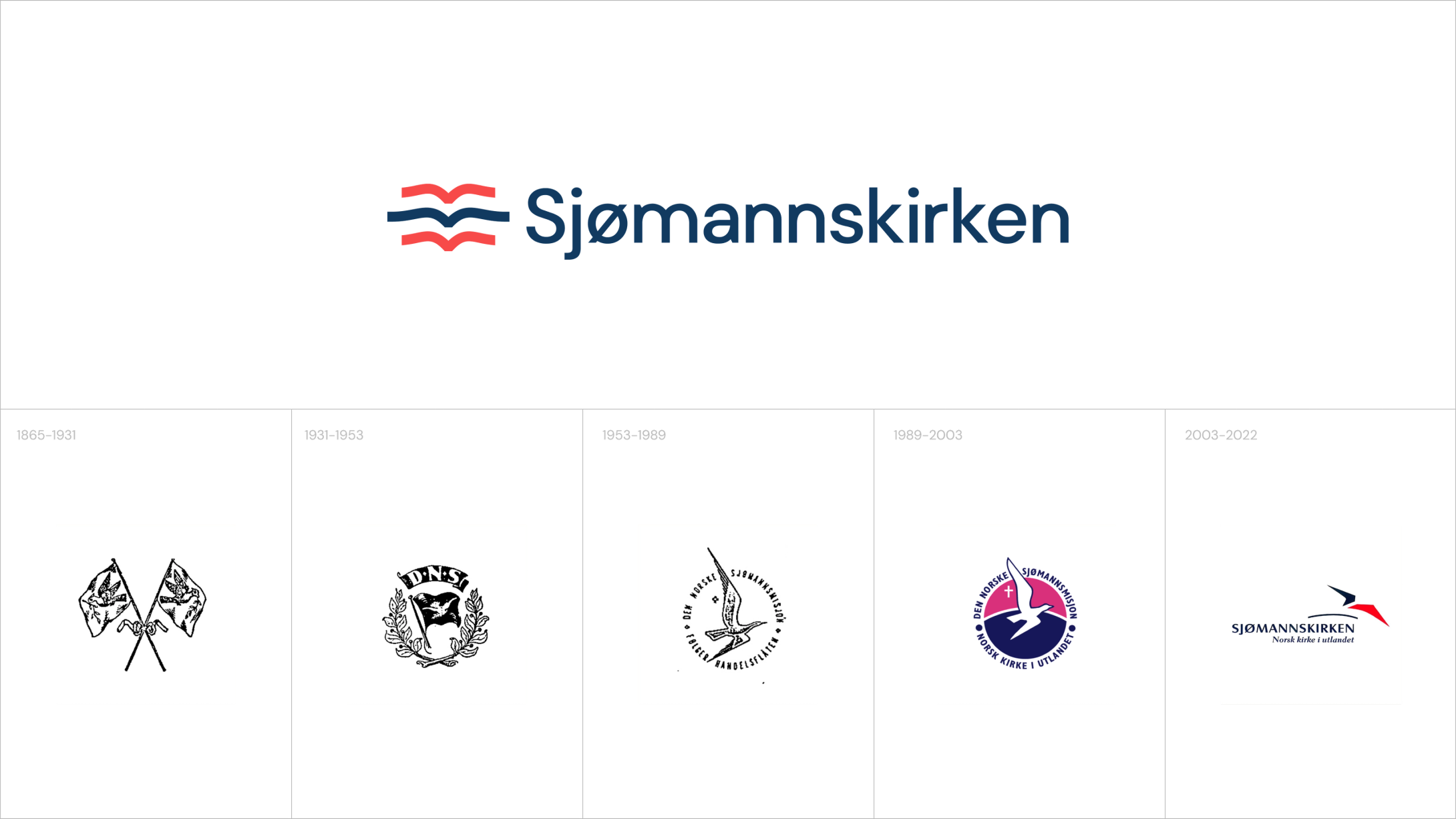
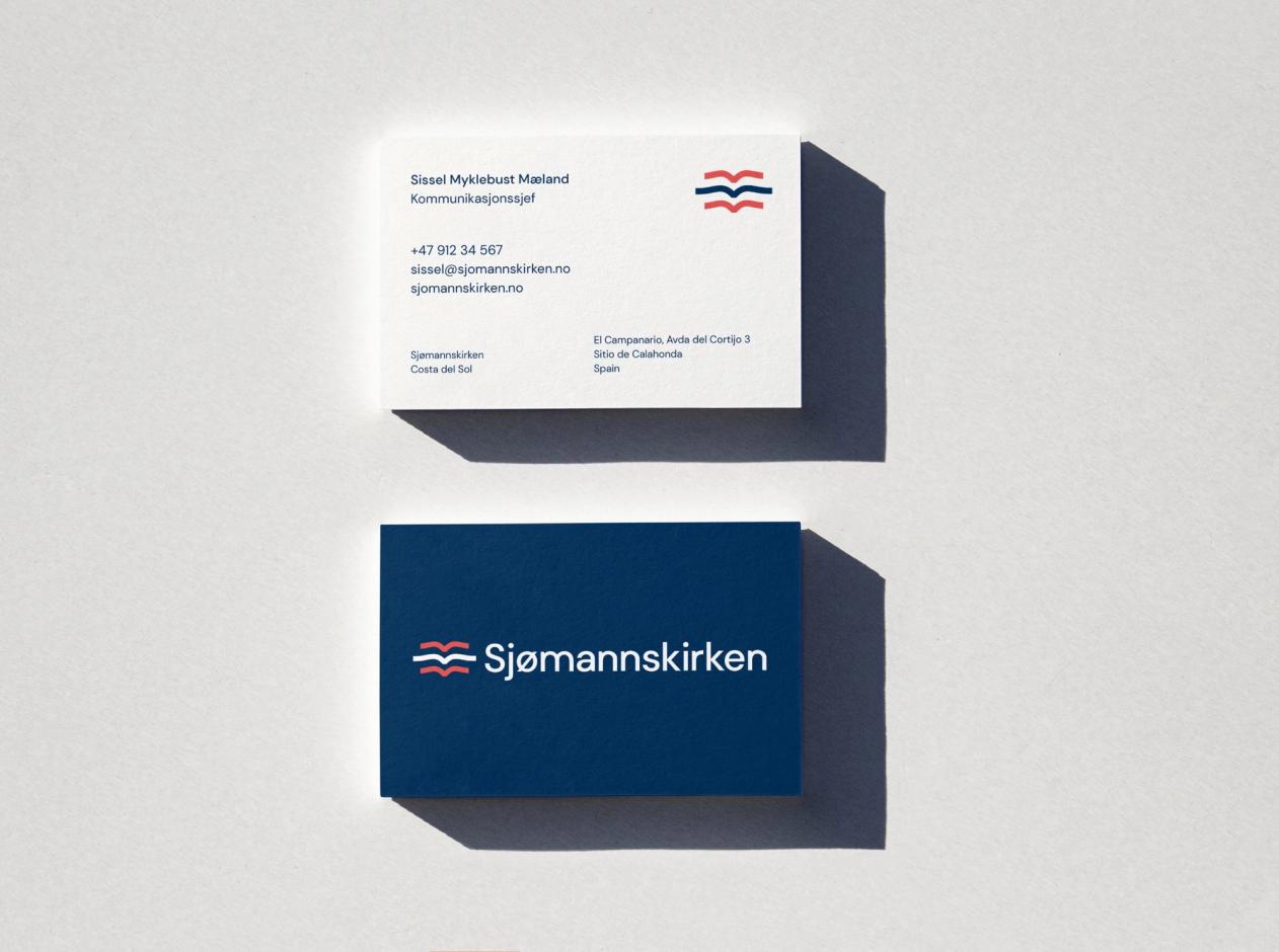
For hundreds of years, the Sjømannskirken logo has been a new version of itself, connected to the symbol of a lone seagull, originally representing a safe harbour for sailors. Our recommendation was to not change it totally, but adding to it, so the one seagull became a flock. Three seagulls together, telling a story of community, being together, and never feeling alone.
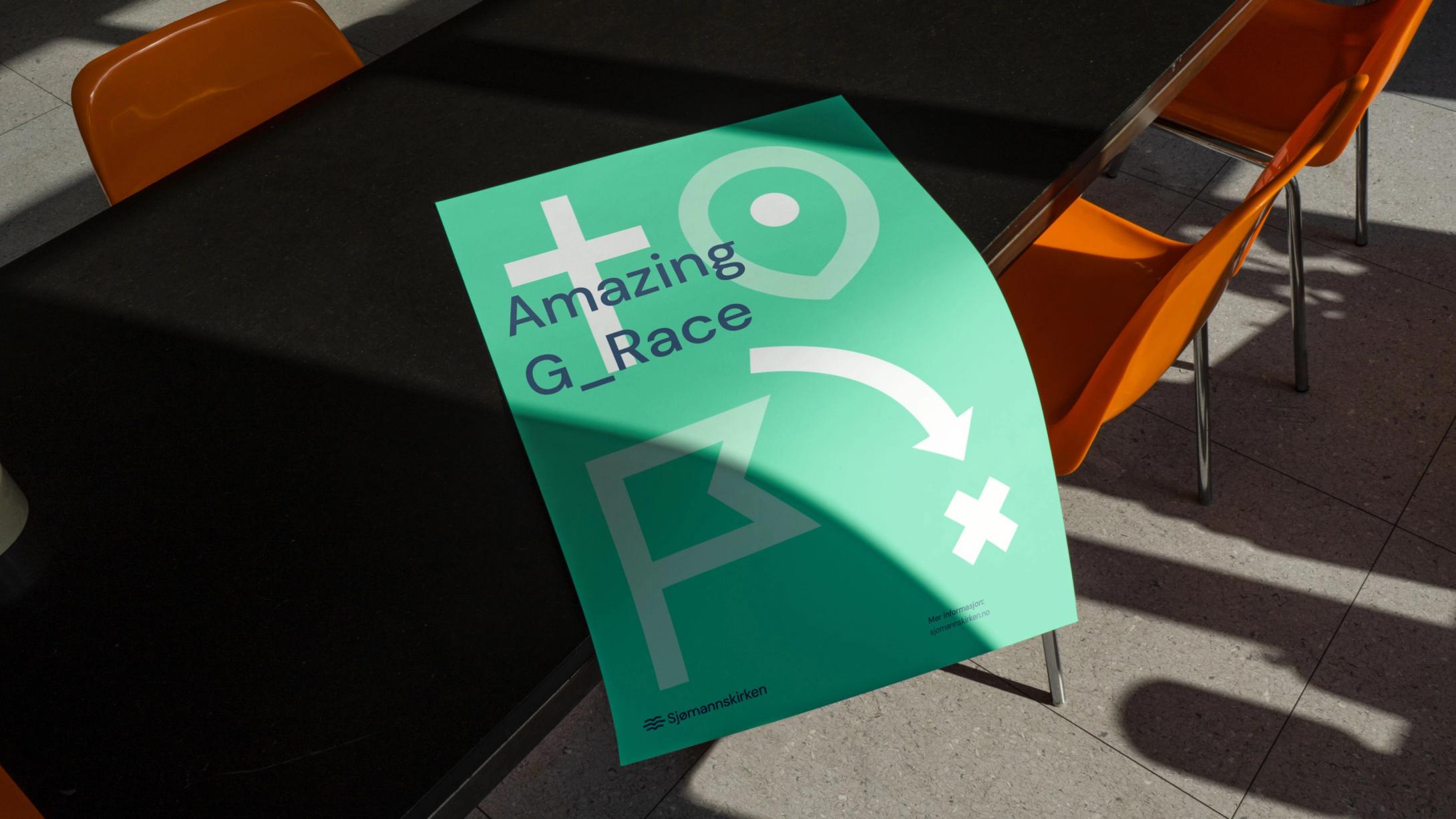
We also developed a visual icon style to differentiate the many aspects of Sjømannskirken, fronting their large number of activities, creating an easy way for the organisation to communicate towards their different target groups.
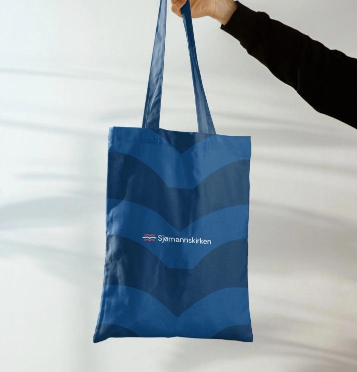
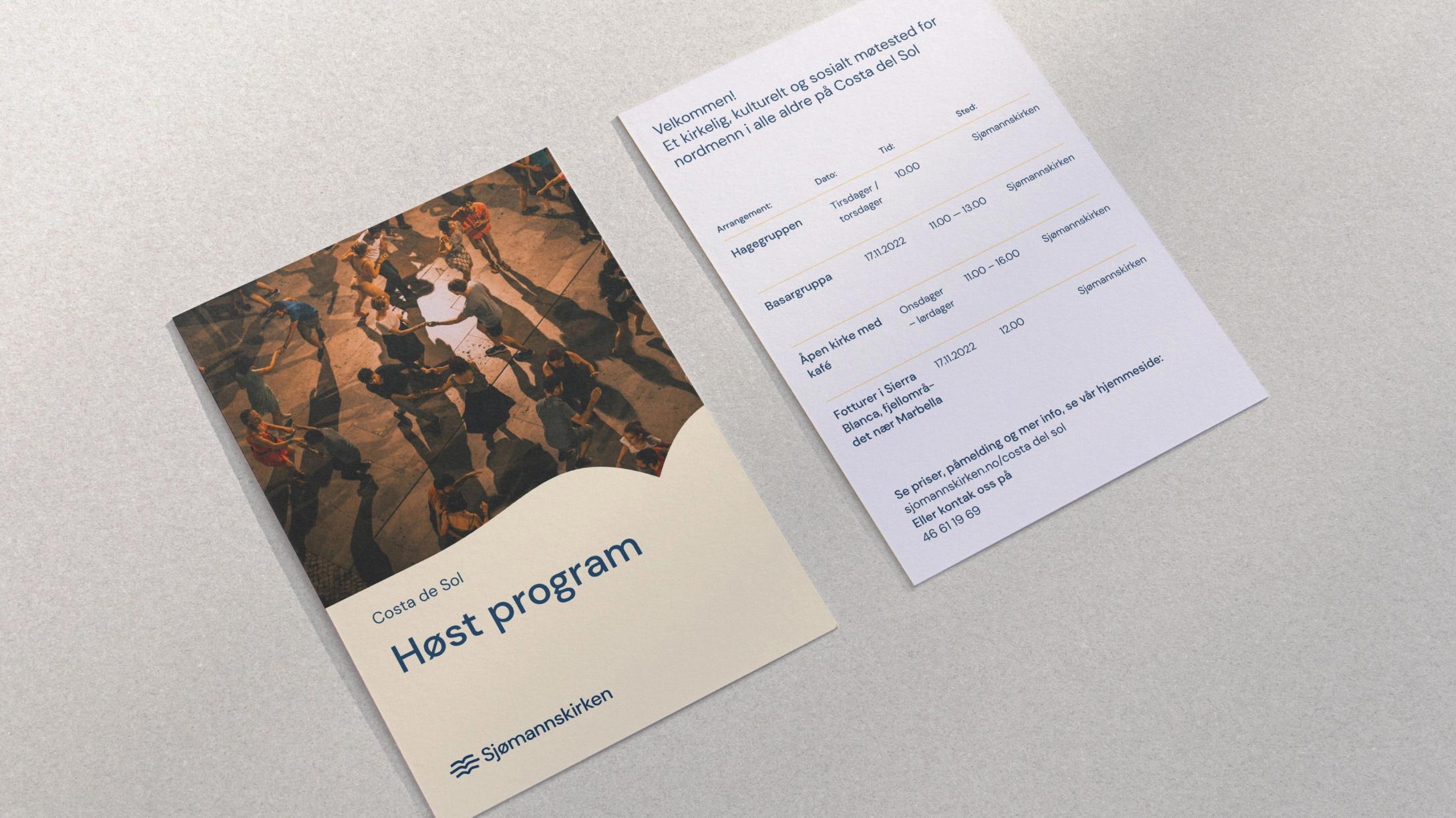
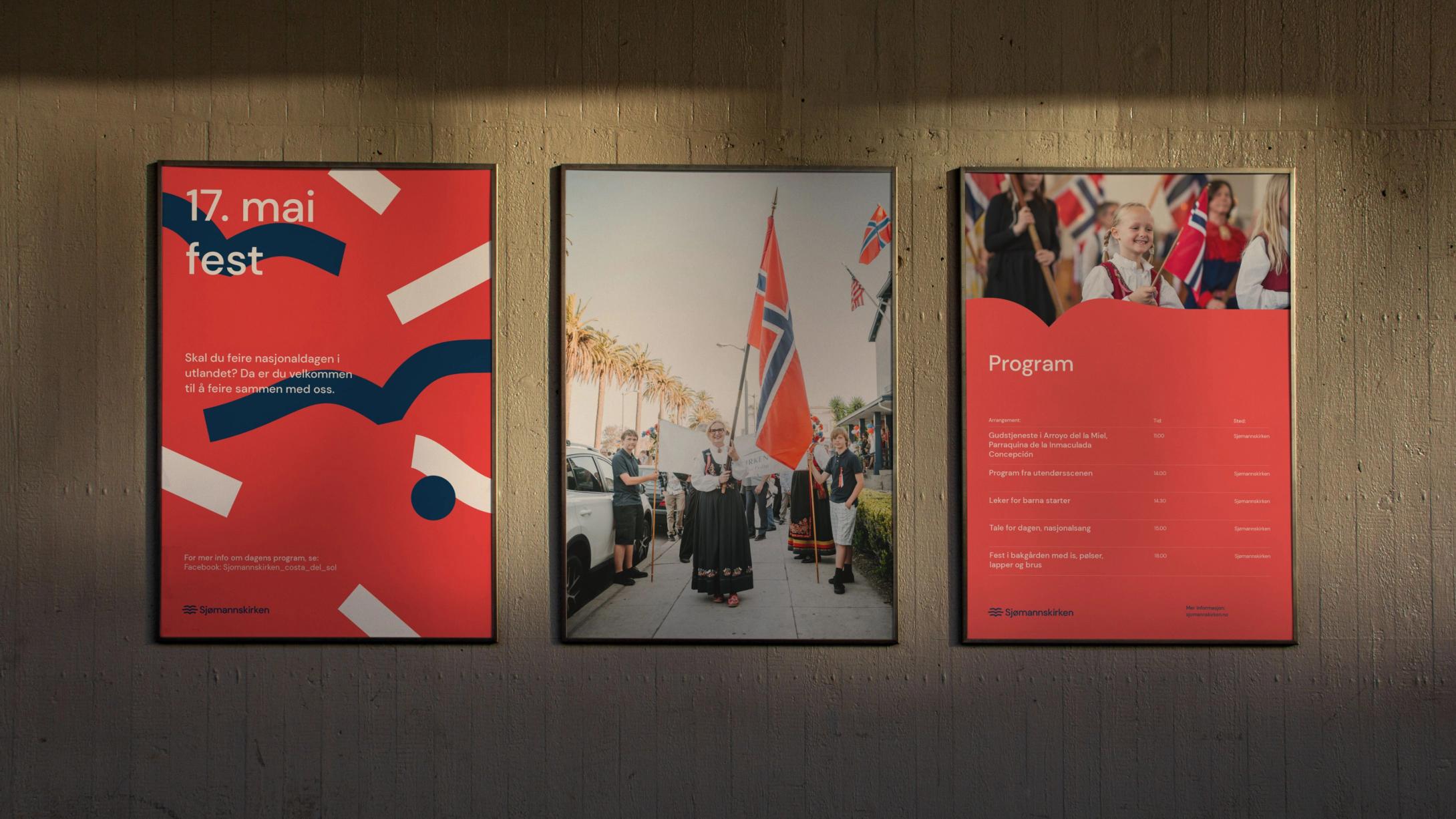
Based on the national Norwegian colours, we created a red, white, and blue colour pallet, maintaining the roots of the organisation around the world. The dark navy is there through the whole brand, representing the colour of the ocean and the sea, connecting all the continents of the world.
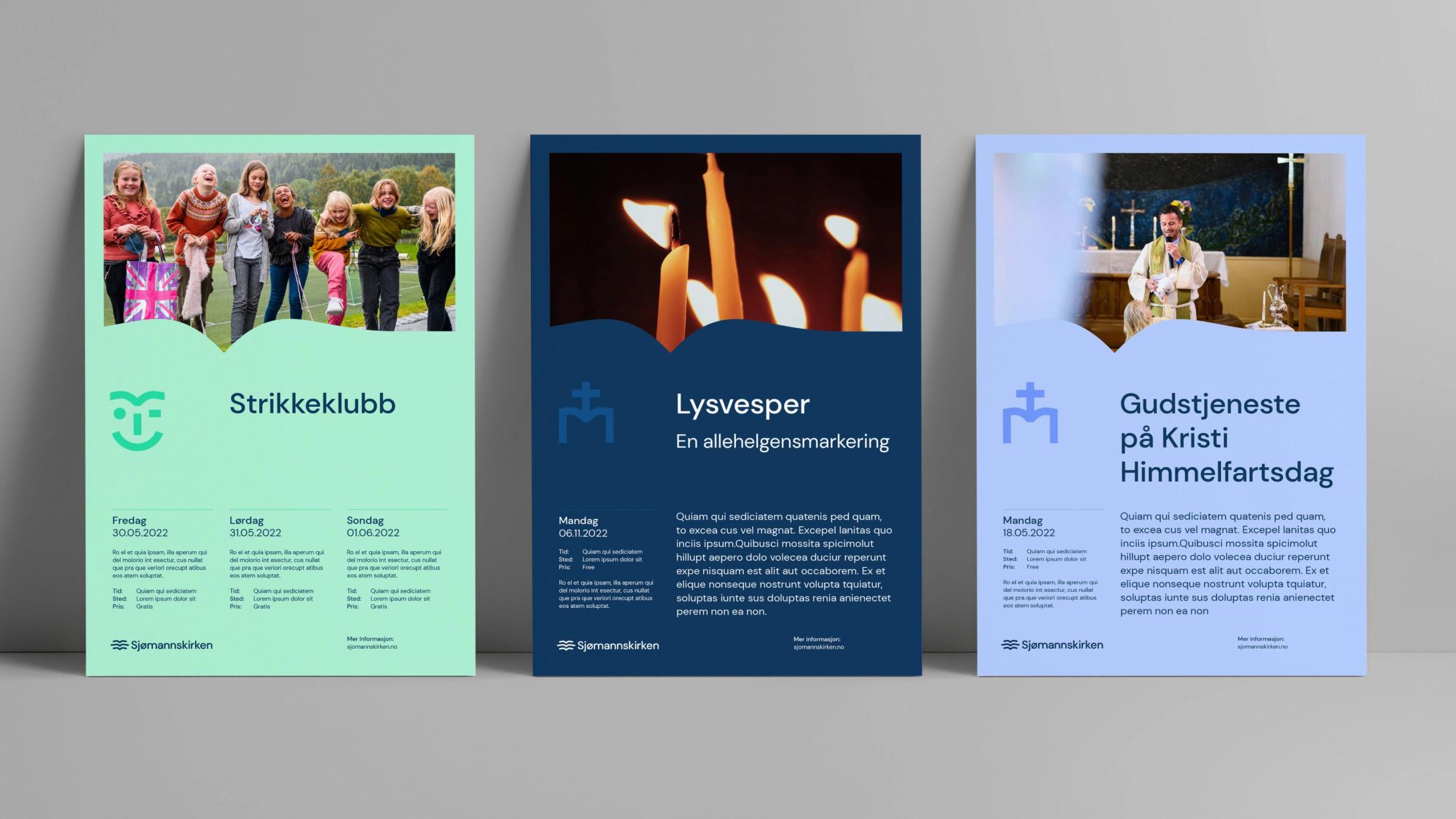
We also introduced a more vibrant and energetic secondary colour palette to work with all the diverse events and locations that Sjømannskirken operates.
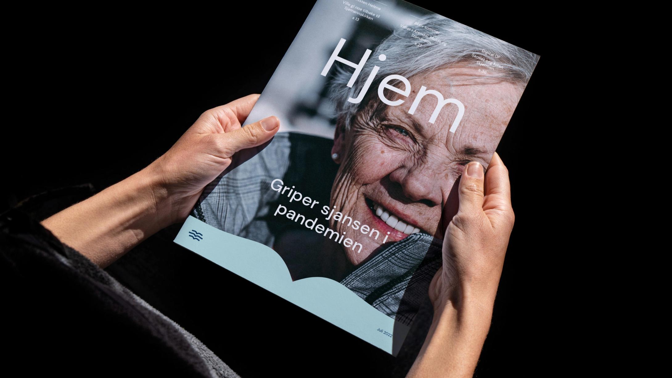
To make the new profile accessible and easy to use, we chose an open source typography, concomitant use of brand graphics, simple layout solutions, and a comprehensive, but easy to use and engaging digital brand manual.