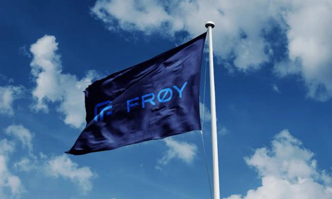
A revitalised identity balancing heritage and progress, reaffirming Frøy’s position as a trusted, forward-looking force in the aquaculture industry.
About the project
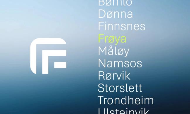
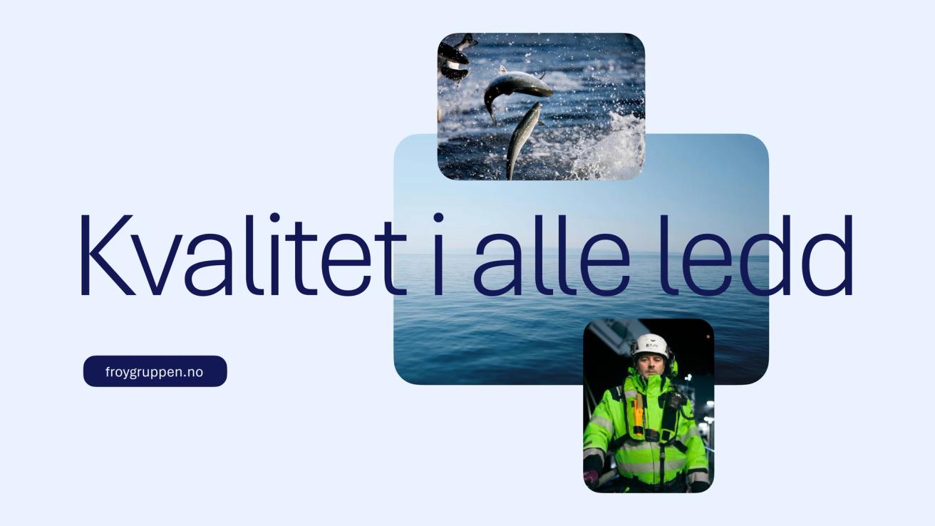
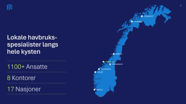
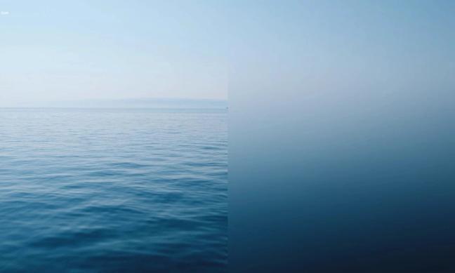
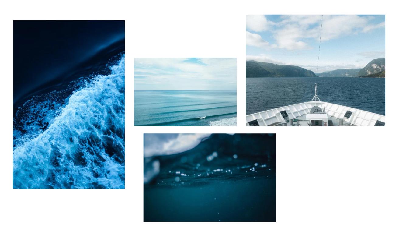
Frøy is a leading provider of integrated services to the aquaculture industry, offering everything from vessel operations to maintenance, logistics, and biological expertise. With a strong presence along the Norwegian coastline, Frøy supports fish farming operations through safe, efficient, and sustainable solutions. As a key player in the blue economy, Frøy helps shape the future of aquaculture.
Frøy is known for its strong local presence, reliability, and commitment to quality. As the company evolves, embracing new technology and growth opportunities, the need arose to modernise its visual identity and strengthen internal unity under one clear, confident brand.
Nonspace was brought in to guide Frøy through a comprehensive brand uplift. From strategic insight and design exploration to a refreshed, flexible identity system that preserves recognition while signalling progress.
Frøy faced the challenge of redefining its identity without losing the trust and recognition built over decades. Built on a strong foundation, the existing visual profile had supported Frøy through years of growth, but the feeling was that it no longer fully reflected Frøy’s evolving professionalism, technological development, and future ambitions.
In an industry where many players look alike, Frøy needed a clearer and more distinctive expression to stand out. Internally, the identity was perceived as limiting rather than inspiring. At the same time, a complete logo replacement would be both costly and impractical, as the mark is present across vessels, signage, and equipment.
The challenge was to evolve, not erase, to create an identity that could stand out, modernise, and unite, while preserving the heritage and recognition that make Frøy a trusted name in the industry.
Through workshops, brand audit, interviews, and visual exploration, we identified the core elements that define Frøy’s DNA.
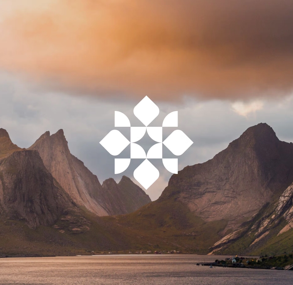
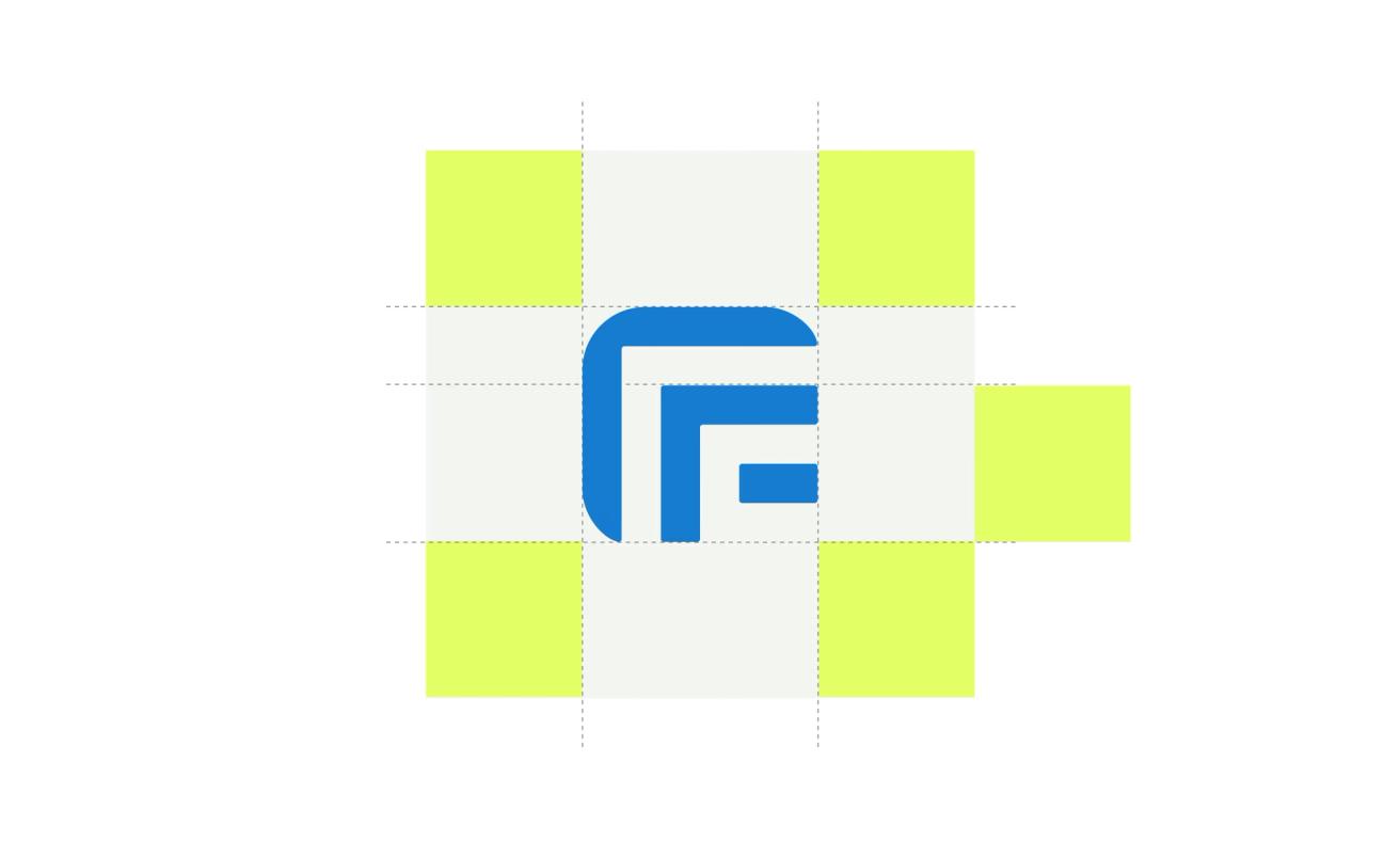
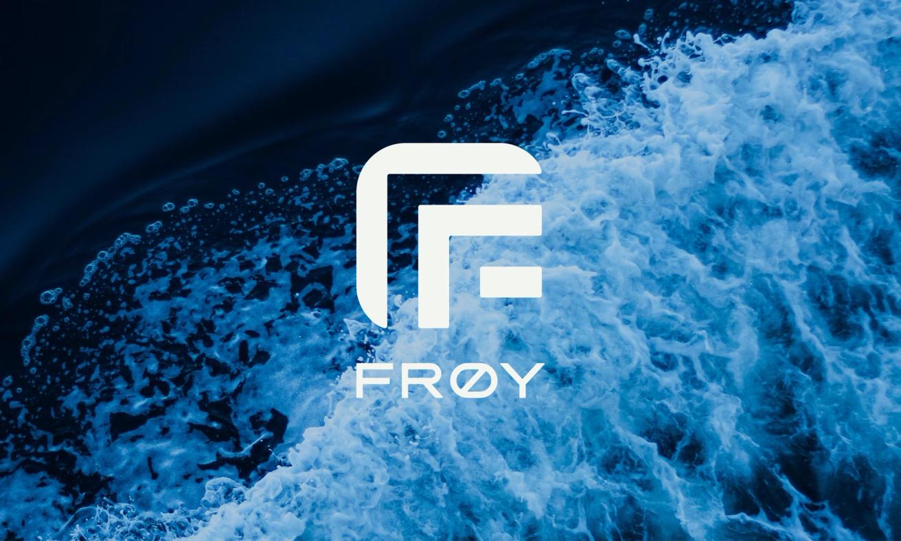
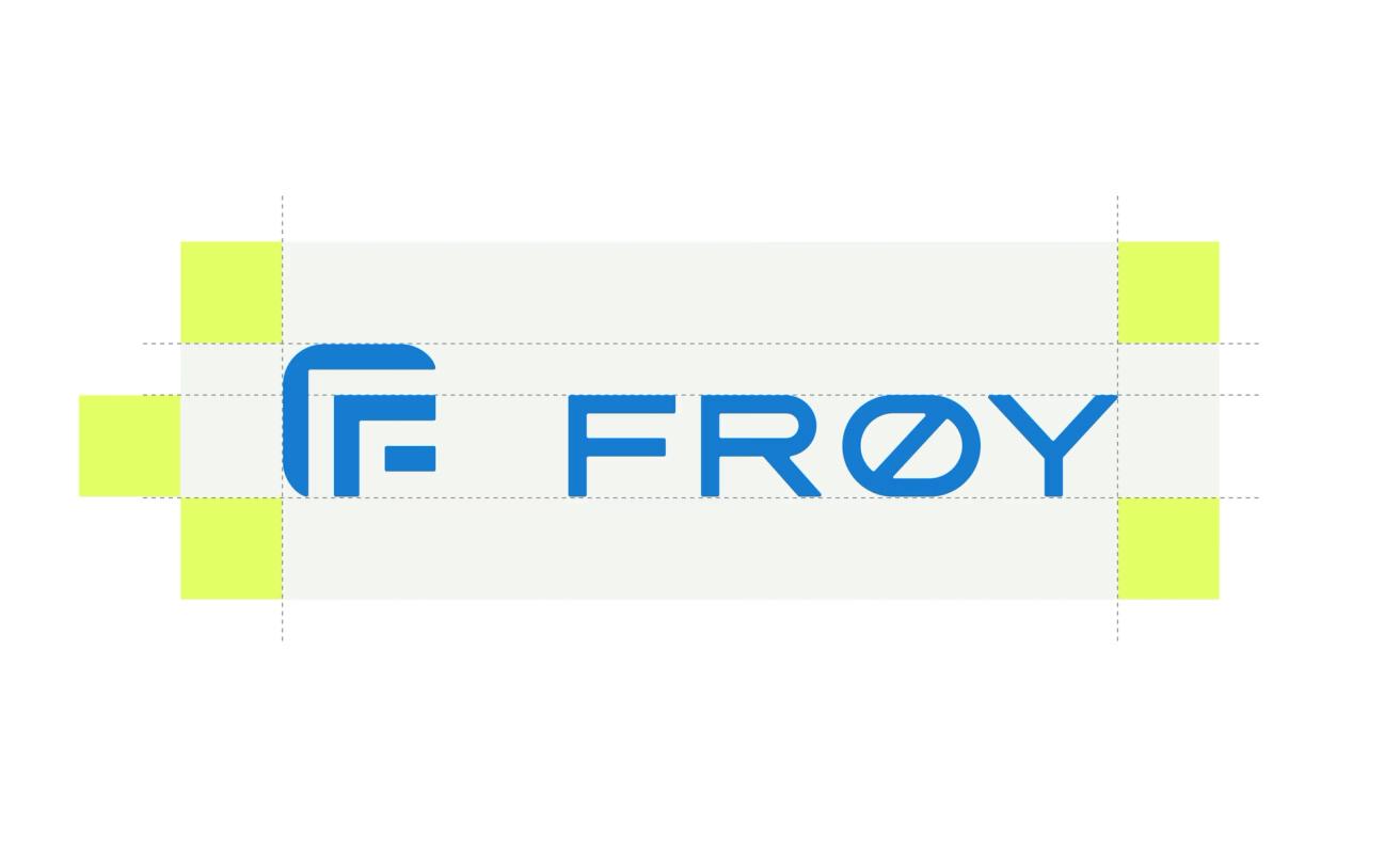
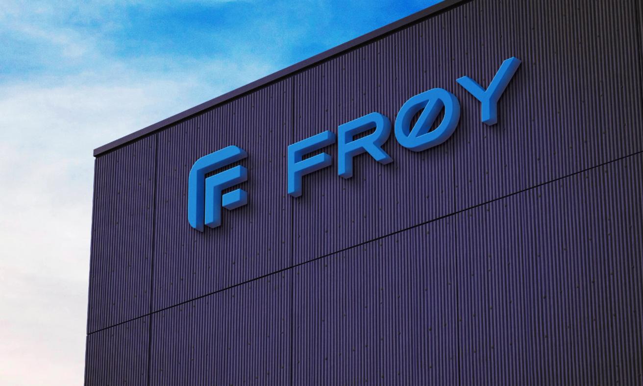
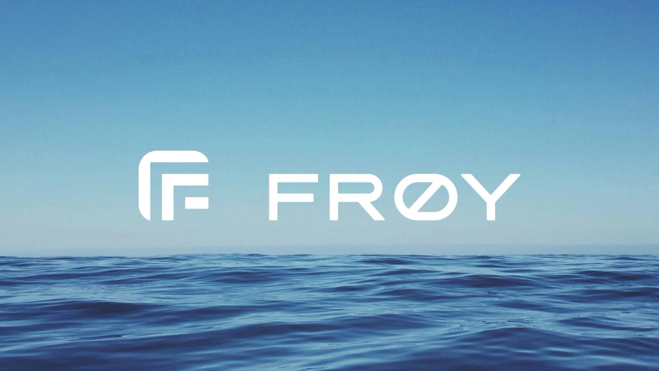
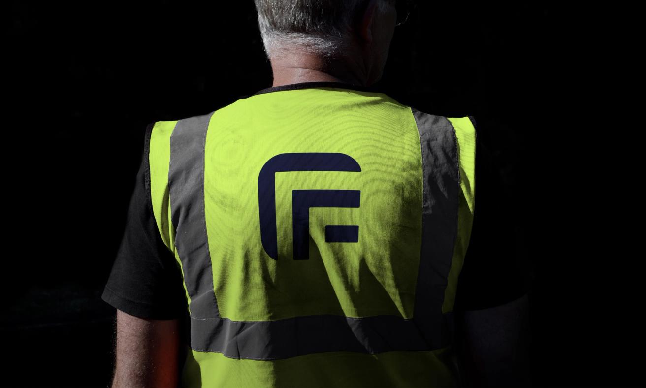
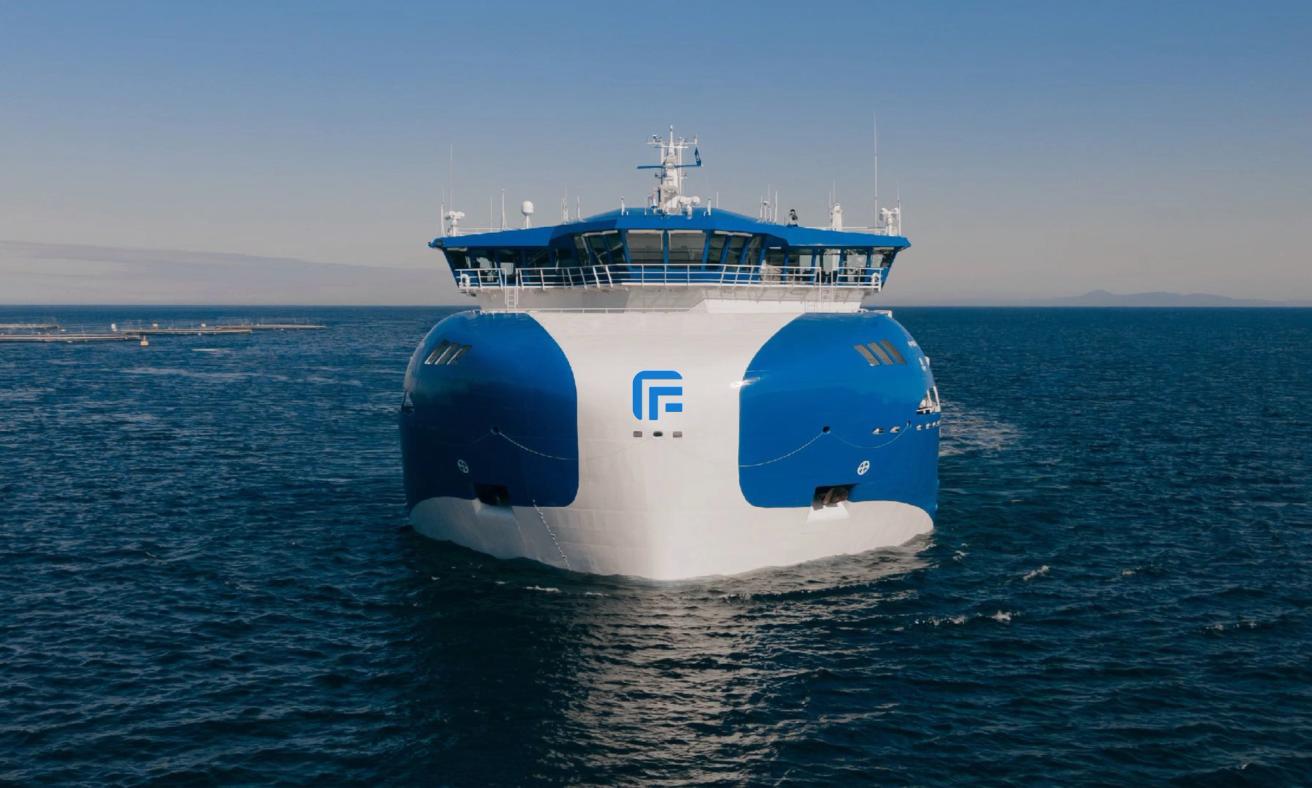
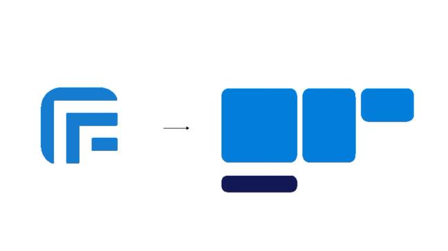
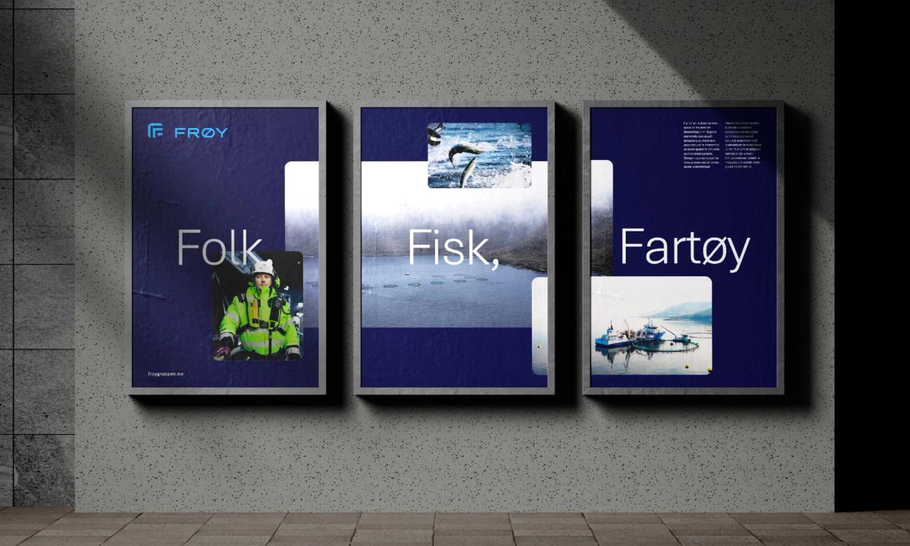
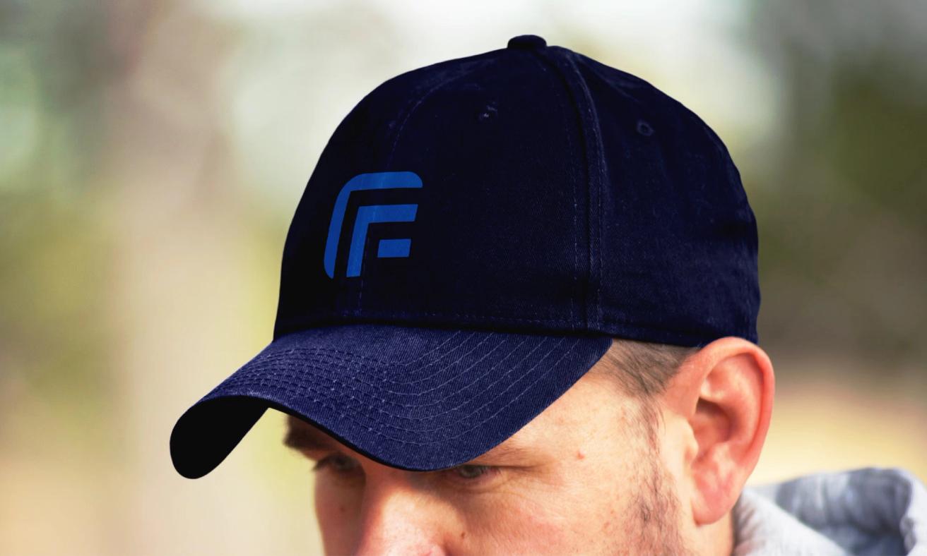
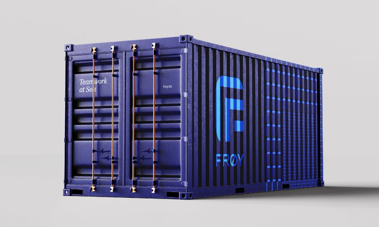
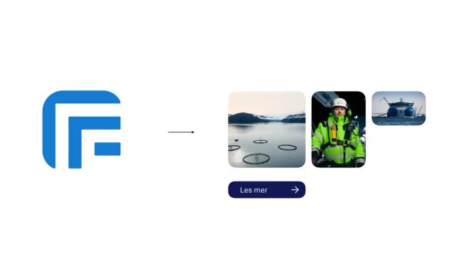
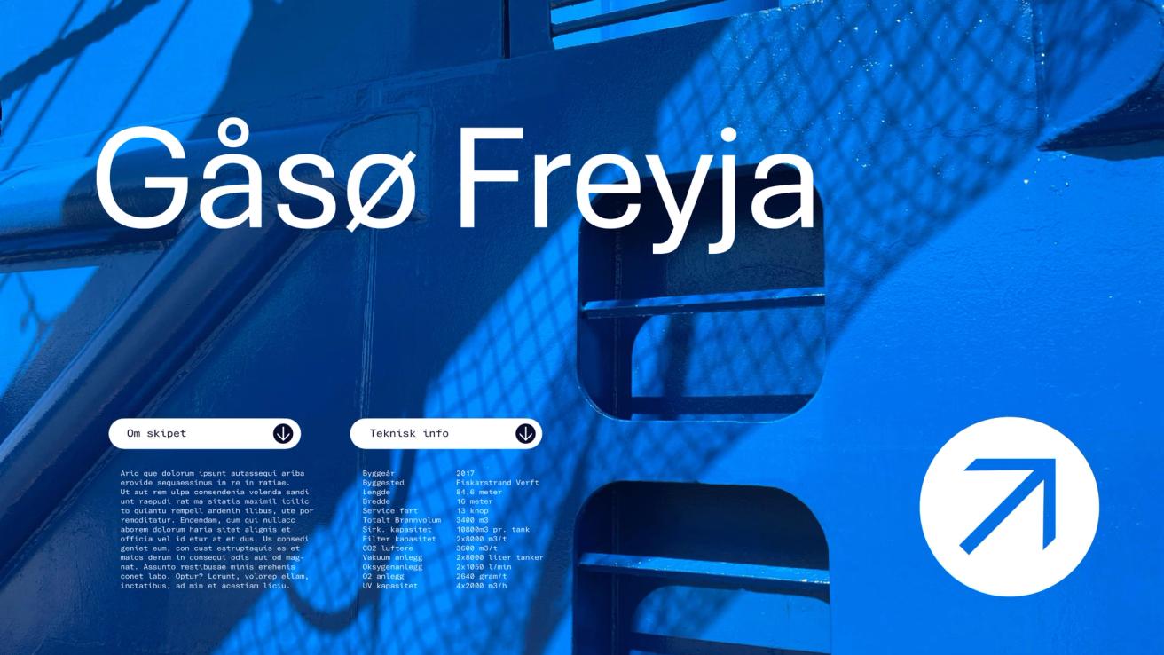
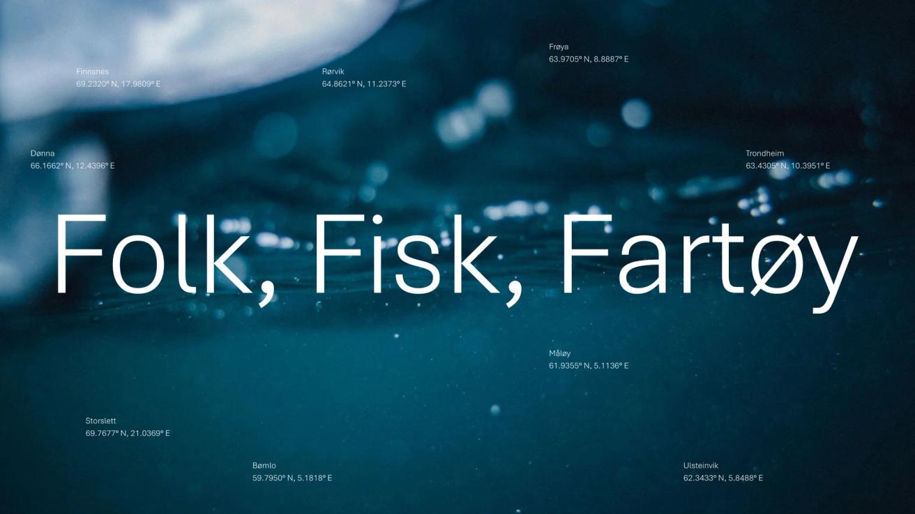
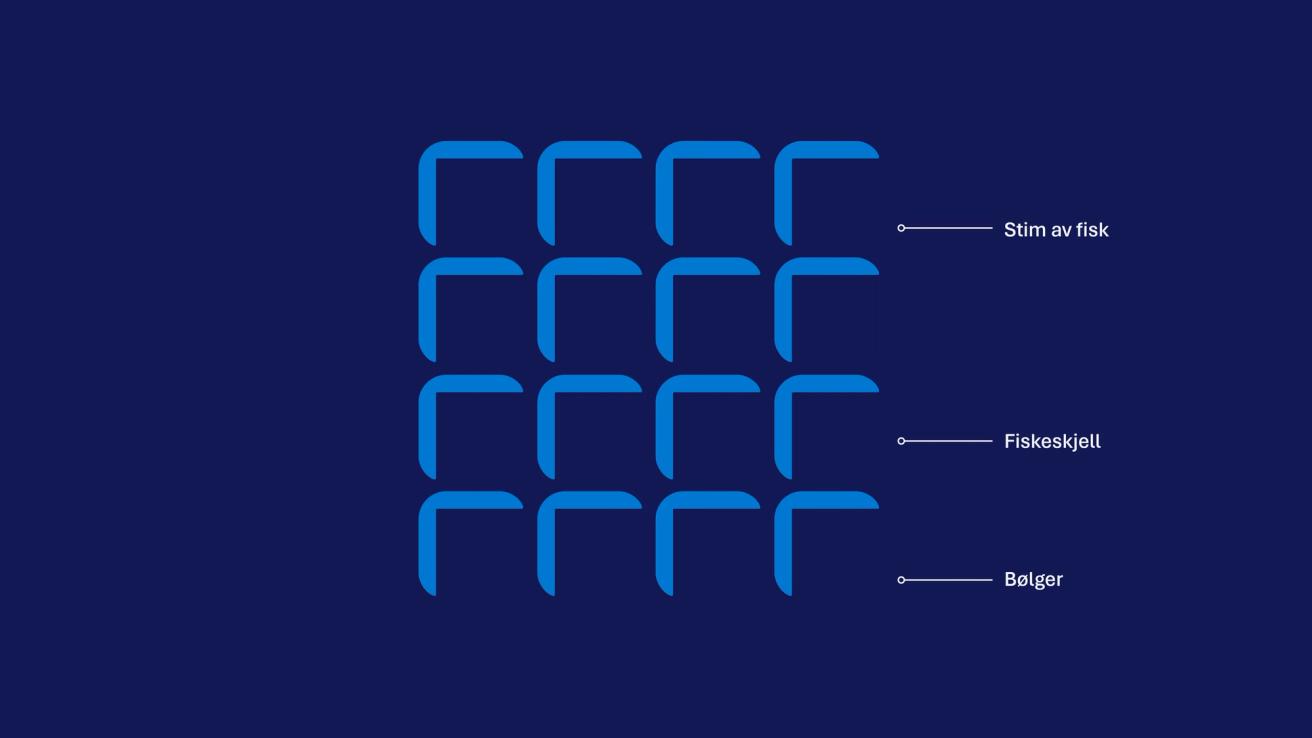
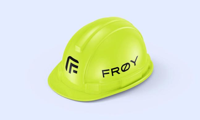
At the centre of the new identity lies an updated “F” symbol, refined to retain the recognisable shape while adding meaning and modernity. The new mark subtly incorporates three “F”s, representing Fisk, Folk og Fartøy (Fish, People, and Vessels), and evokes associations with waves, fish scales, and movement at sea. It introduces a positive upward dynamic that reflects growth and progress, while remaining familiar enough for a smooth, cost-effective transition.
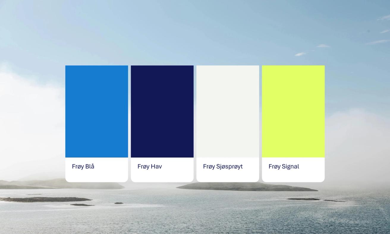
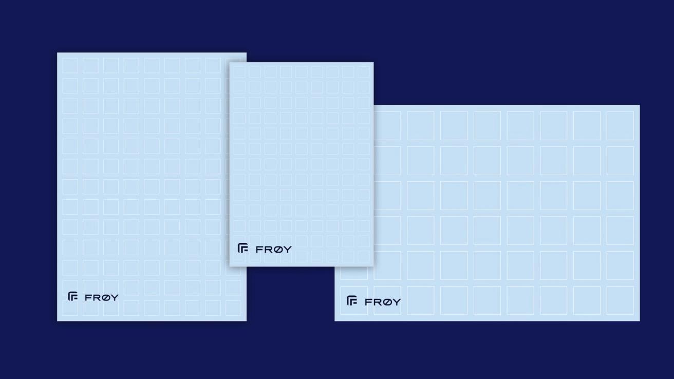
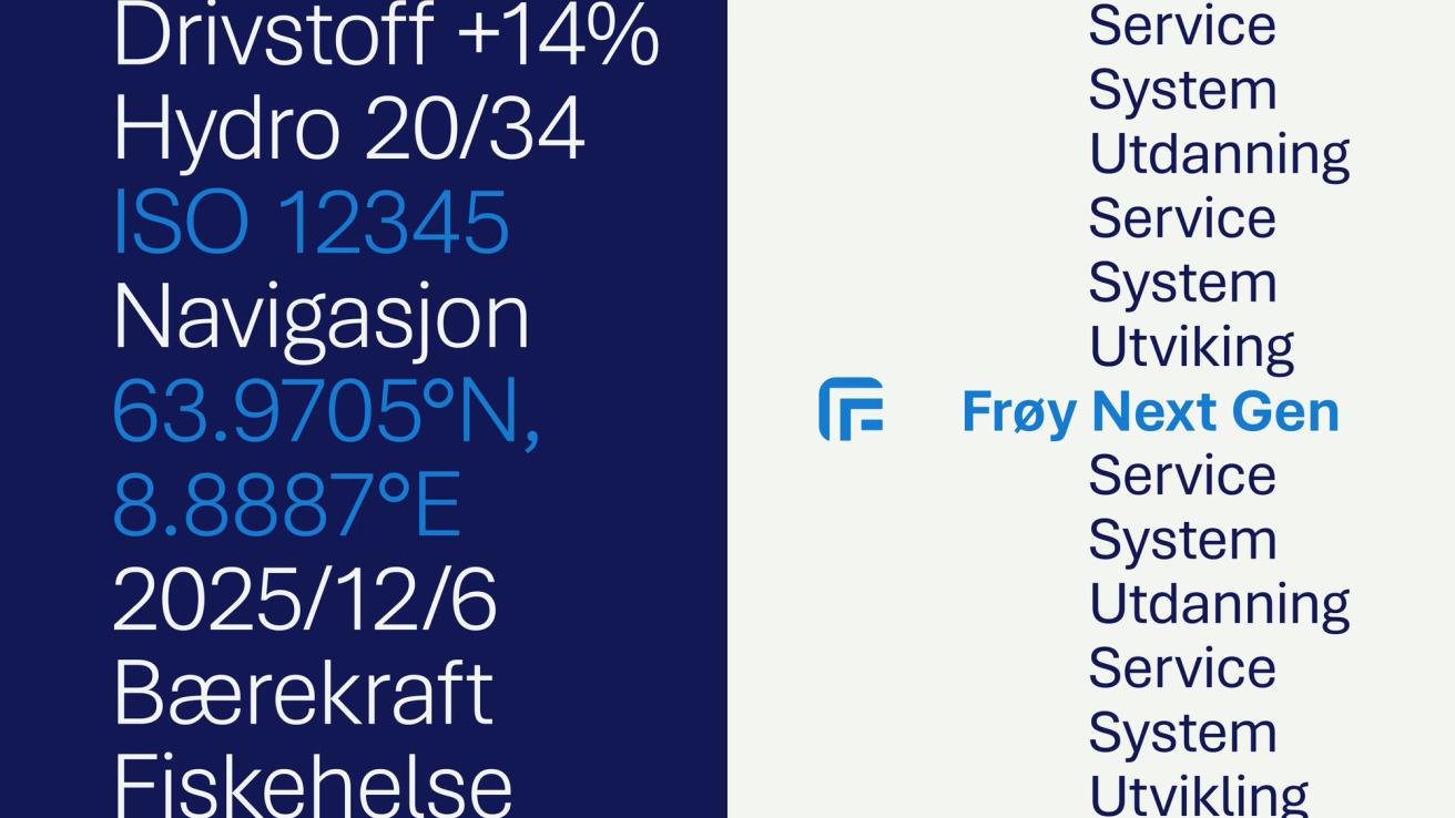
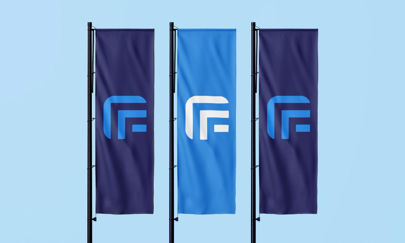
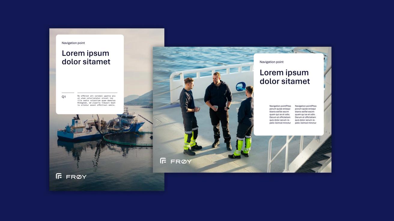
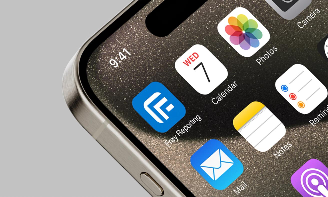
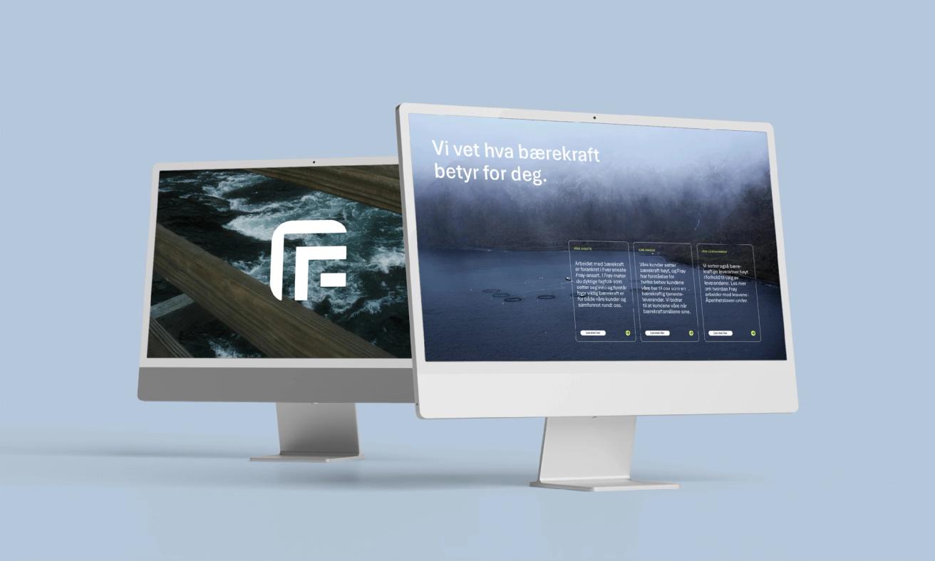
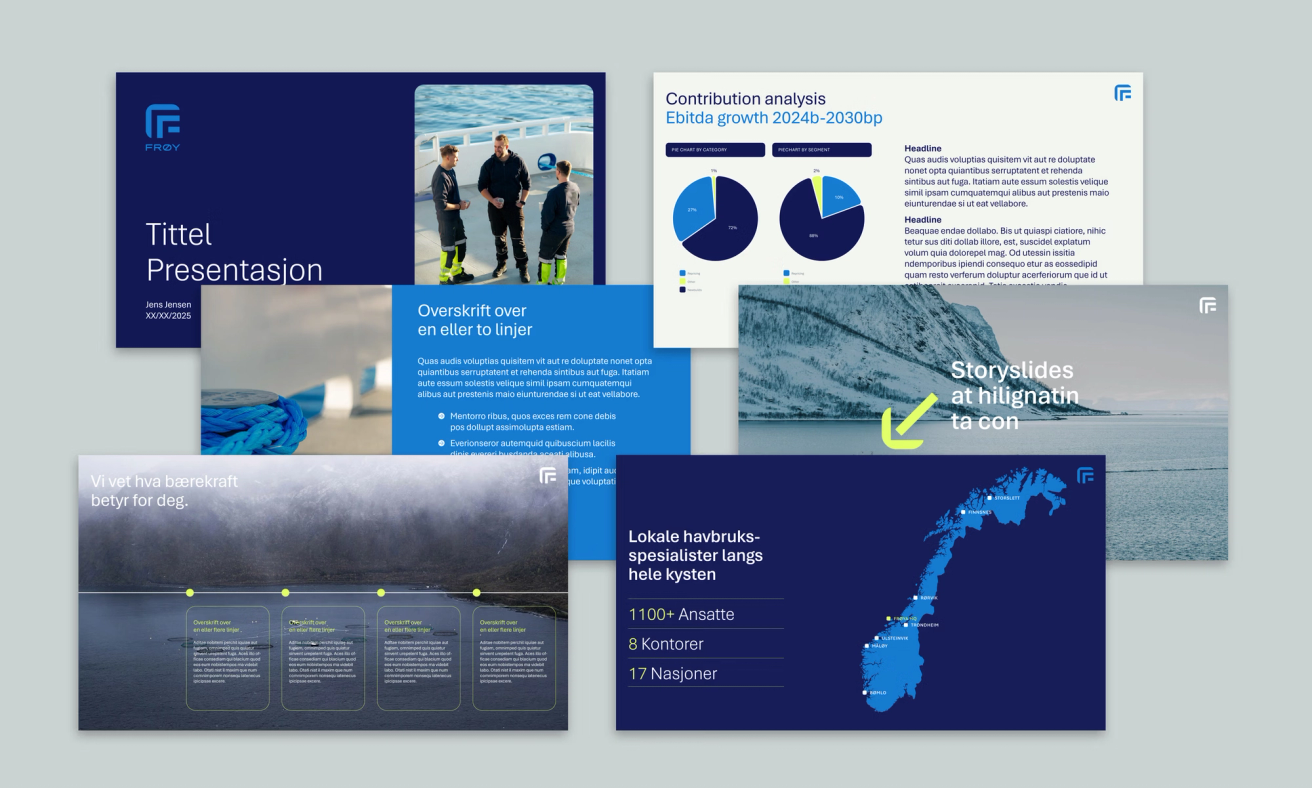
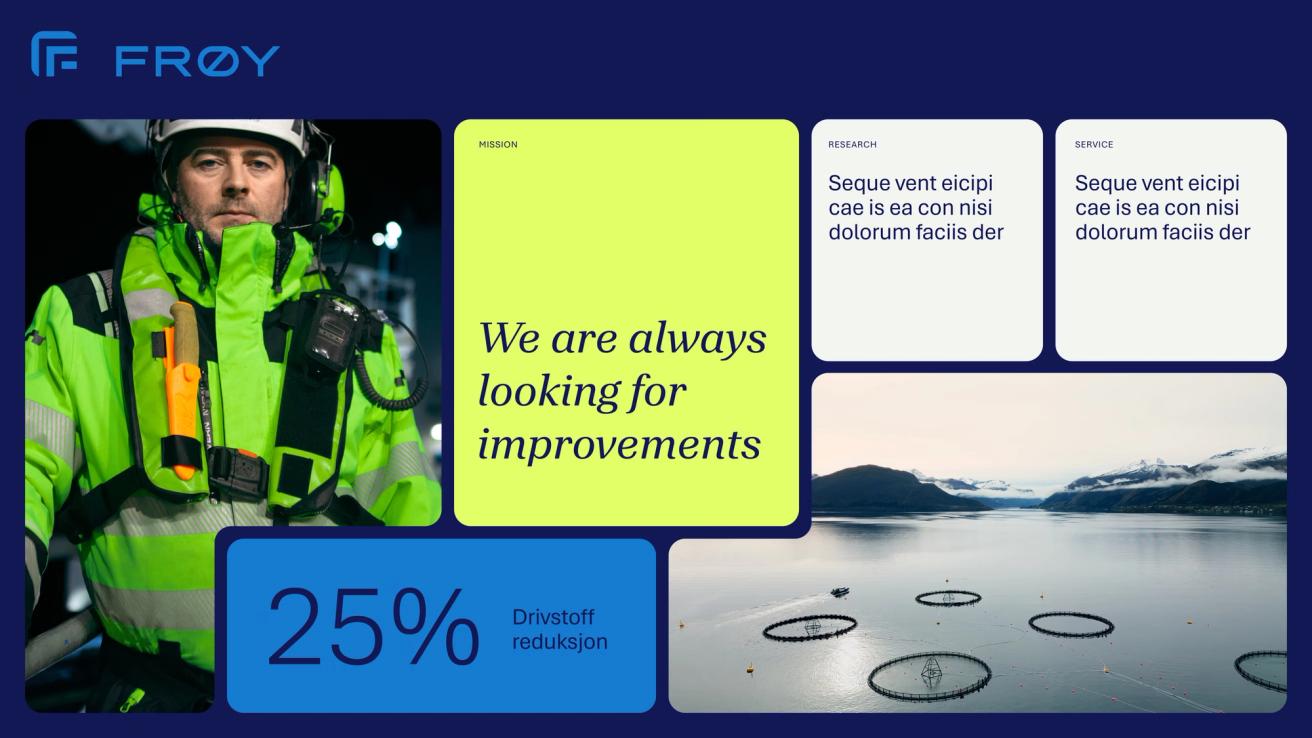
Building on this foundation, we developed a complete and flexible identity system, including a refreshed colour palette, updated graphic elements, and a set of design principles that ensure consistency across all touchpoints. Iconography and layout principles were designed to work seamlessly across digital and physical formats.
Together, these elements form a unified brand system: Modern, distinctive, and scalable, designed to evolve alongside the company and support its ambitions for the future.
The new identity gives Frøy a renewed sense of clarity as a modern, confident brand.
By strengthening its visual distinctiveness while preserving familiarity, Frøy now stands out in a competitive maritime landscape without losing its heritage. The refreshed design system has made communication more consistent and adaptable across digital and physical channels, empowering teams internally and strengthening recognition externally.
Frøy’s new identity bridges tradition and innovation to reflect who they are today and where they’re heading next.


Relevant cases

Ensuring Production Continuity

For The Pioneers
Always Forward