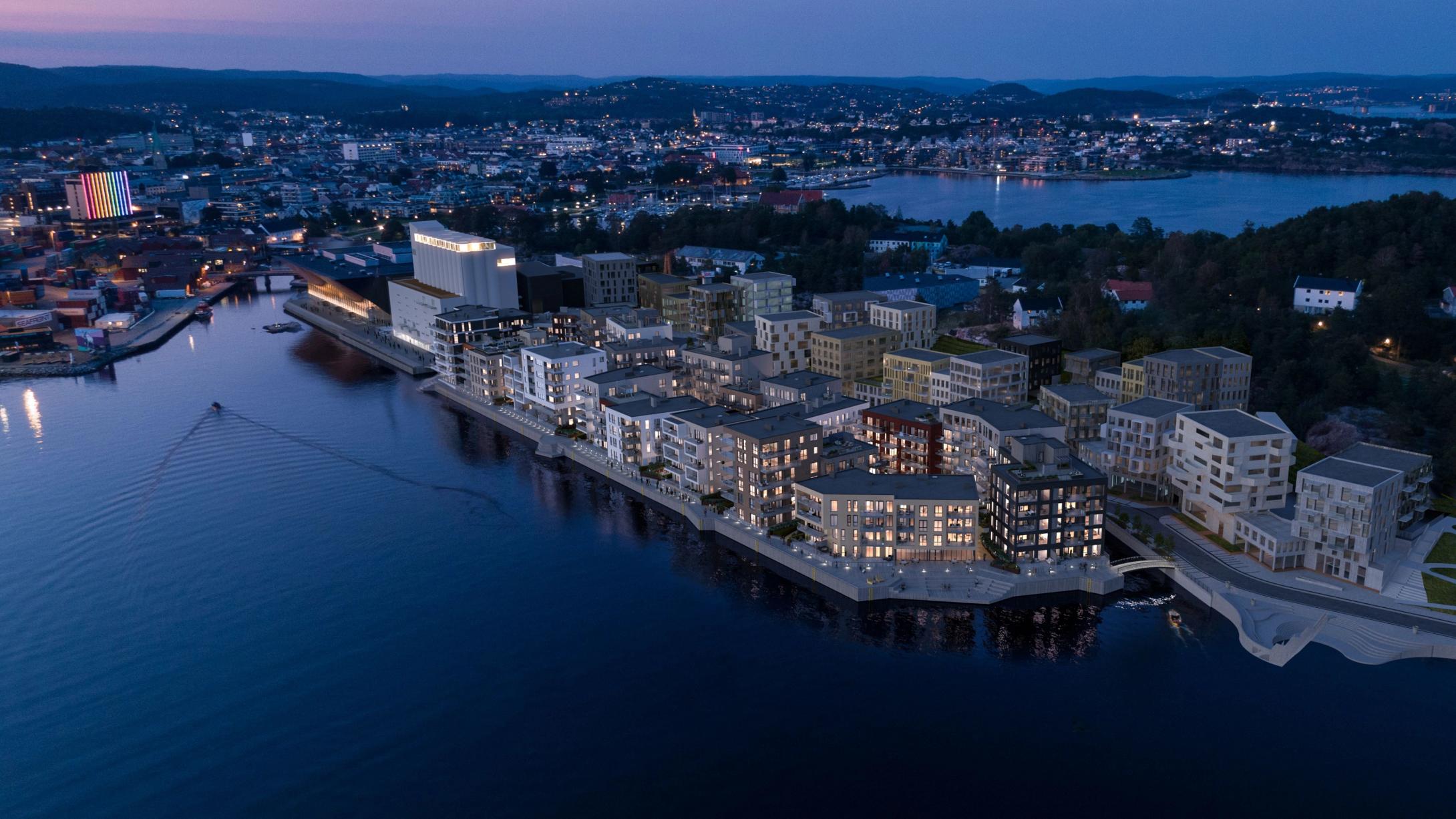
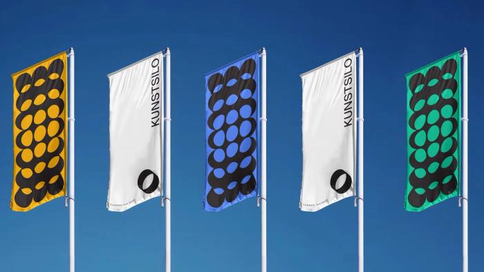
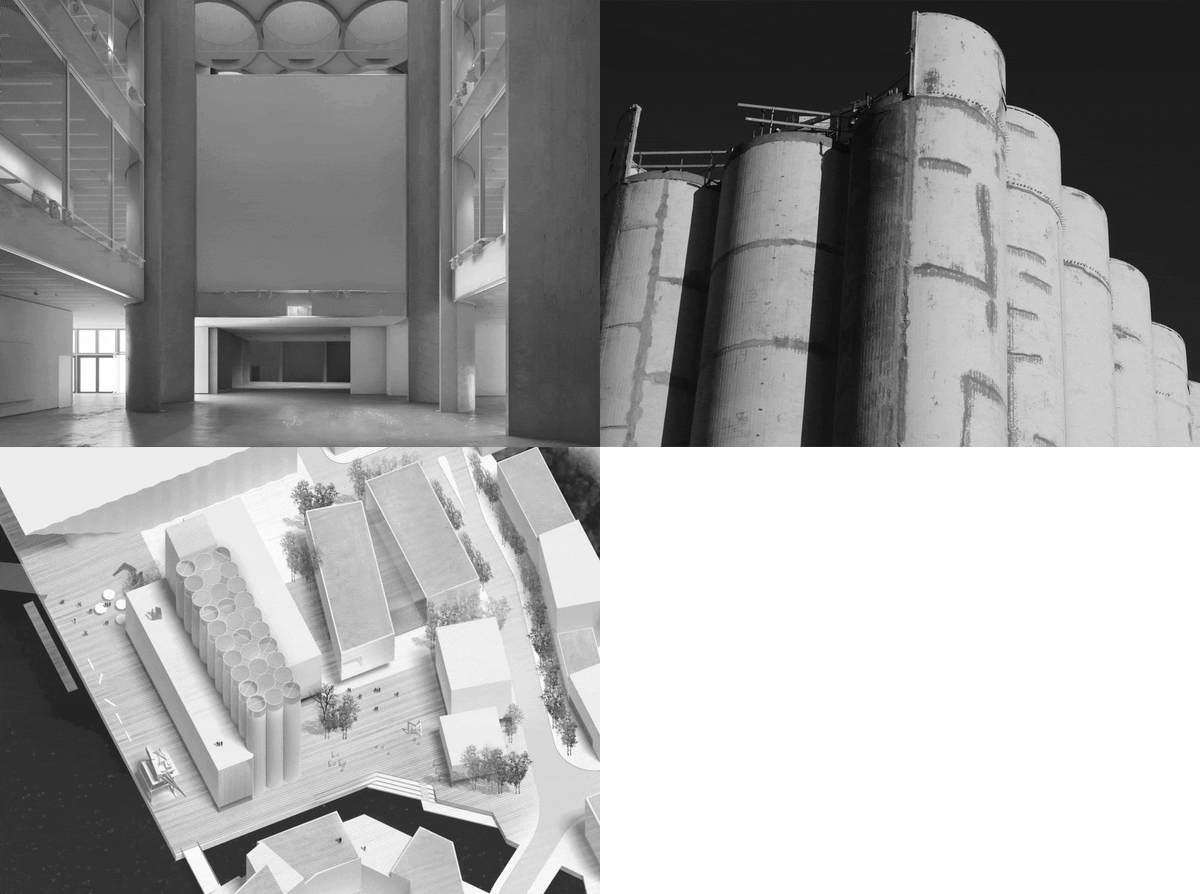
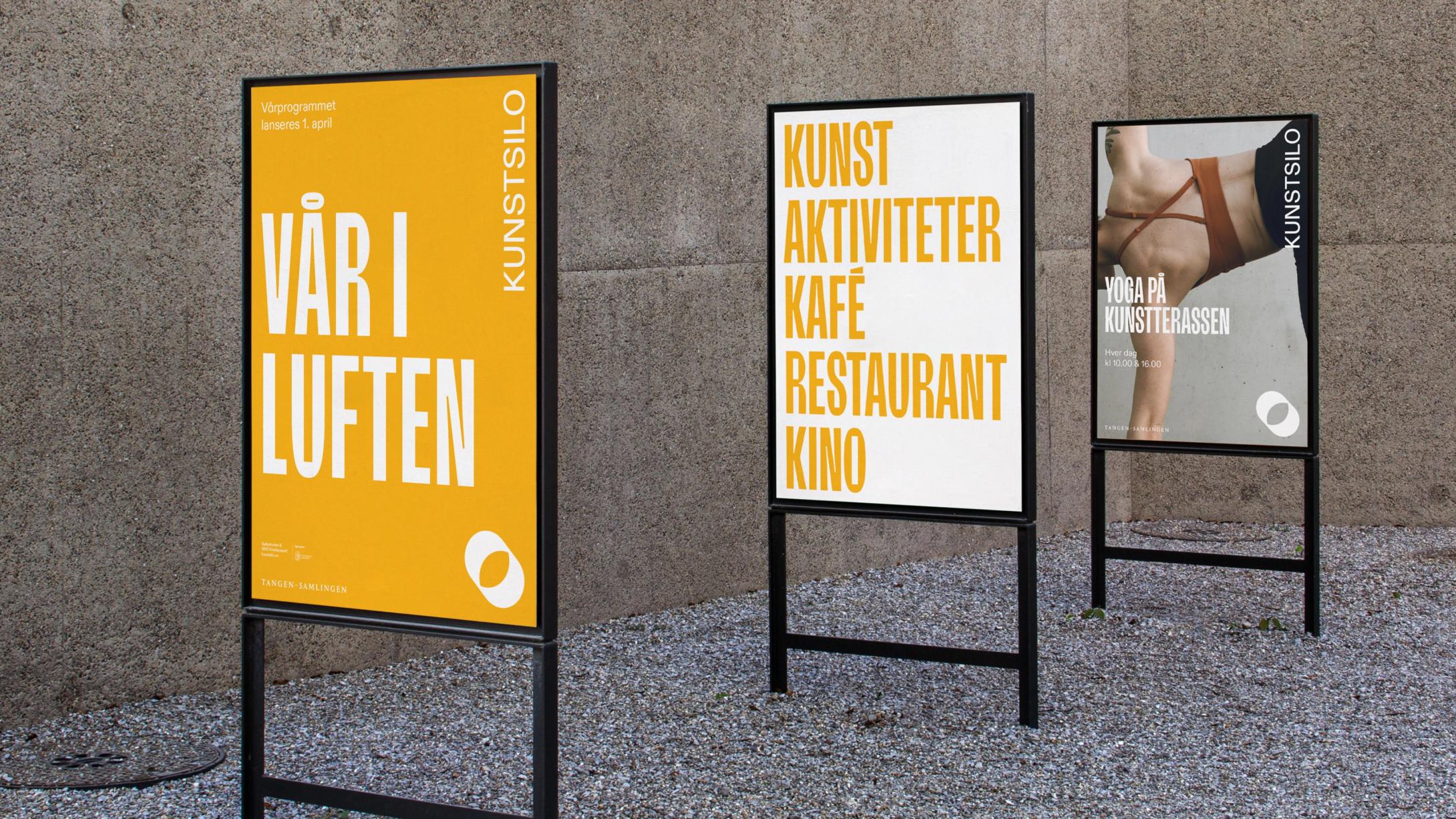
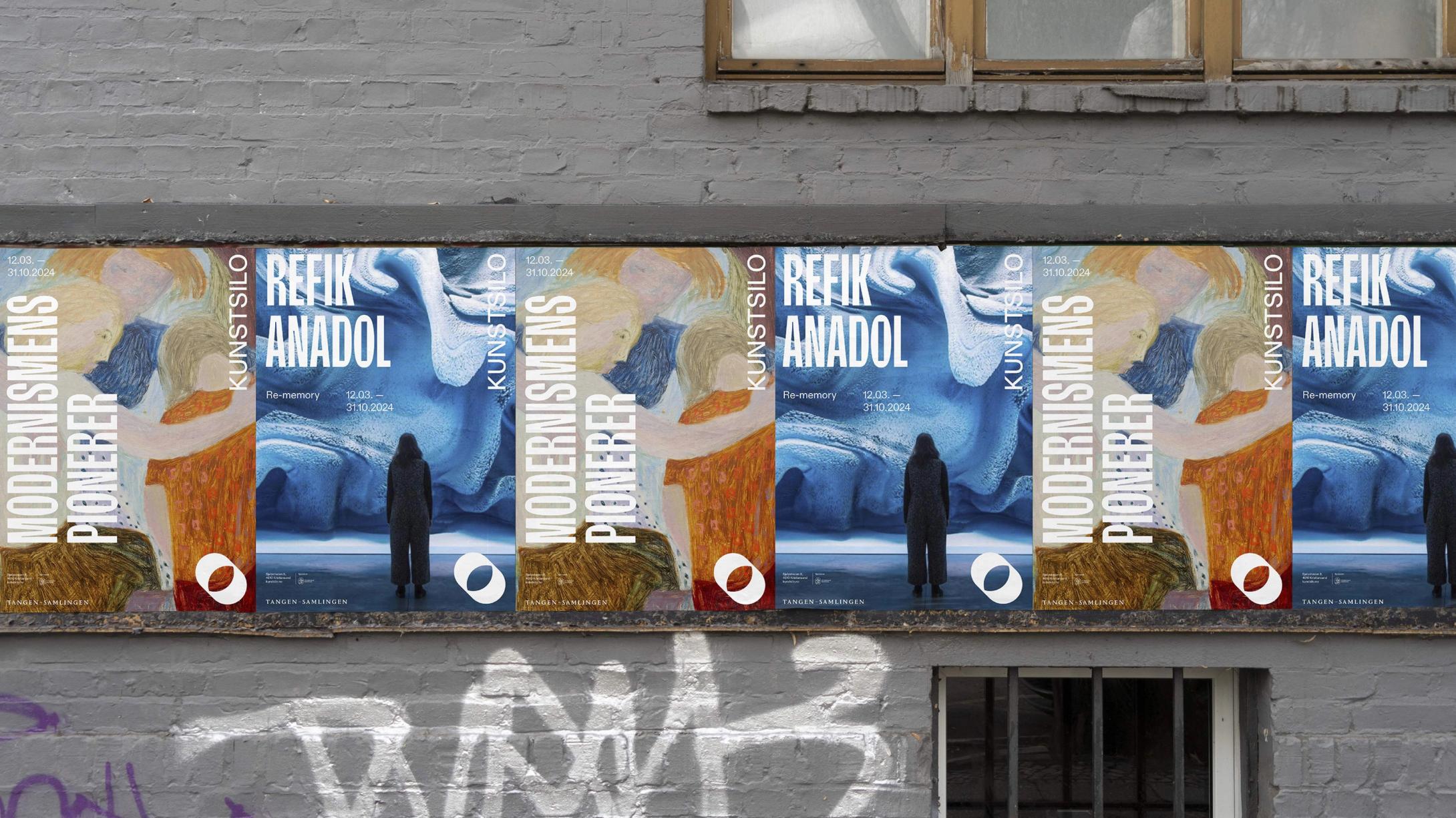
The brand strategy, "Shifting Perspectives," is inspired by the silo's iconic architecture and represents the subjective changes that occur both in space and in reaction to exhibits and events at Kunstsilo. An open and reflecting identity where everyone is invited to create new discoveries and new conversations, shifting perspectives through art and real life experience.
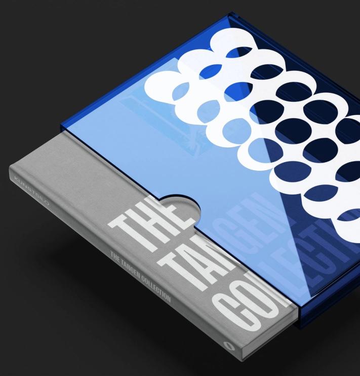
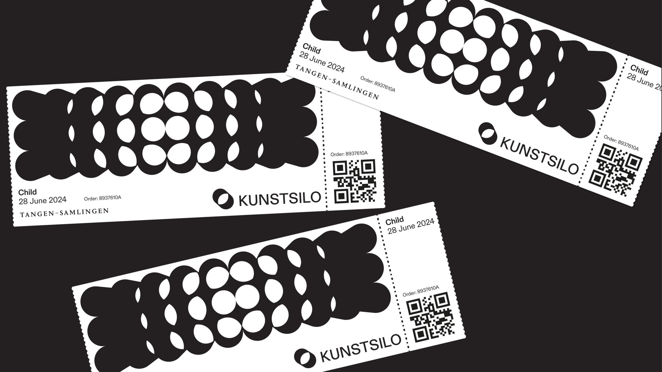
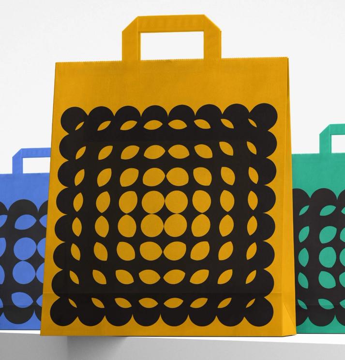
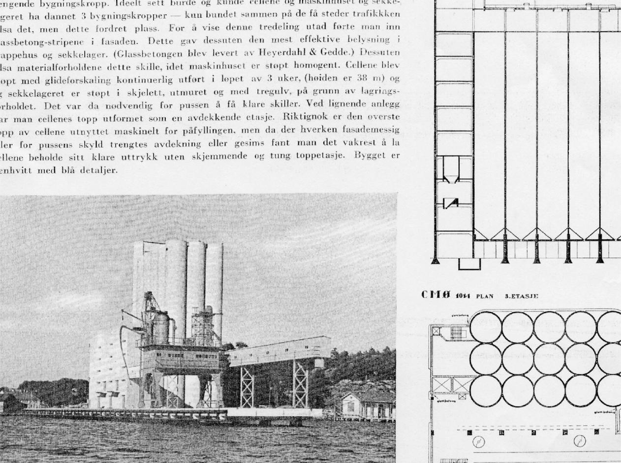
The visual identity captures characteristic elements of the silo with reference to 20th Century modernism, including its tall proportions, cylindrical forms, and striking voids and brutalism.
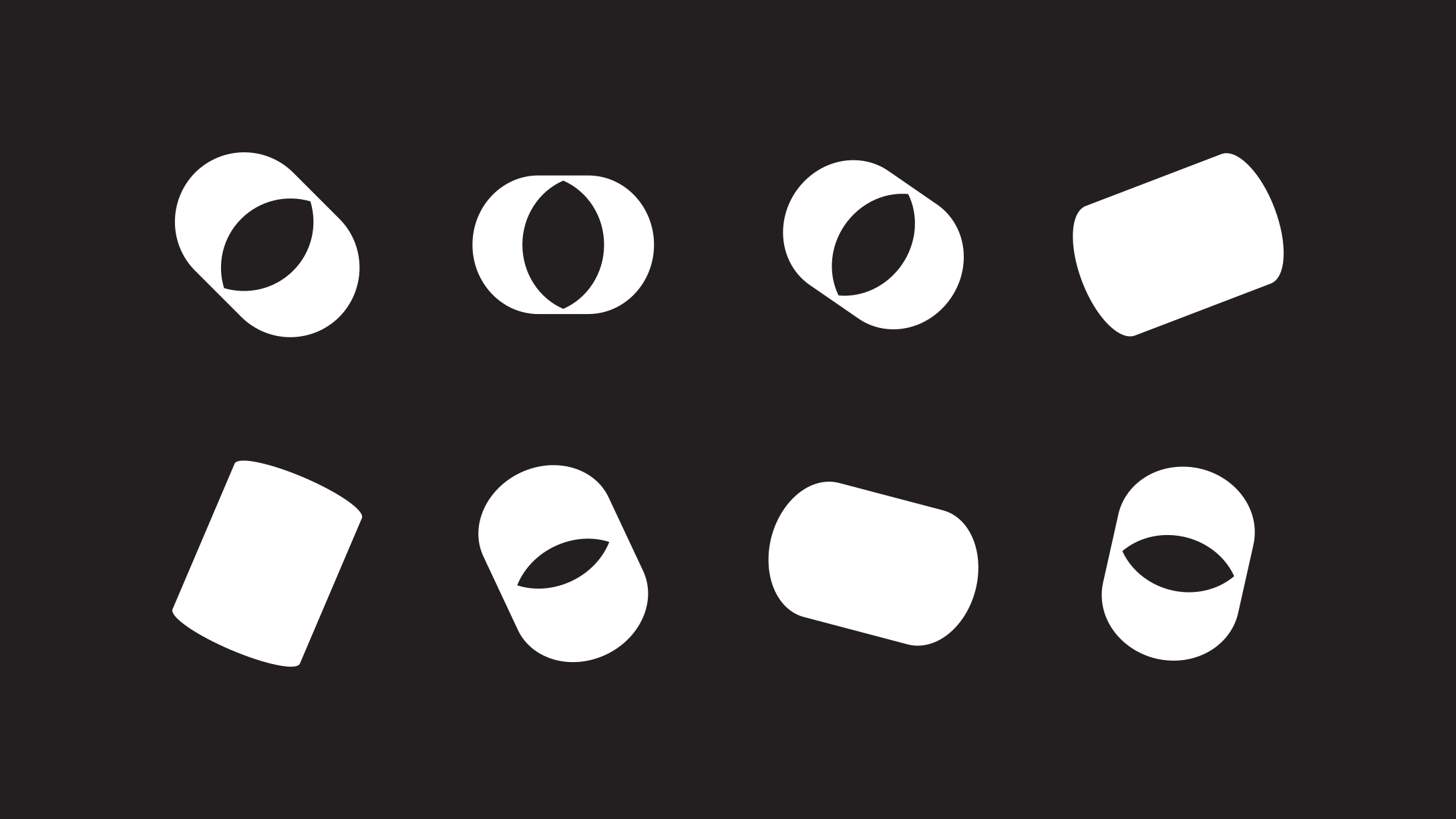
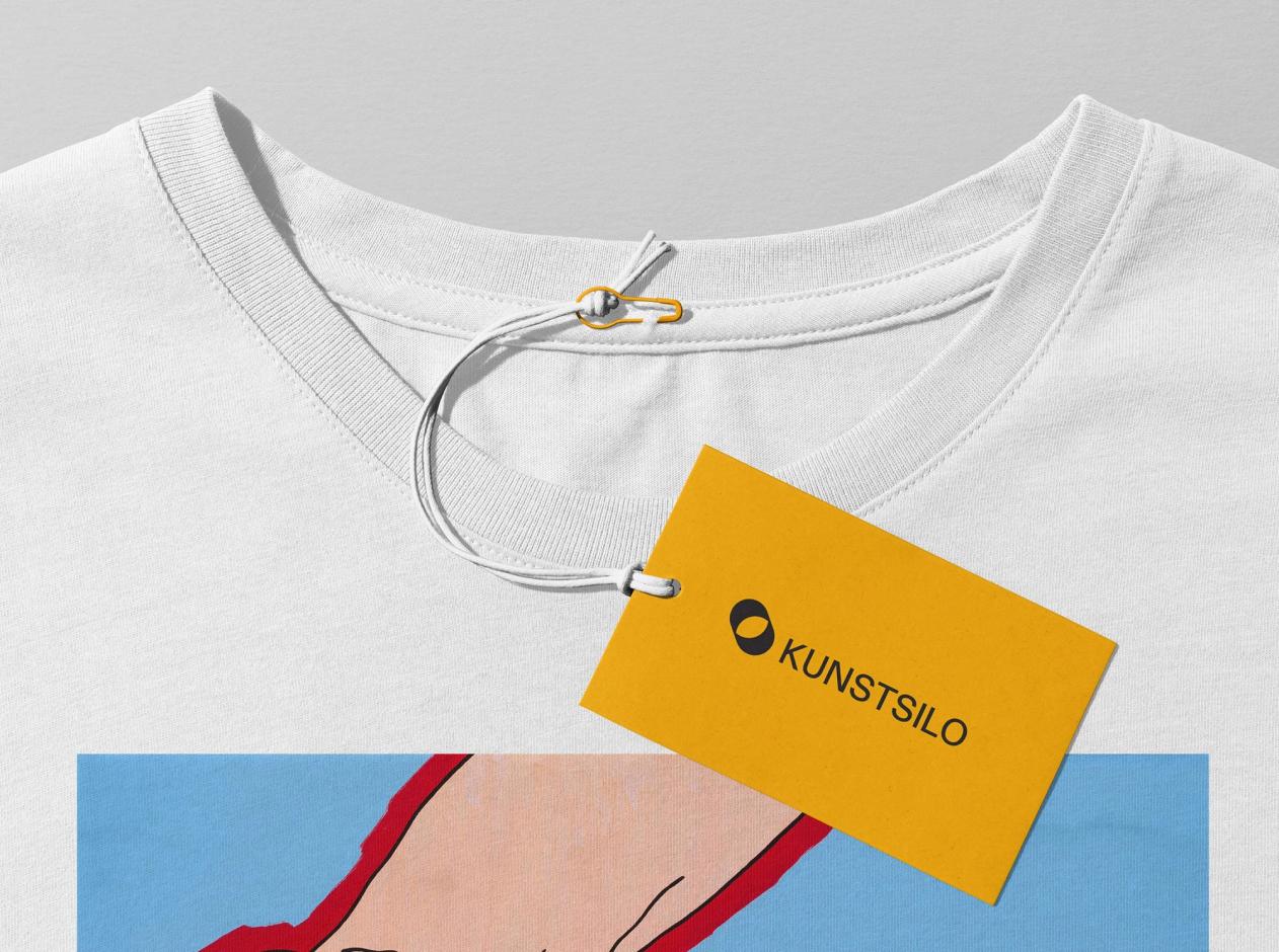
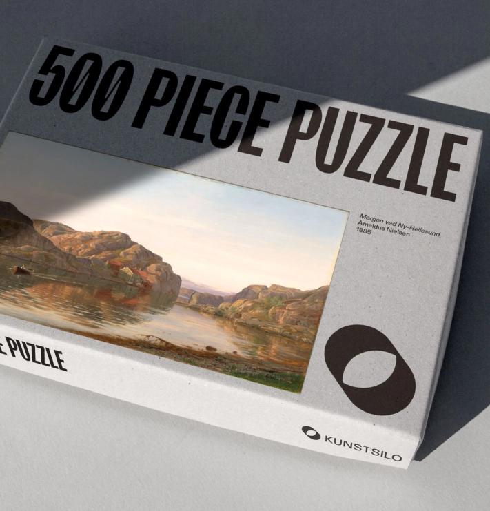
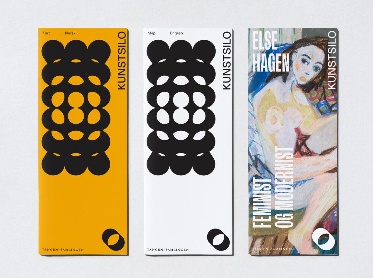
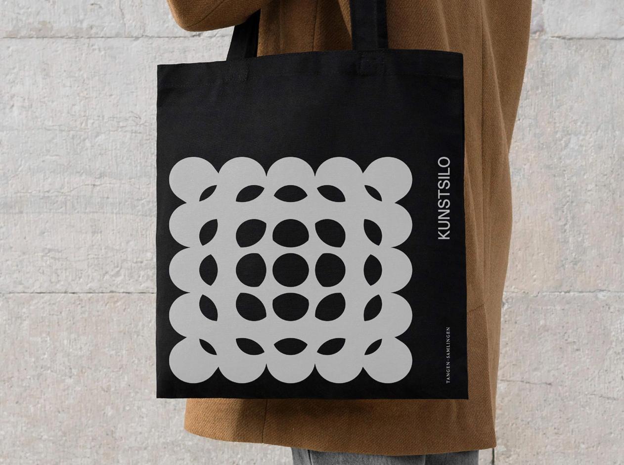
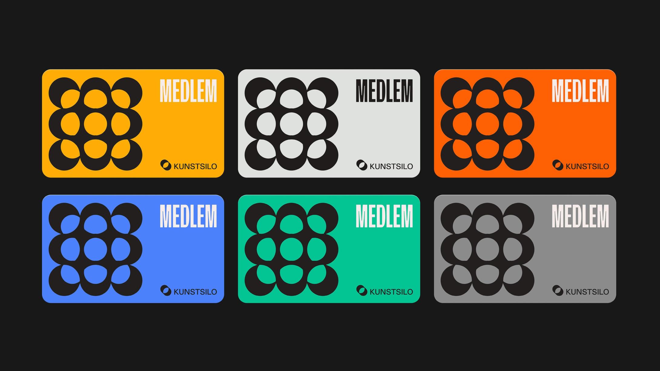
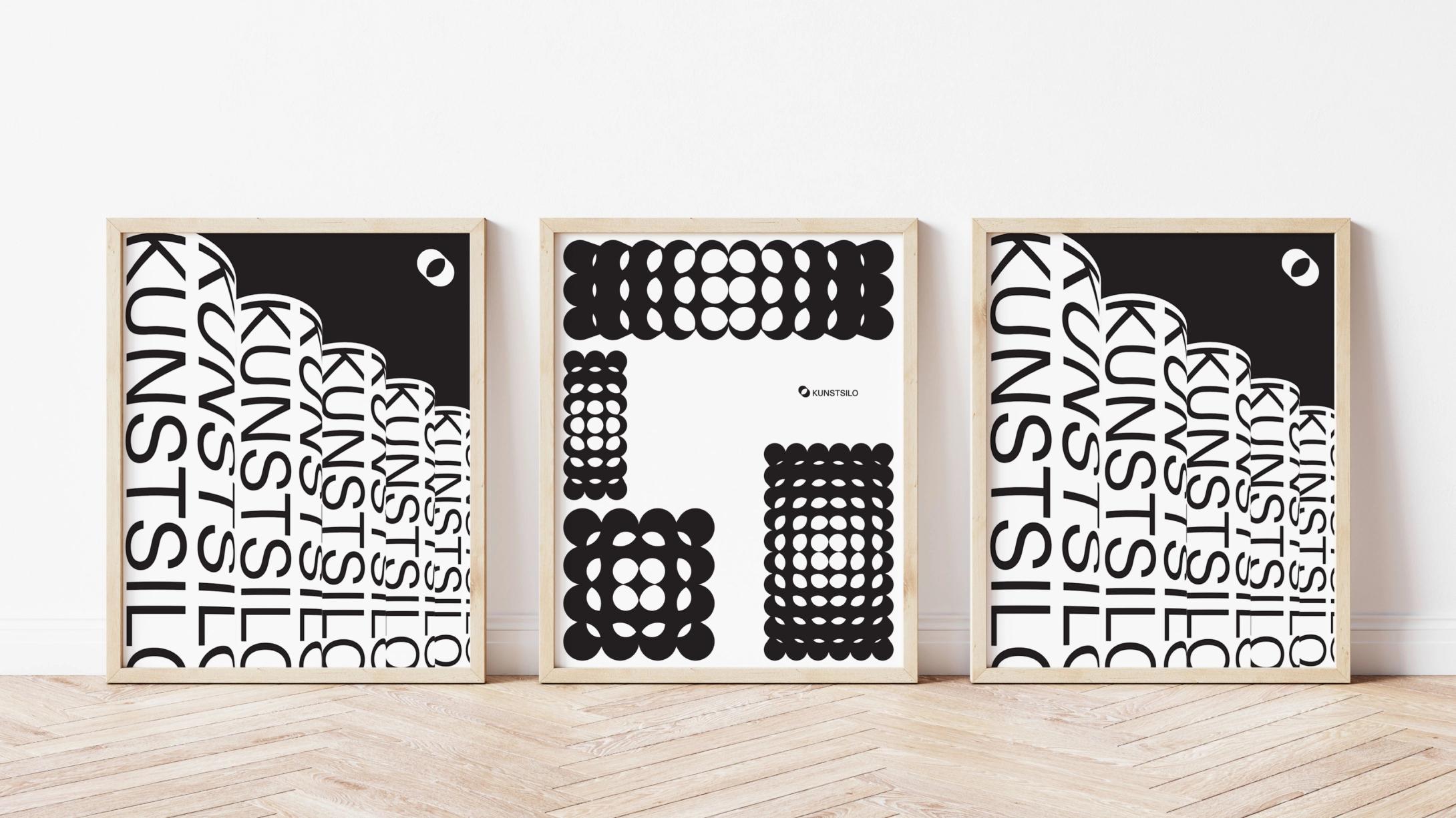
The logo symbol is a graphic representation of the silo's cylindrical form, while the brand pattern is derived from both the architecture of the building and the logo symbol. This pattern can become a powerful visual element to help build the iconic nature of the brand - connecting the institution with the building.
The idea of "Shifting Perspectives" is embodied in the symbol through a distortion in the perception of depth.
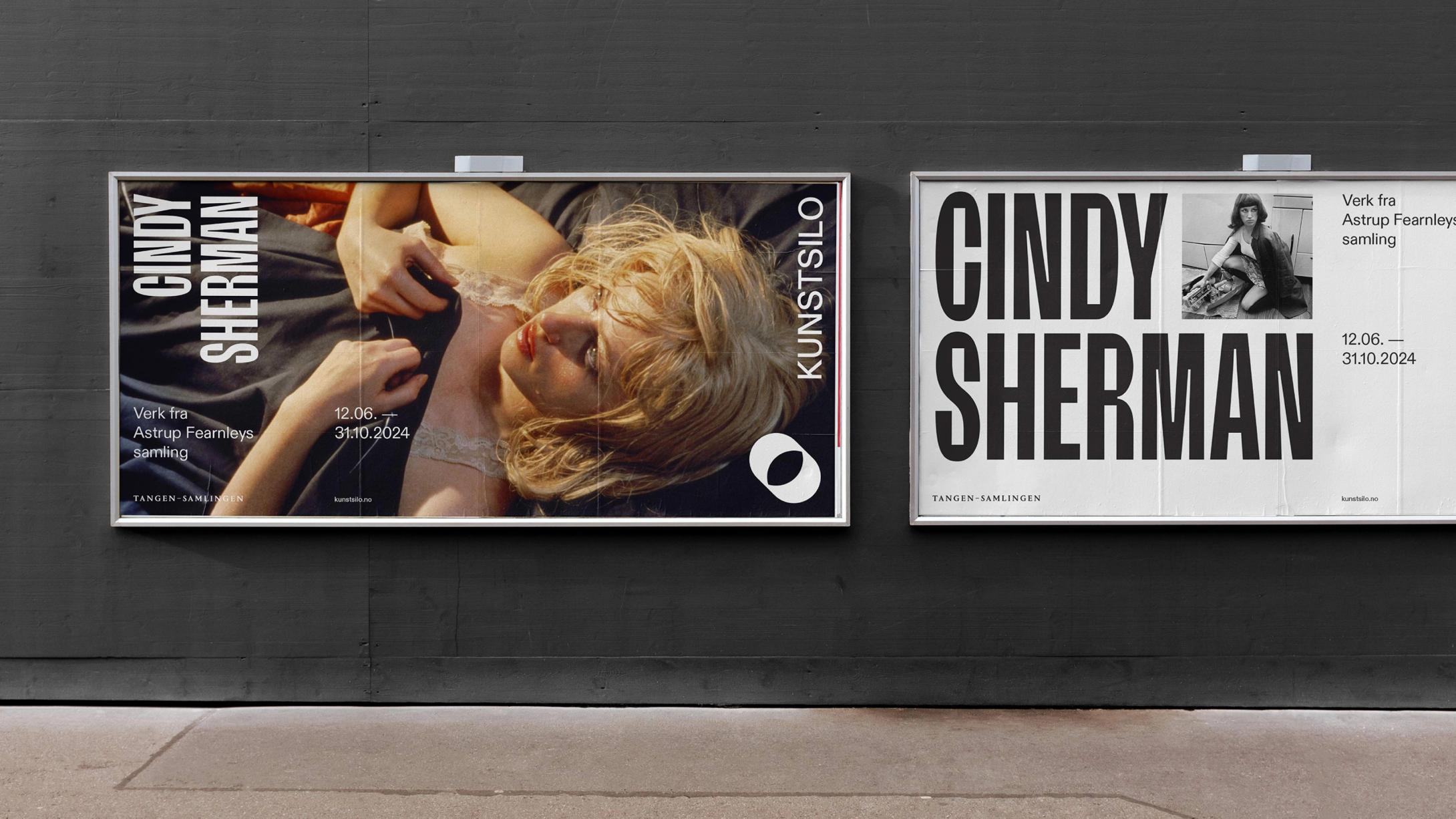
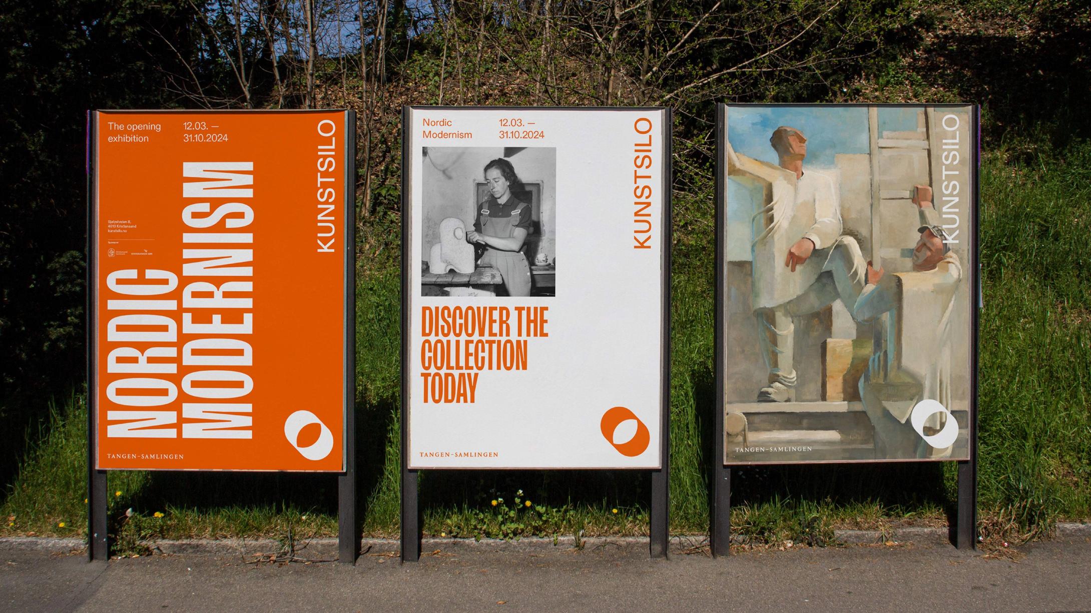
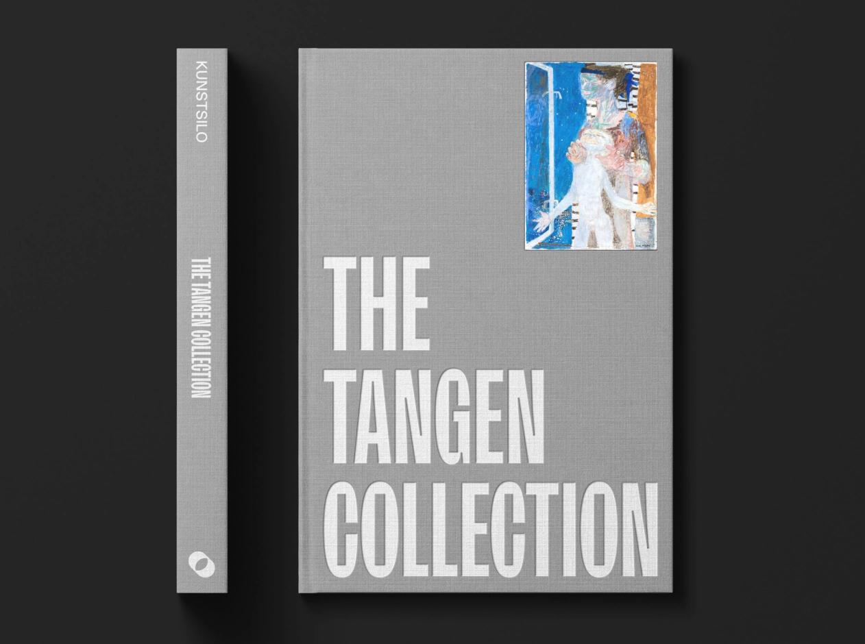
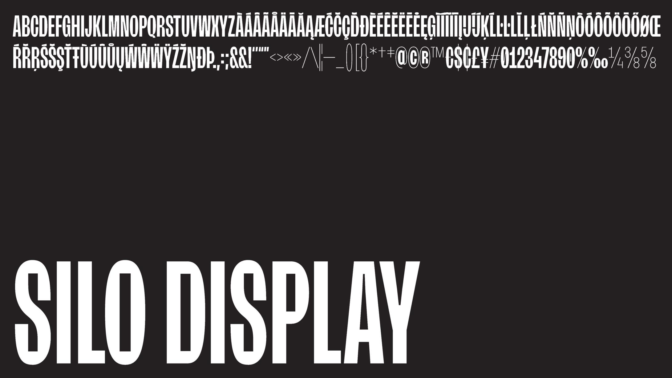
Our custom designed display font ‘Silo Display’ is the centre of the typographic palette.
Overall, the visual identity aims to connect the institution with the building, creating an timeless and iconic brand.