Brand repositioning, visual strategy, and performance marketing for a fast-casual seafood concept.
About the project
Pink Fish is a fast-casual restaurant concept that redefines seafood dining by combining quality, sustainability, and speed. Founded in Norway, Pink Fish brings the best of the ocean to the table with a modern twist, specialising in fresh Norwegian salmon prepared with globally inspired flavours. The menu offers a diverse range of dishes, from salads and wraps to hot meals and burgers, crafted for health-conscious, environmentally aware consumers.
Pink Fish launched in 2017 as Norway's first fast-casual seafood chain. Seven restaurants across Norway and Singapore. A menu built around Norwegian salmon. Co-founded by Geir Skeie, a Bocuse d'Or-winning chef.
The brand had been developed by a London agency. The design looked confident — vibrant colours, bold graphics, a youthful energy. But by 2019, the business was struggling to gain traction.
Marketing spend wasn't working. A campaign with influencers cost 1 million kroner and generated zero measurable sales. Brand awareness remained low. Repeat customers existed, but not enough of them. People liked the food when they tried it, but the brand wasn't top of mind.
The problem wasn't the quality of the original branding. It was market fit. The visual identity felt aimed at Gen Z, but the actual customer base was Millennials aged 23–45. The brand looked like one thing and behaved like another.
Nonspace was brought in to diagnose what wasn't working and realign the strategy.
The original positioning was generic — taste, health, convenience, sustainability. Lifestyle trends, not strategic insights. Research showed customers agreed with these values in theory but didn't act on them when hungry.
The deeper issue: fast food is a subconscious quality-for-convenience trade-off. Fish has higher quality expectations than beef or chicken. Pink Fish needed to overcome a barrier burger chains didn't face.
The brand lacked anchors. Nothing made it the obvious choice when standing hungry on a street with ten options in sight. Tone of voice occasionally veered into bragging. Photography looked dated. Menu hierarchy was cluttered. External screens showed so much brand messaging that passing foot traffic had only a 15% chance of seeing an actual product offer.
Service varied between locations. Some had poor footfall due to demographic mismatch. The visual identity felt Gen Z but the actual customers were Millennials aged 23–45.
Pink Fish needed strategic realignment, not cosmetic changes.
Nonspace began with a comprehensive brand audit — workshops with leadership, customer behaviour analysis, trend research, evaluation of every touchpoint from digital screens to in-restaurant experience.
The strategic work established core communication anchors and a defined brand personality. Not abstract values, but tangible reasons to choose salmon over a burger. The personality: enthusiastic about seafood, honest and real, genuinely optimistic. Fun but not funny.
The repositioning clarified purpose: Pink Fish brings enthusiasm about seafood to people on the move. The only fast-casual brand building community around the advantages of seafood.
Nonspace then addressed every customer touchpoint.
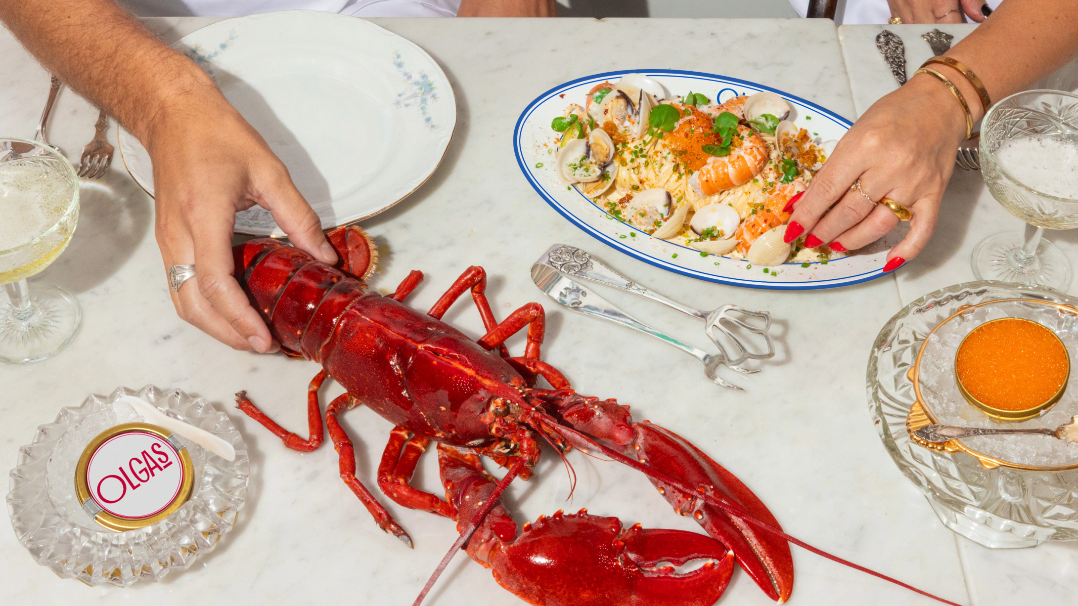
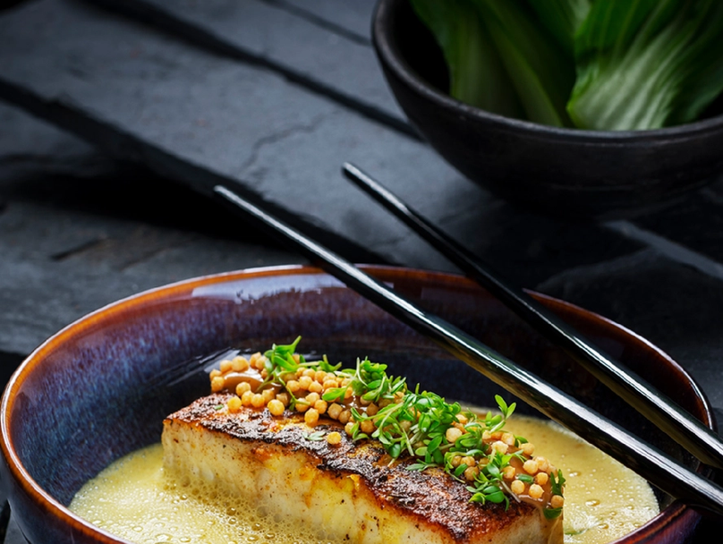
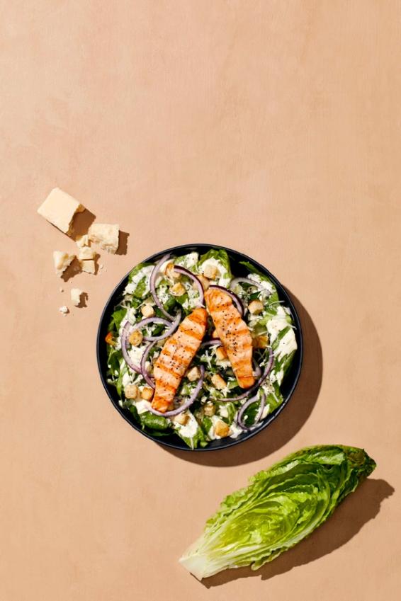
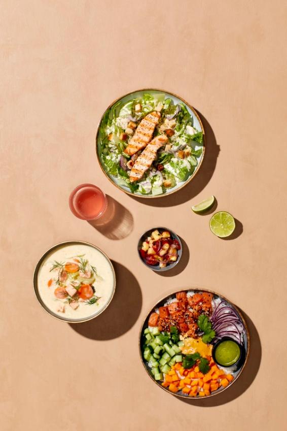
Photography: A three-tier system replaced outdated imagery. Brand-level photography celebrated ingredients in art-directed compositions inspired by Geir's Bocuse d'Or pedigree. Product photography made food look fresh and abundant. Campaign photography was conceptual and witty, designed for social sharing.
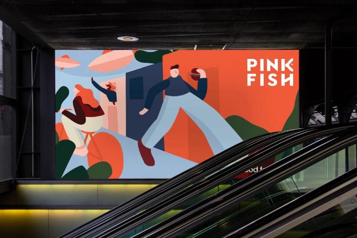
Retail environment: External digital screens were rebalanced — prioritising product offers over brand messaging to capture the critical 3–5 second window. Menu boards were restructured for instant clarity. Point-of-purchase materials became memorable touchpoints, not logo repetition.
Performance marketing: Geo-fenced campaigns targeted four personas within kilometres of each restaurant. Google, Facebook, Instagram, and Snapchat ads optimised for store visits. Messaging focused on customer benefit, not brand boasting.
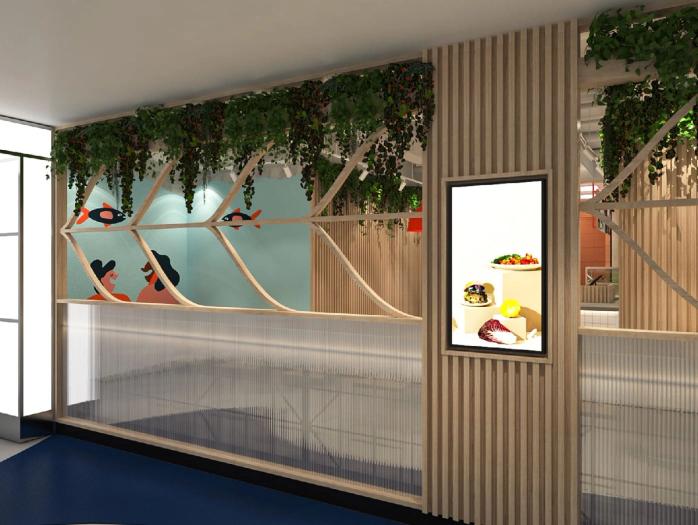
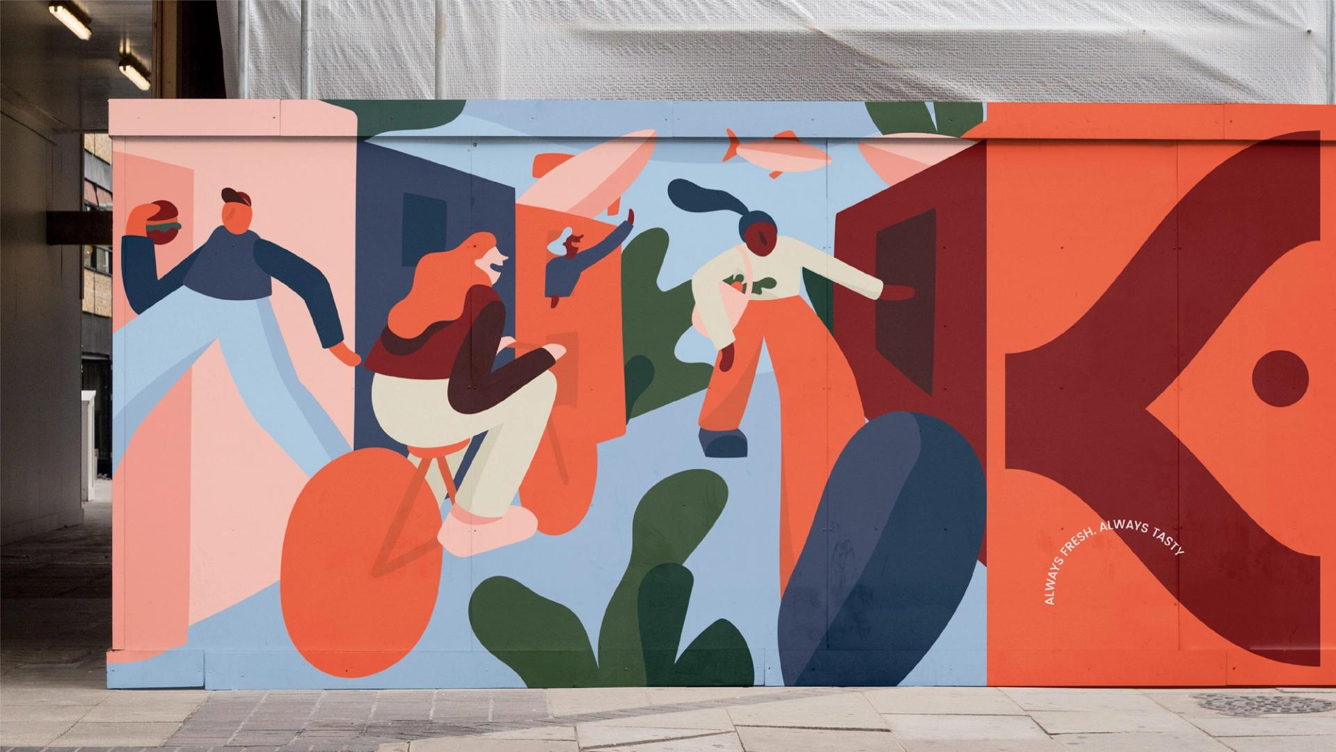
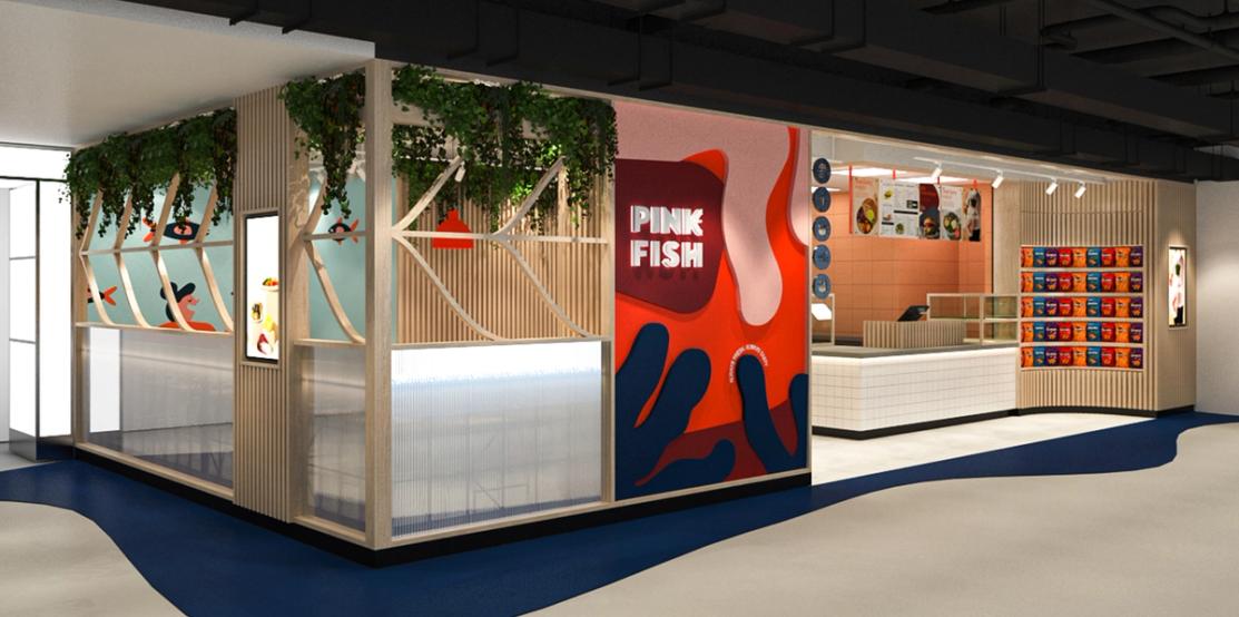
Interior design: Brand-led design direction for Singapore ensured physical space reflected the repositioned brand. Natural materials, greenery, toned-down colour, commissioned illustration murals by Cecile Gariepy — modular artworks telling the brand story through Nordic landscapes, salmon, diverse characters, and modern urban life.
Digital and operational tools: Website redesign aligned online presence with the new direction. Templates in multiple formats gave Pink Fish the ability to create materials in-house while maintaining consistency. Menu communication was simplified. Staff became empowered brand ambassadors.
The realignment gave Pink Fish strategic clarity on who they were speaking to and why those customers should care.
Performance marketing delivered measurable footfall through store visit conversions. Geo-targeted spend reached people near restaurants during meal times, with messaging tailored to their motivations.
The photography system elevated presentation across every channel. Social engagement improved. The brand felt premium without feeling inaccessible.
Templates and tools enabled internal teams to maintain consistency. New menu items and seasonal campaigns could be created in-house while staying on-brand.
Most importantly, the mismatch between visual identity and actual customer base was resolved. Pink Fish could speak authentically to Millennials who valued quality, convenience, and health.
The work demonstrated that brand problems are rarely visual problems. Pink Fish didn't need a new logo. It needed honest diagnosis of why the existing brand wasn't connecting, then systematic correction of every disconnection point.
Nonspace delivered a brand that worked in the market it actually operated in.




Relevant cases
