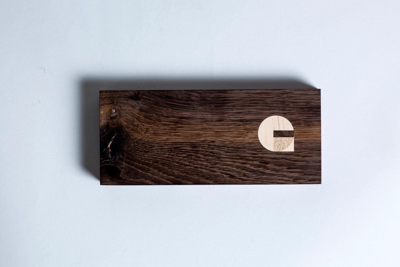
A graphic, tactile logo for an high-end interior architect and furniture maker.
Highlights
About the project
GG Möbel is a bespoke furniture workshop based in Bergen, Norway, specalising in custom-designed kitchens, staircases, built-in furniture, tables, benches, and wardrobes. With a focus on high-quality craftsmanship and tailored design, GG Möbel brings durable, handcrafted living solutions to life, creating functional and beautiful spaces that are uniquely suited to each client's needs.
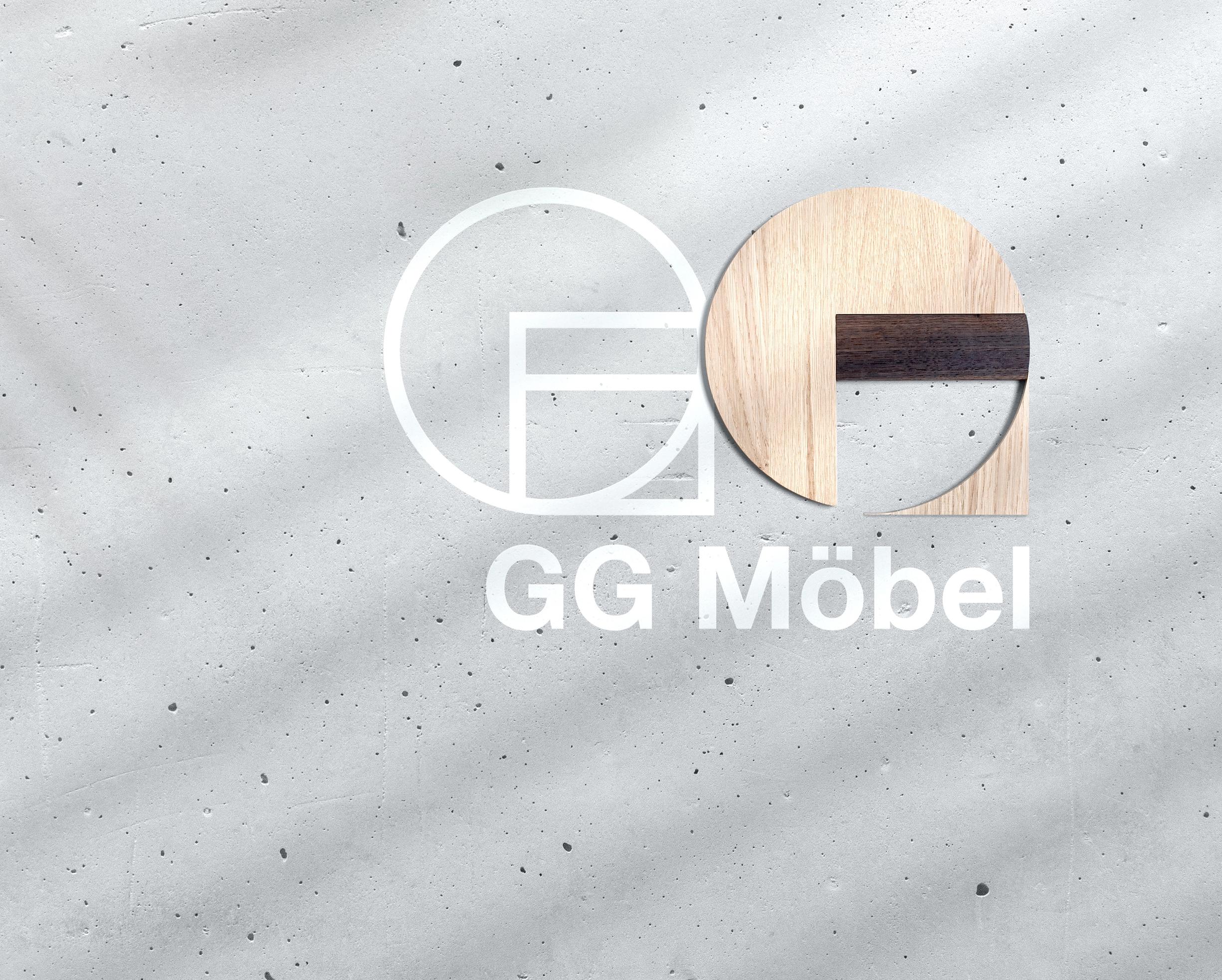
In the digital-first world, a logo can be many things. However, for high-end interior architect and furniture maker, GG Möbel, it required going back to its pure being; the maker’s mark.
(Work developed under ANTI)
Brand
Visual Identity
Graphic Design
Logo Design
Design Systems
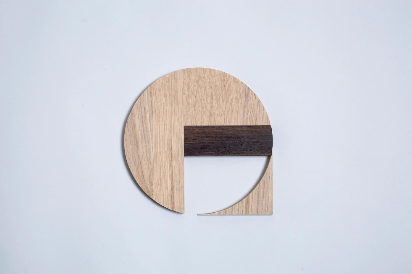
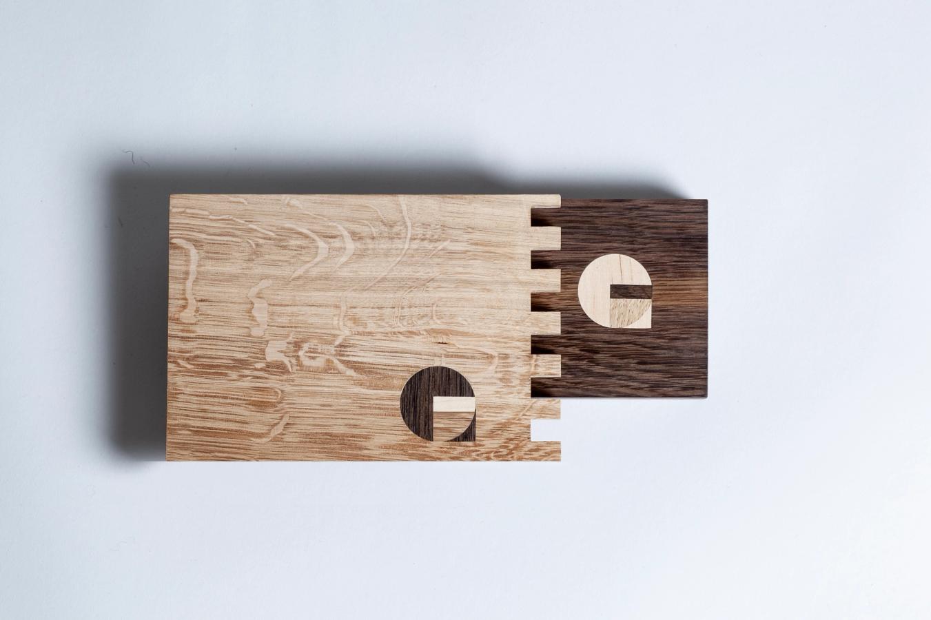
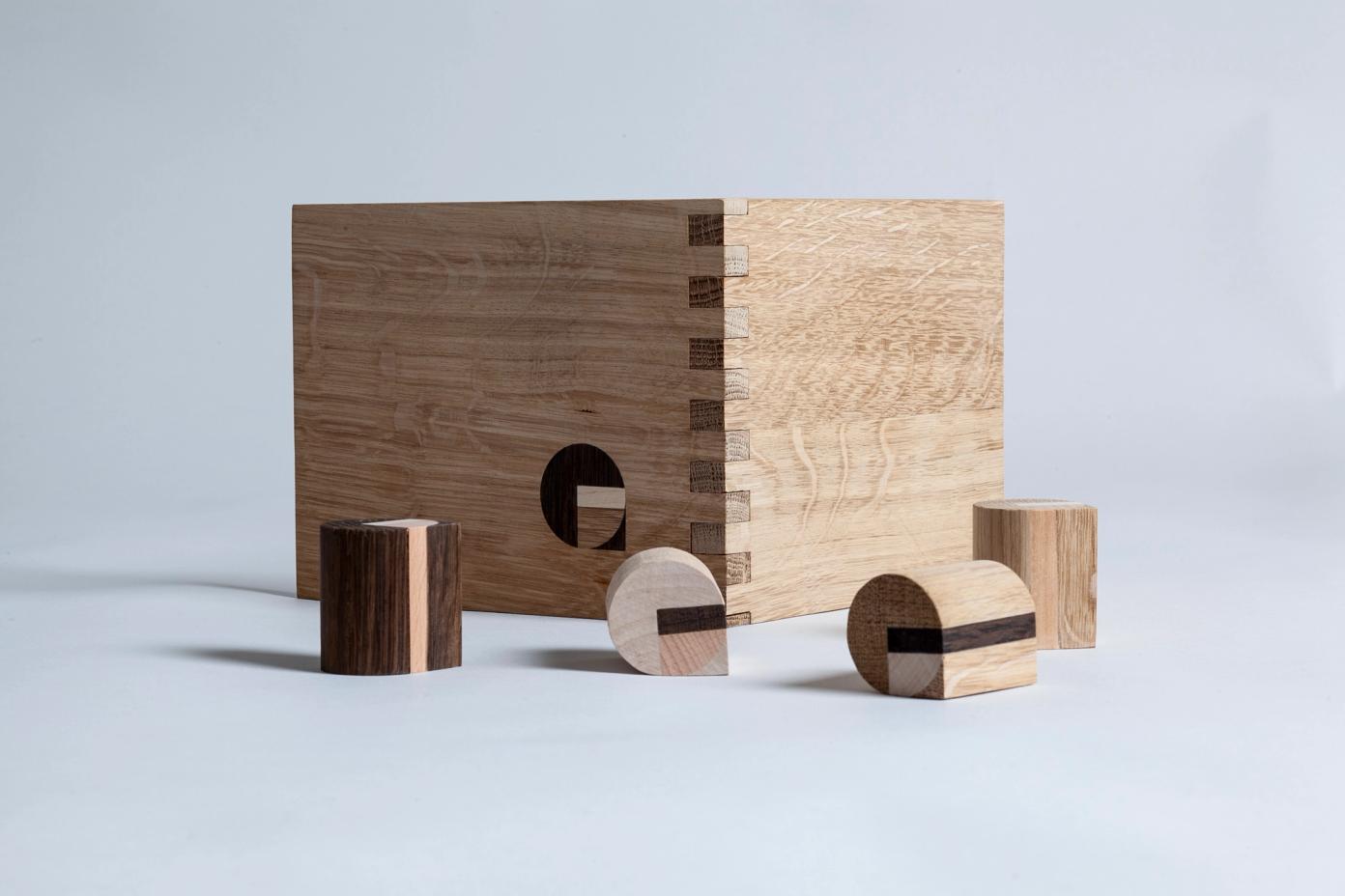
The logo needed to express their philosophy in its form, and its production. To play a function and the details and design of products and interiors. To be produced, by hand, as part of its placement, in natural harmony across materials.
To achieve the essence and function required by GG Möbel, we looked to where their process starts - in the workshop. With compass, ruler, paper and a mechanical pencil in hand, we explored and experienced form the same way the masters did prior to the endless possibilities of the computer.
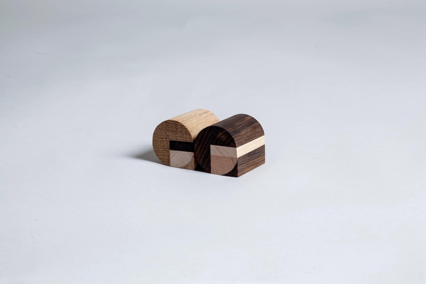
Using mechanical tools in sketching ensured a natural connection to the shape, utility and the axes of tools available in prototyping and production. Understanding the tolerance of a router-bit or the standard widths of a chisel defines the optimal size of the logo. Consideration of the material, its tension, breaking point and structural integrity defines choices in the form of the logo.
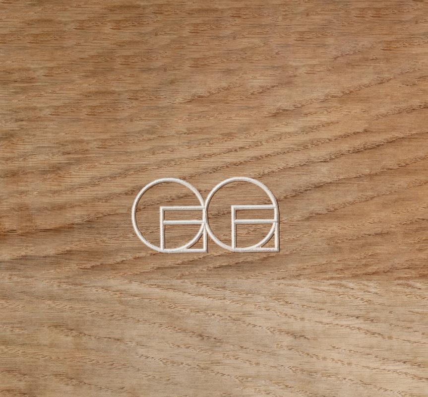
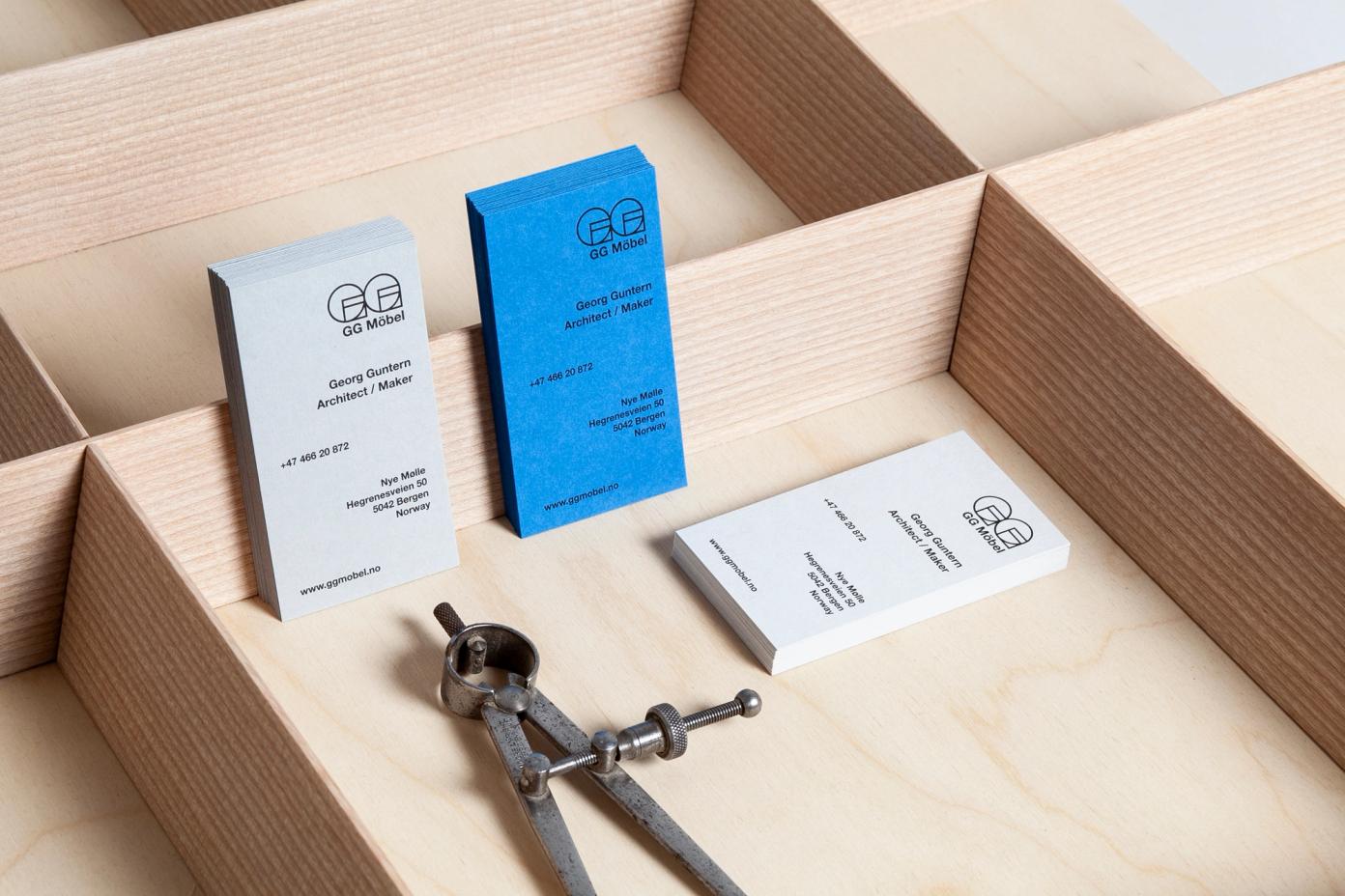
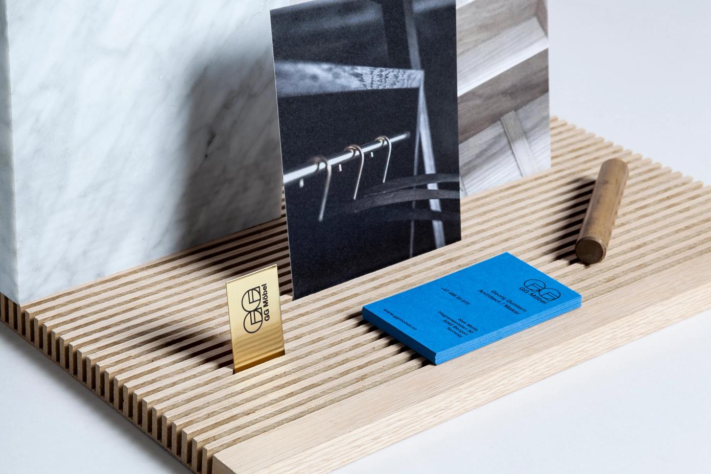
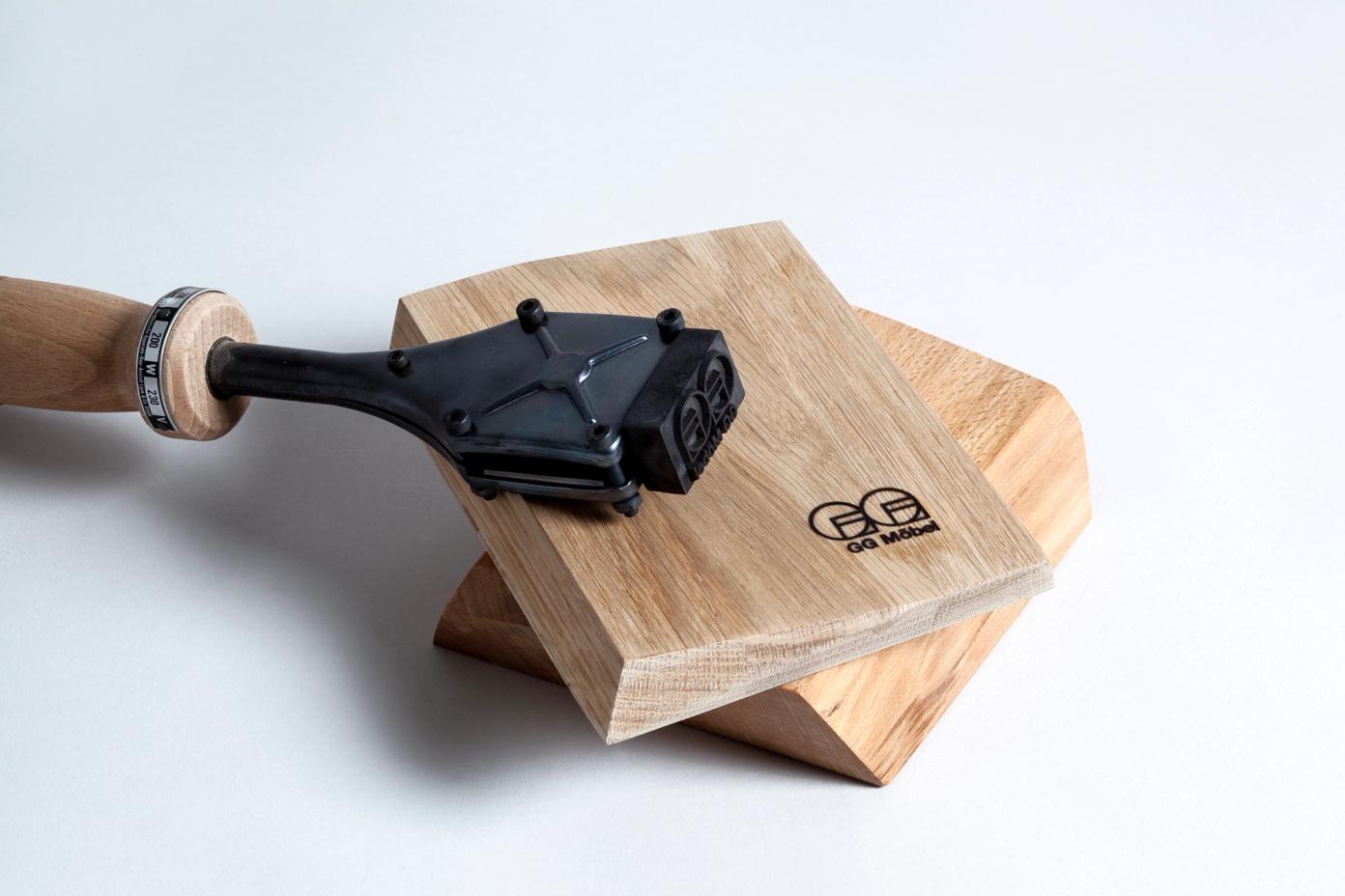
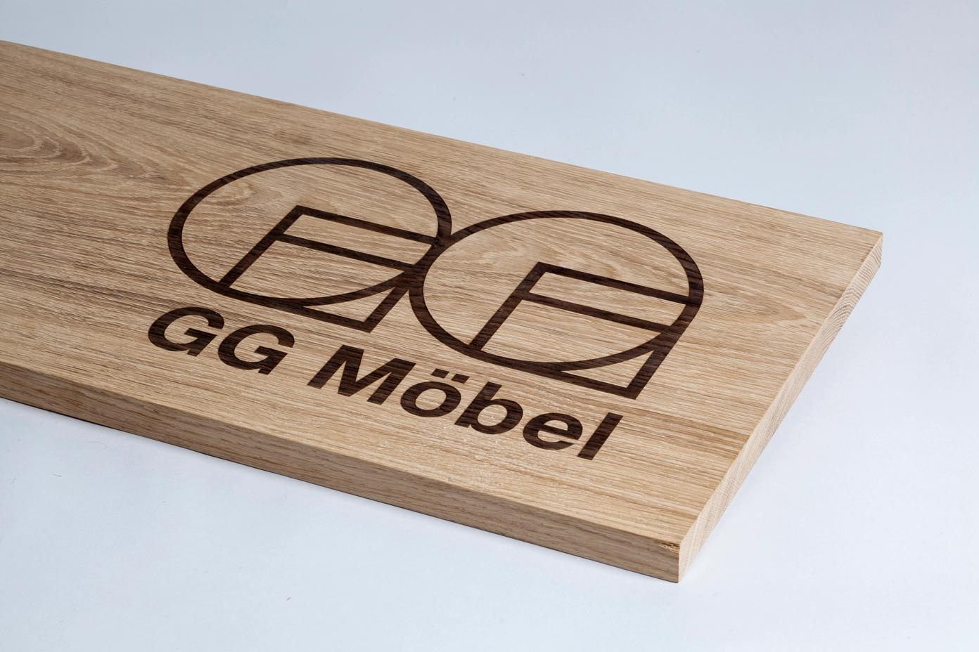
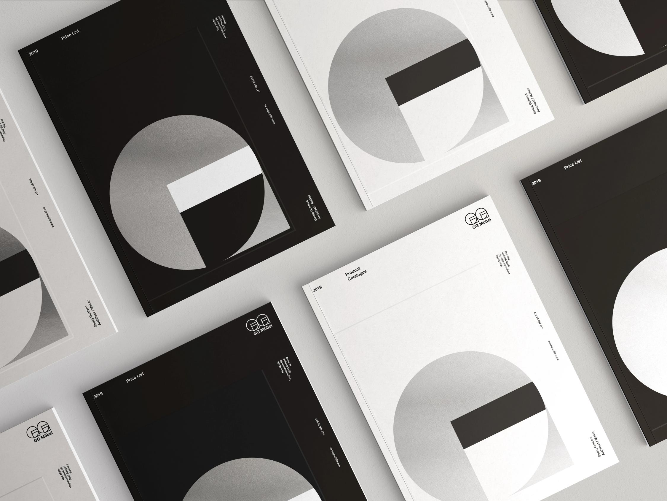
With its mechanical origin, the logo holds impact as an inlay in contrasting species of wood, engraved (with or without coloured wax), heat-stamped on the back of products, as large painted wall graphics in trade fair settings or through print-production embellishments such as embossing, foiling, stamping and more.