How Nonspace brought Norwegian Film Commission's new visual identity to life on the web and made the site work harder in the process.
Highlights
About the project
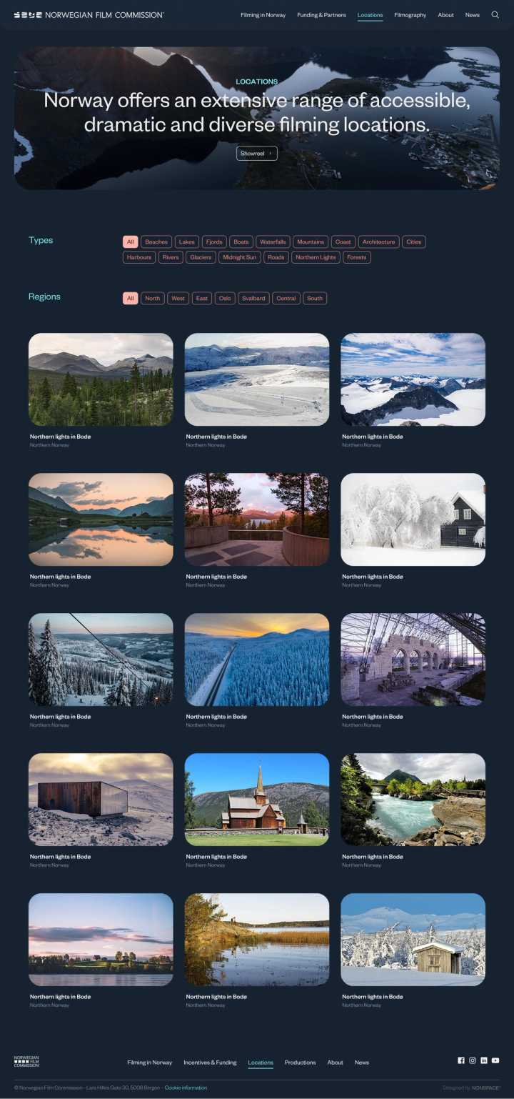
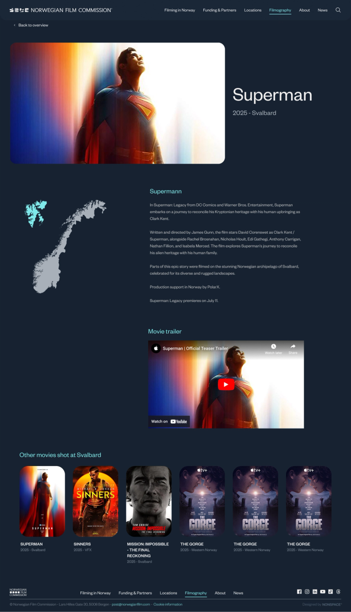
The Norwegian Film Commission works to promote Norway as a world-class location for international film and TV production. With breathtaking natural landscapes, modern infrastructure, and strong industry support, Norway offers a unique backdrop for storytelling at any scale. The Commission serves as a gateway to the country's production resources, helping global filmmakers bring their visions to life.
Nonspace was brought in to implement Norwegian Film Commission's new visual identity on their existing website, built on Sanity CMS. The scope was focused but multifaceted: brand implementation across all pages and components, targeted UX and content improvements.
The goal was to bring the new identity to life on screen, improve the experience where it mattered, and leave the underlying structure intact where it was working.
Bringing a visual identity into a new environment sounds straightforward. In practice, it rarely is.
Every context has its own rules. Colours that work in one setting can feel flat or heavy in another. Typography behaves differently in a responsive web environment than it does elsewhere. Graphic elements need to be reconsidered when they scale and stack across device sizes. Every decision that felt resolved in the brand guidelines needed to be tested again on screen.
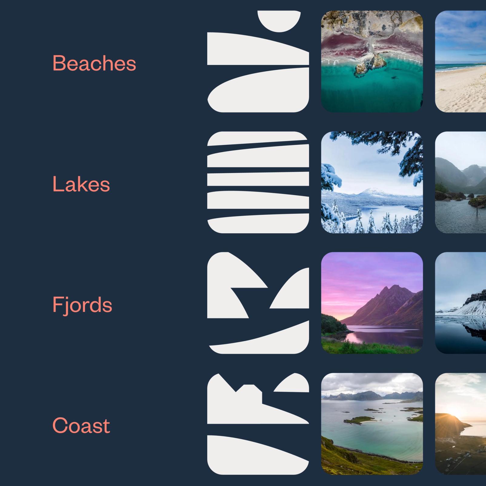
Beyond the visual translation, the site had accumulated the natural friction of a growing organisation. Navigation could be clearer. Some content had become redundant; other topics, such as sustainable filming, Svalbard, visa information deserved more space.
The challenge was to fix all of this without overreaching. Precise, purposeful improvements.
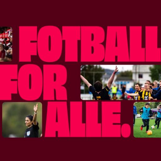
The work started with the identity. Logo, colour palette, typography, and icons were applied consistently across every page and component, adapted for screen where needed to ensure contrast, legibility, and the right visual weight across devices. Where the new icons lent themselves to subtle motion, light animation effects were introduced to bring the interface to life without compromising performance or accessibility. Text overlays on hero images were reviewed and refined throughout. A detail that sits at the edge of brand and UX, and one that often gets missed in identity rollouts.
UX and content improvements were deliberate and targeted. Menu alignment and type sizing were reviewed for clarity and usability. The Practical Information page was restructured: the Why Norway section removed, Information about Norway and Useful Links consolidated, and new sections added for visa information, sustainable filming in Norway, and Svalbard, giving international producers the depth of information they actually need. The 25% Incentive page was folded into Funding and Partners, simplifying the navigation.
Norwegian Film Commission's website now reflects their new identity fully and consistently across every page, every component, and every screen size. The visual language carries through to digital with purpose and coherence.
But the update goes further than a visual refresh. The site is more navigable, more informative, and better equipped to serve the international producers who use it most. Content that was scattered now has structure. Topics that matter to Norwegian Film Commission's audience now have space.
A well-executed identity implementation, done with the right attention to detail, can change how a brand feels online without a rebuild. The foundation was sound. The work was in knowing exactly what to improve, and how.
Relevant cases
Framing the Extraordinary
Kavlifondet — New Website for Norway’s Largest Foundation
Website and Screens